Introduction
SaaS landing pages have exactly one shot to explain a complex product, build trust, and push a visitor toward a single action. The problem? They're harder to convert than almost any other category. According to Unbounce's SaaS benchmark data, the median SaaS landing page conversion rate sits at 3.8% — well below the all-industry median of 6.6%.
In a market where buyers compare three to five solutions before talking to anyone, a forgettable landing page is a direct competitive disadvantage.
This guide is for SaaS marketers, founders, and growth teams who want a clear, practical framework for building pages that actually convert. You'll walk away with:
- The essential elements every SaaS landing page needs
- Best practices that separate high-converting pages from average ones
- Real examples to learn from — and what makes them work
The best-performing SaaS pages don't just describe a product. They preempt buyer objections, prove value on the spot, and make the next step feel obvious.
Key Takeaways
- SaaS landing pages convert below the industry average — the gap is yours to close
- Lead with outcomes, not features; buyers care what they gain, not what you built
- Social proof belongs early — only 54% of SaaS pages use testimonials at all
- One CTA goal per page — repeat that button as many times as needed
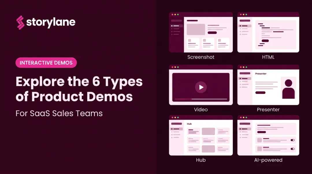
- Interactive demos on landing pages let buyers self-qualify before talking to sales
What Makes a SaaS Landing Page Different
Unlike e-commerce, you can't photograph your product sitting on a shelf. SaaS companies have to communicate intangible value quickly, to skeptical buyers who are often 70% through their research before they contact anyone — and who are comparing multiple tools simultaneously.
That gap creates a specific problem: most SaaS landing pages try to explain too much and end up saying nothing clearly.
Landing Page vs. Homepage
These two are not interchangeable, and mixing them up is one of the most common mistakes SaaS teams make.
| Homepage | Landing Page | |
|---|---|---|
| Audience | Everyone | One specific persona |
| Goals | Multiple (brand, nav, features) | One conversion action |
| Navigation | Full site navigation | Minimal or none |
| Success metric | Engagement, exploration | Single conversion |
A homepage introduces your company broadly. A landing page is built around one goal — a free trial signup, demo request, or lead capture — and every element should push toward that action.
Three Types of SaaS Landing Pages
- Demo/consultation pages — highest friction ask; requires the most social proof and objection handling before the CTA
- Free trial signup pages — lower barrier, but still needs a clear value hook to convert skeptical buyers mid-comparison
- Lead magnet pages — easiest conversion, but attracts broader audiences who may not be ready to buy
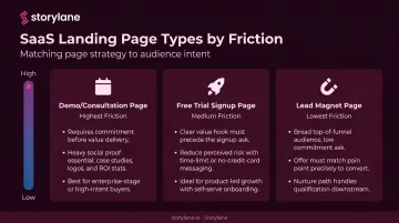
The type of page you build dictates how much trust you need to establish before making the ask. A demo request requires more convincing than a free download — so the page architecture, length, and proof points should reflect that.
The Anatomy of a High-Converting SaaS Landing Page
Hero Section: First Impressions That Actually Work
Nielsen Norman Group research shows users often leave web pages within 10 to 20 seconds. Your hero section needs to answer one question immediately: "Did I come to the right place?"
That means:
- Headline: State the specific outcome the buyer gets — not the product name, not the technology behind it. "Close deals twice as fast without the back-and-forth" beats "AI-powered workflow automation suite" every time.
- Subheadline: One sentence explaining how. Keep it concrete and jargon-free.
- Hero visual: Show the product UI in context, or an image that conveys the outcome. Avoid abstract stock imagery.
- Primary CTA: Visible without scrolling, with action-oriented copy.
One structural note: 91% of SaaS landing pages in Unbounce's sample had no top navigation. That's not an accident — navigation menus create an exit ramp when you need visitors focused on a single action.
Unbounce's 2024 Conversion Benchmark Report found that 5th-to-7th grade copy converts at 12.9% for SaaS pages, versus just 2.1% for professional-level writing. Write like you're explaining it to a smart non-expert, not a room full of engineers.
Social Proof: Earn Trust Before Asking for Anything
Social proof should appear early in the page, not just in a footer section no one reaches. Buyers need a reason to keep reading before they commit to reading more.
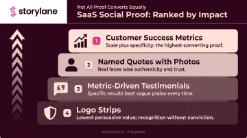
From least to most impactful:
- Logo strips — lowest friction to add, best for recognizable brand names
- Metric-driven testimonials — "saved 6 hours per week" beats "great product"
- Named quotes with photos — higher authenticity than anonymous endorsements
- Customer success metrics — aggregate numbers like "over 10M hours saved" combine scale with specificity
Only 54% of SaaS landing pages in Unbounce's analysis used testimonials at all. That's a gap worth exploiting.
The difference between low-impact and high-impact social proof comes down to specificity. A logo strip with no context signals that companies signed up — not that they got results. To close that gap, pair logos with a specific outcome and frame testimonials around the buyer's pain point rather than a generic product compliment.
Notion does this well: rather than a wall of company logos, they surface short, specific quotes tied to real workflow outcomes. Slack famously launched with a single testimonial from a recognizable tech company with a concrete business result — before most buyers had heard of Slack at all.
Product Visuals and Interactive Demos
Showing the product beats describing it. Text-heavy feature lists leave buyers guessing what the software actually looks like and does. A screenshot of a real dashboard, a short demo video, or an animated walkthrough removes that ambiguity and lets visitors self-qualify.
A growing number of high-converting SaaS pages go further: they embed interactive product demos, letting prospects explore the product before ever talking to sales. According to Navattic's 2026 research, 18% of B2B SaaS websites now have an interactive demo, up 40% year over year.
Storylane enables this with multiple embeddable demo formats — screenshot-based walkthroughs, HTML demos that replicate the actual product interface, video embeds, and mixed-media demos combining all formats. Rather than watching a passive explainer video, visitors can click through a guided product experience at their own pace.
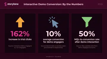
The conversion impact is real:
- Respond.io increased trial clicks by 162% using Storylane interactive demos
- Visitors who engage with an interactive demo convert at 10% on average
- MQLs who interacted with a demo convert at 50%
Storylane's Account Reveal feature takes this further: it de-anonymizes visitors who interact with an embedded demo, enriches their profile with firmographic data, and pushes it to Salesforce or HubSpot without requiring a form fill. Your team gets a Slack alert the moment a high-value account engages, so follow-up happens while interest is highest.
CTAs and Forms: One Goal, Minimum Friction
CTA best practices:
- One goal per page (multiple CTAs pointing different directions consistently hurt conversion)
- Action-oriented copy: "Start your free trial" or "See it in action" — not "Learn more"
- Contrasting color so the button is findable at a glance
- Repeated at multiple scroll depths: above the fold, after social proof, at the bottom
Form friction:
Every additional form field reduces completion. HubSpot's analysis of 40,000+ landing pages confirmed conversion rates decrease as field count grows, with dropdowns and multi-line fields having the worst effect.
For a free trial: ask for email only. For a demo request: name, work email, and company size is typically the ceiling before drop-off accelerates.
Multi-step forms help when you need more information. Formstack found form submission rates more than triple when fields are spread across multiple pages — the first step feels low-commitment, which gets the visitor started.
SaaS Landing Page Best Practices That Drive Conversions
Lead with Outcome, Not Features
The most common SaaS landing page mistake: writing about what the product does instead of what the buyer gets.
The framework is simple. Find the buyer's specific pain point. State the outcome your product creates in plain language.
- ❌ "Our AI-powered workflow automation suite"
- ✅ "Close deals twice as fast without the back-and-forth"
One sentence. No jargon. Clear outcome.
Write for One Buyer, Not Everyone
Pages that try to speak to all personas simultaneously end up resonating with none. The most effective SaaS landing pages are built for one persona at one stage of the buying journey.
This focus tightens copy, sharpens the CTA, and naturally increases conversion. When you genuinely need to serve multiple audiences, build separate landing pages per segment rather than adding sections that dilute the primary message.
Reduce Friction at Every Touchpoint
Friction isn't just about form length. It includes:
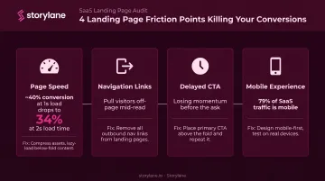
- Page speed: Portent's research shows conversion rates drop from ~40% at a 1-second load time to 34% at 2 seconds
- Navigation links that pull visitors off the page mid-read
- Copy before the first CTA: make the ask before visitors lose momentum
- Perceived commitment: "no credit card required" is a friction reducer, not just a nicety
On mobile, these problems compound. Unbounce's SaaS benchmark data shows 79% of SaaS landing page traffic occurs on mobile — so a page that looks polished on desktop but loads slowly on a phone is losing the majority of its visitors before the scroll begins.
Design Visual Hierarchy to Guide the Eye
Good SaaS landing page design isn't about looking impressive — it's about controlling where attention goes. The sequence should be deliberate:
- Headline anchors the value proposition immediately
- Supporting proof (stat, logo row, or testimonial) validates the claim
- CTA button with high contrast — visible to someone scanning in under two seconds
Whitespace isolates each element from the noise around it, giving the eye a single natural path.
Stripe executes this well: dark background, one high-contrast button, whitespace around every key element. You can't land on their page without immediately knowing where to click.
Test Continuously — Landing Pages Are Never Finished
Top SaaS teams revisit and iterate landing pages continuously — not just at launch.
Test one variable at a time. Headline copy and CTA text yield the highest leverage because they affect every visitor. Button color and image swaps tend to produce smaller, less durable lifts.
For diagnosing where visitors stall, heatmaps and session recordings are the most direct tools. Hotjar and Microsoft Clarity both surface scroll depth, click clusters, and drop-off points without requiring engineering work.
Storylane's per-step analytics surface engagement percentage, completion rate, and time spent at each step of an embedded demo flow — so if visitors consistently drop off at step 4, that's a hypothesis for both demo optimization and landing page messaging refinement.
SaaS Landing Page Examples and What Makes Them Work
Notion: Clarity and a Frictionless Onramp
Notion's landing page leads with a headline that describes an outcome — what you'll be able to do — without naming a feature category or explaining the technology. The CTA is "Get Notion free," which communicates both the action and the cost simultaneously. There's no navigation menu competing for attention.
The hero visual shows a populated workspace with real content visible. This is deliberate: an empty UI screenshot communicates nothing; a populated one lets visitors imagine themselves using it.
The result is a page where the visitor's mental path is short: understand what it does, see what it looks like, click the free CTA.
Mixpanel: Product UI as the Argument
Mixpanel's page makes a bet: show a dashboard with real data and let the product sell itself. Rather than making abstract claims about "powerful analytics," they surface an actual chart with visible metrics.
Each section of the scroll continues a single narrative thread — the copy builds on the previous section's promise rather than jumping to a new feature. Section one establishes the problem (you don't know what users are doing). Section two shows the data view that answers it. The third section introduces the workflow that acts on those insights. The page reads as a story, not a feature list.
Loom: CTA Copy That Removes Hesitation
Loom's primary CTA avoids both vague ("get started") and overcomplicated copy. The button communicates what you'll experience after clicking — not just that you should click.
Alongside the CTA, Loom includes a short product description that handles the "but what exactly is it?" objection before it forms. Visitors don't have to resolve that question themselves — it's answered in one line. That removes a cognitive speed bump that would otherwise slow down the decision to click.
Calendly: Benefit-Driven Copy in a Mature Category
Calendly operates in a category where buyers already know what scheduling tools do. Their landing page leans into that — the copy doesn't explain the problem category, it states the outcome in one jargon-free sentence.
Social proof appears close to the primary CTA, not buried at the bottom. You see the outcome claim, then immediately see who else believed it. That sequence — promise, then proof — shortens the distance between interest and action.
How to Test and Optimize Your SaaS Landing Page
Pre-Test Audit Checklist
Before running A/B tests, assess the baseline:
- What is the current conversion rate? (Establish a baseline to measure against)
- Does the headline pass the 5-second test? (Can a stranger state what the product does and for whom within 5 seconds?)
- Are there competing CTAs pointing to different destinations?
- Is the mobile experience fast and readable?
- Does the page have navigation links that create exit opportunities?
Fix obvious structural problems before testing variables — a broken baseline produces misleading test results.
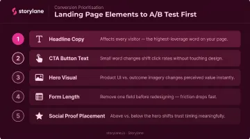
What to Test First
Test in order of visitor impact:
- Headline copy — affects every visitor, highest potential leverage
- CTA button text — small word changes can meaningfully shift click rates
- Hero visual — product UI vs. outcome-focused imagery
- Form length — removing one field is often worth testing before any design change
- Social proof placement — above vs. below the hero
Once you know what to test, the next challenge is avoiding the mistakes that skew results or stall progress before testing even begins.
Common Mistakes to Avoid
- Overloading with information: More content doesn't mean more conviction. If it doesn't reduce a specific objection, cut it.
- Generic social proof: Logo strips with no context and anonymous testimonials add visual weight without persuasive value. Name, role, company, and a specific result — or don't bother.
- Ignoring mobile: Nearly 80% of SaaS landing page traffic arrives on mobile. A page that performs well on desktop but poorly on mobile is losing the majority of its visitors.
- Publishing is never the finish line. Real visitor behavior — captured through heatmaps, session recordings, and funnel analytics — surfaces hypotheses that assumptions never would. Treat every live version as an experiment in progress.
Frequently Asked Questions
What is the average conversion rate for a SaaS landing page?
Unbounce's SaaS benchmark data puts the median around 3.8%, though averages shift widely by traffic source — email converts at 16.9% while paid social sits at 2.9%. These numbers vary enough across datasets that your own baseline is the most useful benchmark to track.
How is a SaaS landing page different from a homepage?
A homepage serves multiple audiences with multiple goals — brand introduction, navigation, feature overview. A landing page is built for one audience, one goal, and one CTA. That focus is why landing pages consistently outperform homepages for targeted conversions.
How many CTAs should a SaaS landing page have?
One CTA goal per page — but that button should appear multiple times as the visitor scrolls: above the fold, after social proof, and at the bottom. All instances should point to the same destination.
Should a SaaS landing page lead with a free trial or a demo request?
It depends on product complexity. Simpler, self-serve products convert better with a frictionless free trial CTA (no credit card required). Complex enterprise products with longer sales cycles benefit from a demo request that connects prospects with a sales rep who can assess fit.
What's the single most important element on a SaaS landing page?
The headline. It's the first thing every visitor reads — if it fails to communicate clear value to the right person in under 5 seconds, nothing else on the page gets a chance to do its job.