Introduction
Most SaaS teams don't lose users because their product is bad. They lose them because users never figure out how to get value from it.
Poor onboarding is a silent churn driver. According to Userpilot's 2023 State of SaaS Onboarding report, which reviewed 100+ SaaS tools, users who don't activate in the early weeks are highly likely to churn.
What's striking: 36% of SaaS products offer no in-app guidance at all.
Product walkthroughs fix this. Done well, they guide users to their first "aha moment" faster, reduce support load, and move prospects from curious to converted without a sales rep on every call.
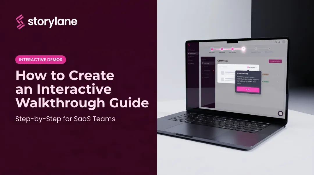
This guide covers how to plan, build, and optimize product walkthroughs that drive real adoption — from defining goals and mapping user flows to choosing the right format and measuring what's working.
Key Takeaways
- A product walkthrough is a guided, interactive experience designed to get users to a specific outcome.
- Walkthroughs serve three core goals: converting prospects, onboarding new users, and driving feature adoption.
- The most effective walkthroughs are built around what users want to accomplish, not what your product can do.
- Measure completion rates, time-to-value, and downstream metrics like support tickets to keep improving.
What Is a Product Walkthrough?
A product walkthrough is a guided, step-by-step experience that directs a user through a product, feature, or workflow — moving them from a starting point to a defined outcome. Unlike a help article or tutorial video, a walkthrough requires the user to act at each step rather than passively consume content.
That difference has measurable consequences. Freeman et al. in PNAS found that students in traditional lectures were 1.5x more likely to fail than those in active-learning environments. In product education, the same rule applies: users who do something retain it. Users who watch something often don't.
Walkthroughs vs. Live Demos vs. Videos
| Format | Interaction Level | Delivery | Best For |
|---|---|---|---|
| Product Walkthrough | High — user takes action | In-app or standalone | Onboarding, presales, adoption |
| Live Demo | Medium — rep controls | Synchronous, rep-led | Complex enterprise deals |
| Product Video | Low — passive viewing | Async, one-way | Awareness, supplementary education |
Why Walkthroughs Matter for SaaS
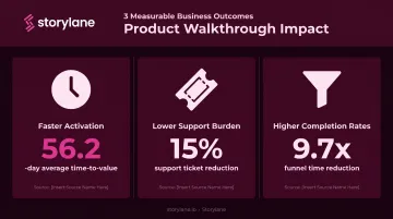
Three concrete business outcomes:
- Faster activation — Appcues' 2022 Product Experience Benchmark Report found the average SaaS time-to-value is 56.2 days. Walkthroughs compress that window significantly.
- Lower support burden — Pendo reports customers reduce support ticket volumes by an average of 15% through in-app guidance.
- Higher completion rates — Blip used personalized onboarding flows and cut median funnel completion time from 1.1 hours to 6.8 minutes — a 9.7x reduction.
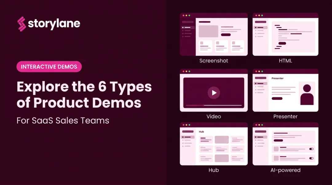
Types of Product Walkthroughs
Not all walkthroughs serve the same purpose. The two primary categories serve very different audiences at very different stages.
In-App Walkthroughs
These are guided flows triggered inside your live product — typically using tooltips, modals, hotspots, and checklists. They're designed for users who have already signed up and need help reaching their first meaningful outcome.
In-app walkthroughs are best for:
- First-time setup and activation sequences
- Introducing new features to existing users
- Reducing confusion at known friction points
The key is timing. Triggering an in-app walkthrough too early (before a user has context) or too generically (the same flow for every persona) significantly reduces effectiveness.
Interactive Product Demos (Pre-Sales Walkthroughs)
These are shareable, self-guided replicas of your product that prospects can explore before a sales call, free trial, or purchase decision. They're not embedded in the live product — they live on marketing pages, in outbound emails, or inside buyer hubs.
Common deployment spots include:
- Website and landing pages for inbound traffic
- Outbound email sequences and LinkedIn outreach
- Buyer hubs and deal rooms during active opportunities
- Conference and event follow-up
This format is where Storylane focuses most of its capability. Teams in marketing, sales, and presales can build fully annotated, narrated interactive demos (screenshot, HTML, or video) without writing a single line of code. A prospect clicks through a real product experience on their own schedule and arrives at a sales call already informed rather than starting from zero.
SpyCloud, one of Storylane's customers, solved a specific problem with this approach: prospects were losing interest between demo requests and actual sales calls. Embedding an interactive demo into the pre-call sequence kept prospects engaged and primed for a more productive conversation.
How to Create a Product Walkthrough: Step-by-Step
Step 1 — Define the Goal and Audience
Every walkthrough needs one clear objective. Not "show users the product." Something specific: "Help users send their first campaign" or "Show prospects the reporting dashboard."
Trying to cover everything in a single walkthrough is the most common mistake. It leads to long, unfocused flows with low completion rates. Pick one outcome, identify the user segment it serves, and build around that.
Step 2 — Map the User Flow
Once you have a goal, work backward to find the minimum number of steps needed to reach it. A good rule: 5–7 steps per flow. If a workflow requires more, break it into sequential walkthroughs rather than one long tour.
Ask at each step:
- Is this step genuinely required to reach the outcome?
- Can this step be combined with the previous one?
- Would skipping this step confuse the user?
Step 3 — Choose the Right Format and Tool
The goal determines the format:
- In-app tooltips and checklists → post-signup onboarding and feature adoption
- Interactive demos → presales discovery, marketing pages, outbound sequences
- Video tutorials → async feature education and supplementary content
For interactive demos, Storylane's AI-powered creation flow lets you capture screens once, describe the demo's purpose, and get contextual annotations, a clickable guide, and voiceover narration generated automatically. Teams can choose from 25+ language options and multiple voice personalities, then publish without any developer involvement.
Step 4 — Write Clear, Action-Oriented Copy
Walkthrough microcopy has one job: tell the user what to do next.
Compare these two approaches:
- "Click 'New Campaign' to begin building your first email." — clear, action-driven
- "The Campaign Builder feature allows users to create and customize email campaigns." — descriptive, not instructional
Keep each step to one action. Use plain language. Match your brand's tone. Avoid technical jargon unless your audience specifically expects it.
Step 5 — Test, Iterate, and Personalize
Once copy is in place, the walkthrough isn't done — it needs to be tested. Before a broad release, run it with real users and watch for:
- Steps where users hesitate or ask questions
- Tooltips that get skipped
- Drop-off points near the end (a sign the flow is too long)
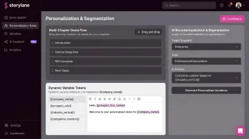
Segmenting walkthroughs by user role, plan tier, or use case measurably improves completion rates. Storylane supports this through:
- Multi-chapter demos — separate flows for different buyer personas
- Dynamic variable tokens — automatically swap in prospect-specific names, logos, and data
- AI recontextualization — adapt a base demo for different segments without rebuilding from scratch
Best Practices for Effective Product Walkthroughs
Keep It Goal-Oriented, Not Feature-Oriented
The most common walkthrough mistake: building a feature tour instead of a goal-completion journey. Users don't care about features in isolation. They care about outcomes. Frame every step around what the user is trying to accomplish.
Instead of "Here's our Analytics tab," try "Here's how to see which campaigns are driving conversions."
Make Walkthroughs Self-Paced and Skippable
Auto-triggered walkthroughs that force users down a fixed path underperform significantly. Chameleon's Product Tour Benchmarks report, analyzing 15M product-tour interactions, found users were 123% more likely to complete tours they initiated themselves versus automatically launched ones. Users who triggered a tour from a checklist item were 21% more likely to complete it.
Give users agency. Offer the walkthrough as a choice, let them skip steps, and avoid locking them into a fixed sequence. Forced walkthroughs get dismissed before they deliver value.
Use Visual Cues and Interactive Elements
Progress indicators, highlight overlays, and contextual hotspots serve a dual purpose: they guide users through the flow while keeping them oriented within the product. Chameleon found that progress indicators improved tour completion by 12% and reduced dismissals by 20%.
Requiring action at each step (rather than just reading) also improves retention, consistent with the active-learning principle discussed earlier.
Personalize by Segment
A single walkthrough trying to serve every user type ends up serving none of them well. Attention Insight's implementation of personalized walkthroughs (via Userpilot) increased heatmap-analysis activation from 47% to 69% — a 47% relative lift — by targeting user segments with contextually relevant flows.
Segment-specific flows consistently outperform generic ones:
- Attention Insight lifted feature activation by 47% using segment-targeted walkthroughs
- MYOB saw a 21% increase in global setup rates after adding survey-driven, personalized onboarding checklists
Storylane supports this approach through persona-specific demo chapters, buyer hubs organized by segment, and variable tokens for prospect-level personalization.
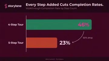
Keep Walkthroughs Short and Link to Deeper Resources
Chameleon's data is clear: 4-step tours had a 46% completion rate. 5-step tours dropped to 23%. Every step you add is a drop-off risk.
Keep each walkthrough to the minimum steps required to reach the goal. Then offer users a clear path to deeper resources — help docs, additional tours, or a live demo — rather than trying to cover everything upfront.
How to Measure the Success of Your Product Walkthrough
Primary Engagement Metrics
Track these for every walkthrough:
- Completion rate — The Chameleon benchmark sits at 61% across all tour types; anything consistently below 50% warrants investigation.
- Step-level drop-off rate — The step with the highest exit rate is typically your biggest optimization opportunity.
- Time-to-complete — Significant slowdowns at a specific step usually signal confusion, not just disinterest.
Storylane's analytics dashboard surfaces completion rates, time spent, and CTA click rates per demo session, so teams can pinpoint exactly where walkthroughs are working and where they're losing people.
Connecting Walkthrough Data to Business Outcomes
Engagement metrics tell you how the walkthrough performed. Downstream metrics tell you whether it changed behavior:
- Activation rate — Did users who completed the walkthrough activate at a higher rate than those who didn't?
- Feature adoption rate — Are users who saw a feature walkthrough actually using that feature more?
- Support ticket volume — Did support tickets related to a specific workflow decrease after a walkthrough was added?
- Trial-to-paid conversion — Are users who engaged with presales demos converting to paid at higher rates?
ContactMonkey, a Storylane customer, connected their interactive demos directly to $1.3M in attributed pipeline, a 28% demo-to-opportunity rate (2x other inbound sources), and a form conversion rate that climbed from 11% to 15%.
The Continuous Improvement Loop
Don't treat a published walkthrough as finished. Build a feedback loop:
- Find the step with the highest drop-off rate
- Form a hypothesis about why users leave — too many steps, unclear copy, wrong trigger timing
- Change one variable at a time: step count, copy, timing, or personalization
- Re-measure over a meaningful sample size before drawing conclusions
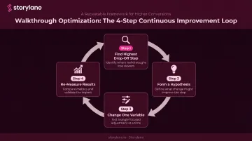
Even a single change — trimming one step or rewriting a tooltip — can move completion rates measurably. Start with the highest drop-off point and work forward from there.
Frequently Asked Questions
What is a product walkthrough?
A product walkthrough is a guided, step-by-step experience that helps users learn a product, complete a key action, or discover a feature. It can live inside the product as an in-app flow or as a standalone interactive demo prospects explore before signing up or booking a call.
What to include in a product overview?
A strong product overview covers four elements:
- Core value proposition tailored to the viewer's role
- Primary use cases that map to their specific pain points
- Two or three key features that directly address those pain points
- A clear next step — starting a trial, booking a demo, or exploring a workflow
What is the difference between a product walkthrough and a product tour?
Product tours are typically linear sequences of UI highlights — tooltips and modals shown after login — while walkthroughs are more interactive and require users to complete actions at each step. In practice, the terms are used interchangeably across the industry, though walkthroughs imply higher user participation.
How long should a product walkthrough be?
Aim for 5–7 steps per flow, with total completion time under 3–5 minutes. Chameleon's benchmark data shows completion rates drop sharply beyond 4–5 steps, so shorter, focused walkthroughs consistently outperform long tours.
When should you use a product walkthrough instead of a live demo?
Walkthroughs are preferable when prospects need to explore at their own pace, when you're scaling one-to-many education, or when a synchronous demo isn't feasible. Live demos remain the right choice for complex enterprise deals where real-time conversation and customization are essential.
How do you measure the success of a product walkthrough?
Start with completion rate and step-level drop-off data to gauge engagement quality. Then tie walkthrough performance to downstream metrics — feature adoption, support ticket volume, trial-to-paid conversion, and time-to-value — to confirm the flow is actually changing behavior.