The problem is that building one without a clear framework often produces a feature tour in disguise: high completion rates, low activation. According to Amplitude, more than 98% of users churn within two weeks if they haven't experienced real value. That's the window your walkthrough needs to address.
This guide covers the exact steps to build an effective walkthrough, what you need in place before starting, the UI elements that drive results, and the mistakes that silently kill activation.
Key Takeaways
- Interactive walkthroughs require real user actions, not passive observation
- Scope walkthroughs to one outcome, not every feature
- Define your activation milestone before building, not after
- Use step-level drop-off data to improve walkthroughs after launch
- Personalized flows drive higher completion rates than generic, one-size-fits-all walkthroughs
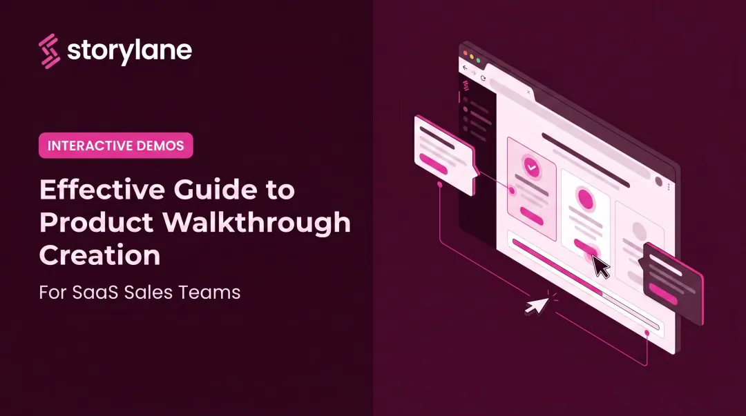
How to Create an Interactive Walkthrough Guide
Step 1: Define Your Goal and Target User Segment
Every walkthrough needs a single, measurable activation milestone before a single step is built. Without one, you'll optimize for completion rates, not for whether users actually got value.
An activation milestone is the specific in-product action (or demo moment) that signals real value has been delivered. Common examples:
- User connects their first integration
- Prospect completes a key workflow in a demo environment
- New user publishes their first project or report
- Account reaches a defined usage threshold (like five active users)
Why segmentation matters here: A marketing manager and a developer using the same platform need different paths to their first win. Research from Appcues suggests products that personalize onboarding by segment see 10–20% higher completion rates. Build for a specific role or use case first, then expand.
Goals should connect directly to trackable events. Pendo recommends measuring onboarding across three categories: engagement (guide views, completion rates), product usage (feature clicks, page views), and business outcomes (retention, NPS, trial-to-paid conversion) — with a source link to their onboarding benchmarks if you want the full breakdown.
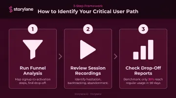
Step 2: Map the User Journey and Identify the Critical Path
The critical path is the minimum sequence of actions a user must complete to reach your defined goal. Nothing more. Stripping out non-essential steps is as important as including the right ones.
To identify it, use product analytics:
- Run funnel analysis — map the steps between signup and activation, then find where users drop off
- Review session recordings — watch where users hesitate, backtrack, or abandon
- Check drop-off reports — Pendo's benchmark of 1,000+ products found only 30% of users show regular usage within their first 90 days, which means most critical paths aren't short enough
For pre-sales walkthroughs, the critical path works differently. It's not the full onboarding sequence: it's the sequence of moments that communicates your product's core value to a prospect who hasn't committed yet. That usually means fewer steps and more deliberate "aha moment" targeting.
Step 3: Choose Your Tool and Format
Not all walkthroughs serve the same purpose, and your tool needs to match the use case:
| Use Case | Format | Audience |
|---|---|---|
| In-app onboarding | Embedded in-product flow | Existing users post-signup |
| Pre-sales demo | Hosted externally, shareable link | Prospects before a sales call |
| Feature adoption | In-product, contextually triggered | Existing users who haven't used a feature |
Key capabilities to look for in a walkthrough tool:
- No-code editor (sales and marketing teams shouldn't need engineering)
- Multiple UI element types (tooltips, modals, hotspots, checklists)
- Audience segmentation
- Analytics with step-level data
- CRM integrations (Salesforce, HubSpot, Marketo)
Storylane supports both in-app onboarding and externally hosted pre-sales demos from a single platform. Its no-code editor lets teams build demos in minutes without developer involvement. Teams like Whispli chose it specifically because sales reps could build, update, and deploy walkthroughs without touching the engineering queue.
For pre-sales use cases, Storylane's AI suite covers the full creation workflow: one-click contextual annotation generation, AI voiceovers in 25+ languages, and AI video avatars for guided product presentations. Personalization tokens (user name, company name, use-case content) adapt a single base demo to dozens of prospect segments without building separate versions. The Account Reveal feature de-anonymizes demo visitors, surfacing company and contact data so sales teams can follow up with high-intent prospects who never filled out a form.
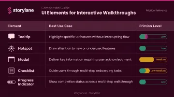
Step 4: Build the Walkthrough Using the Right UI Elements
The UI elements you choose determine how much friction each step creates. Match the element to the intent:
| Element | Best For | Friction Level |
|---|---|---|
| Tooltip | Contextual guidance on a specific UI element | Low |
| Hotspot | Drawing passive attention without blocking flow | Low |
| Modal | Key decision points requiring full attention | Medium |
| Checklist | Multi-step flows where users need a progress overview | Low-Medium |
| Progress indicator | Reducing abandonment across any walkthrough | Low |
The case for driven actions: A driven action requires the user to complete a real task before advancing (clicking a specific button, entering a value, completing a field). This is what separates an interactive walkthrough from a passive tour. Nielsen Norman Group's research on contextual help confirms that active task practice improves retention because users perform actions instead of just observing.
On step count: Pendo data shows guides of 2–4 steps achieve nearly 50% completion, with longer guides holding around 45%. Keep walkthroughs scoped to 3–7 steps and always show progress. A step counter ("Step 3 of 5") removes uncertainty about what's left, which is one of the most common reasons users abandon mid-flow.
Step 5: Analyze Performance and Iterate
Launch is where optimization begins, not ends.
Metrics to track post-launch:
- Step-level completion rates to pinpoint exactly where users exit
- Overall completion rate: Appcues benchmarks 60–70% as healthy; below 50% typically signals a structural problem
- Time-to-activation: how long from first session to the activation milestone
- Downstream metrics: feature adoption rate, trial-to-paid conversion, retention at 30/60/90 days
- For demo walkthroughs: engagement depth, step-level time spent, conversion to next sales stage
A/B test variations in copy, element type, step order, or timing. Appcues data suggests SaaS teams running onboarding experiments can expect 10–30% activation improvement over 2–3 quarters. That's not a one-time lift: it compounds with each iteration.
Tools with built-in step monitoring catch broken steps before they silently hurt activation. Storylane's engagement tracking captures demo opens, step views, completion rates, and time spent, feeding into intent scoring that classifies prospects as low, medium, or high engagement.
When Should You Use an Interactive Walkthrough?
Walkthroughs are high-effort assets. Deploy them where the cost of user confusion or drop-off is highest.
High-value scenarios:
- Onboard new users during that first session — before the two-week churn window closes
- Re-engage existing users who miss new releases — Pendo data shows 6% of features generate 80% of clicks in the average product
- Support pre-sales exploration — Gartner's 2025 survey of 632 B2B buyers found 61% prefer a rep-free buying experience, making self-serve demos a prerequisite, not a nice-to-have
- Guide existing users toward premium features at the right moment in the upsell flow

When walkthroughs are the wrong tool:
- Very simple workflows where a single tooltip suffices
- Broad product overviews that a lightweight product tour covers better
- Users who prefer unguided exploration (a resource center or on-demand guide works better)
What You Need Before Building
Skipping this stage leads to walkthroughs that reflect team assumptions, not user behavior.
Define your activation milestone first: Document the specific in-product action or demo moment that signals real value. Teams that skip this end up with walkthroughs that measure completion but not success.
User and journey data: Gather three types before building:
- Product analytics showing where drop-offs occur
- User research or CS feedback identifying common confusion points
- For pre-sales walkthroughs: sales team input on which capabilities resonate most with prospects
Builder prerequisites: Have these ready before you open the builder:
- Walkthrough tool configured and integrated with your product or demo environment
- Finalized UI copy (tooltip text, modal headers, CTA labels)
- Personalization variables mapped out (user name, company name, use-case content)
Key Elements That Define an Effective Walkthrough
Outcomes depend less on step count and more on whether these structural elements are present.
Outcome-First Framing
Every step should connect to the user's goal, not explain what a feature does in isolation. Compare these two phrasings for the same step:
- Feature-centric: "This is the dashboard. Here you can view all your reports."
- Outcome-centric: "Set up your first report here — once it's live, you'll see performance data update in real time."
The second version connects the action to why it matters.
Contextual Triggering
Walkthroughs should appear based on user behavior or stage — first login, reaching a specific page, completing a prior step — not fire universally for every user at the same time. Context-aware triggers reduce irrelevance and what Nielsen Norman Group calls tutorial fatigue from front-loaded onboarding.
Personalization
Segmenting users by role, use case, or persona allows different paths to be served. Dynamic variables (name, company, workflow type) make the experience feel tailored.
McKinsey reports that 71% of consumers expect personalized interactions and 76% get frustrated when they don't receive them. That expectation applies in B2B SaaS too. In Storylane, dynamic tokens adapt a single base demo to different personas without building separate versions for each.
Feedback Loops
Include lightweight sentiment checks at key steps: a simple "Was this helpful?" prompt or a short completion survey. Behavioral data tells you where users drop off; sentiment data tells you why.
Progress Visibility
Step counters, progress bars, or checklist-style views reduce abandonment by eliminating uncertainty about what's left. Completing a step should feel like forward momentum, not an advance toward an unknown endpoint.
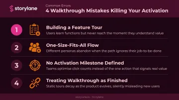
Common Mistakes When Creating Interactive Walkthroughs
Most interactive walkthroughs don't fail because they're broken — they fail because of decisions made before the first step was built. These are the four patterns that consistently undercut results.
Building a feature tour instead of an outcome-focused walkthrough. A feature tour describes what the product does. A walkthrough guides users to do something that delivers value. The failure shows up in the data: high completion rates, low activation, poor retention. The steps were completed — but the user never reached their first win.
Sending every user through the same flow. A single universal walkthrough fails diverse user bases. Segmentation before step one is required, not optional.
Not defining the activation milestone before building. Teams build a complete walkthrough, launch it, and then discover it doesn't move the metrics that matter. Success criteria must precede construction.
Treating the walkthrough as a finished asset. Product UIs change and user behavior evolves. A walkthrough that isn't monitored will break silently — a tooltip pointing to a button that no longer exists is a silent activation killer. Tools with step-level monitoring catch these issues before they damage activation rates.
Frequently Asked Questions
What is an interactive walkthrough?
An interactive walkthrough is a step-by-step guided experience inside a product or demo that requires users to complete real actions at each step before advancing. Unlike a passive tour or video tutorial, users must engage — clicking, entering values, completing tasks — rather than observe.
How do you conduct an interactive walkthrough?
Five phases, each informing the next:
- Define a clear goal and activation milestone
- Map the critical user path using product analytics
- Build using contextual UI elements (tooltips, driven actions, progress indicators)
- Launch to a segmented audience
- Iterate based on step-level completion data
What is the difference between an interactive walkthrough and a product tour?
A product tour shows users what the product does — often passively, with no required actions. An interactive walkthrough requires users to complete real tasks at each step, making it more effective for driving activation and retention, not just awareness.
What UI elements should an interactive walkthrough include?
Core elements include:
- Tooltips for contextual guidance at each step
- Hotspots to draw attention without blocking flow
- Modals for key decision points
- Checklists for multi-step flows
- Progress indicators (step counters or progress bars) to reduce abandonment
How long should an interactive walkthrough be?
Length should be determined by the activation milestone, not by how many features exist. Most effective walkthroughs are scoped to a single outcome and range from 3 to 7 steps. Shorter is almost always better — completion rates drop sharply beyond 7 steps.
How do you measure the success of an interactive walkthrough?
Key metrics to track:
- Step-level completion rates to identify drop-off points
- Overall completion rate and time-to-activation
- Downstream feature adoption or trial-to-paid conversion
- Engagement depth and next-stage conversion (for pre-sales demo walkthroughs)