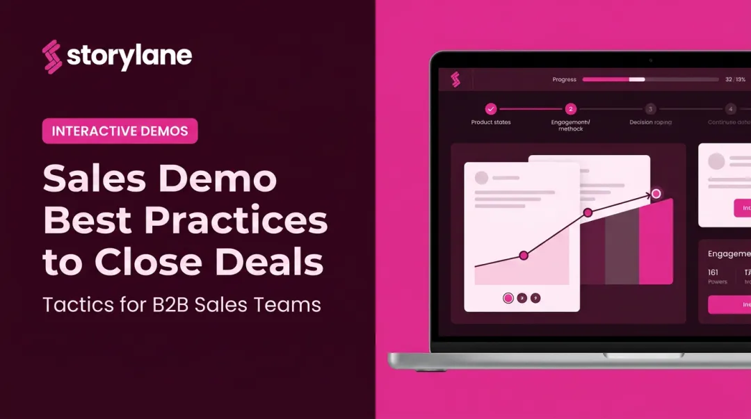
Introduction
Your demo page is where intent meets action. A visitor who lands there has already read your homepage, maybe watched a video, possibly compared you to a competitor — and decided they want to see more. Most teams spend heavily to get prospects that far. Losing them on the demo page is one of the most preventable conversion failures in B2B SaaS.
Yet most SaaS demo pages squander it. The typical setup: a headline that says "Request a Demo," a form asking for job title, phone number, company size, and budget, and zero indication of what actually happens next. Visitors who weren't 100% certain bounce. Those who weren't ready to talk to sales bounce. Even motivated prospects hesitate when the page gives them nothing to work with.
B2B SaaS demo request pages convert at just 1.5% to 4% on average — and the gap between the low and high end of that range isn't random. It's almost entirely explained by page design decisions.
This guide covers 7 CRO best practices written specifically for SaaS demo pages. Each one targets a distinct friction point in the demo request journey — from the first headline a prospect reads to the A/B test that confirms what's actually working.
Key Takeaways
- Outcome-led headlines outperform action-led headlines because prospects care about what they'll gain, not what they'll do
- Removing a single form field can increase conversions by 50% — qualification belongs in the discovery call, not the form
- Embedding an interactive product preview before the form shows prospects what they're signing up for — and filters out low-intent visitors before they book time
- Social proof works best placed directly adjacent to the form, not in a separate testimonials section
- A/B tests need statistical significance (95% confidence) before you act on results — never stop early
- Your CTA copy and button design carry more weight than most teams realize — small word changes can shift conversion rates meaningfully
Best Practice 1: Write a Headline That Sells the Outcome, Not the Action
"Schedule a Demo" tells a visitor what to do. It says nothing about why they should.
Prospects aren't motivated by the act of booking a meeting. They're motivated by what the meeting will give them — a solution to a specific problem, proof that your product fits their use case, or a clear sense of whether the investment is worth pursuing. A headline that communicates the action but skips the value forces the visitor to do that mental work themselves. Most won't.
Weak vs. Strong Headline Patterns
| Weak | Strong |
|---|---|
| Schedule a Demo | See How [Product] Cuts Sales Cycle Length in 30 Minutes |
| Request a Demo | Watch [Product] Eliminate Manual Reporting for Ops Teams |
| Book a Demo | Get a Personalized Walkthrough Built Around Your Use Case |
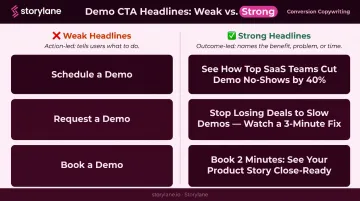
The strong version does three things: it names the audience's problem, connects it to a product outcome, and signals the time investment required. Prospects are trading calendar time. They'll only do it if the return feels obvious before they ever click "Book."
That buyer-first framing is rarer than you'd think. Unbounce's analysis of SaaS landing pages found that only 27% of sampled SaaS headlines used "you" or "your" — meaning most pages are still written from the product's perspective, not the buyer's.
Supporting Subheadline and Above-the-Fold Bullets
The headline can't carry the full weight alone. Your subheadline should add specificity — name the ICP segment ("for revenue operations teams at B2B SaaS companies"), cite a concrete result metric ("customers reduce ramp time by 35%"), or describe a use case.
Pull this language from sales call recordings or win/loss interviews. The phrasing your best customers use to describe their problem is almost always sharper than what marketing invents.
Just below the headline, include 3-4 short bullets that pre-answer "what will I get from this demo?" Something like:
- A live walkthrough of the features most relevant to your team size
- A comparison of how similar companies use [Product] in their workflows
- Answers to your specific questions — no scripted pitch
- A clear next step if it's a fit (and an honest answer if it's not)
These bullets reduce uncertainty before the prospect ever reaches the form. They're not benefits copy — they're a preview of the actual meeting.
Best Practice 2: Cut Your Demo Request Form to the Minimum
Sales teams want qualification data. That's reasonable — knowing a prospect's company size, role, and budget helps reps prioritize. The problem is that every field added to a form creates friction that suppresses submissions, and the tradeoff usually hurts pipeline more than it helps.
The data backs this up. Formstack found that removing a single form field can increase conversions by 50%. HubSpot's analysis of 40,000+ landing pages confirmed that multiple text areas and dropdowns correlate with lower conversion rates. The direction is consistent: shorter forms convert better.
The Minimum Viable Field Set
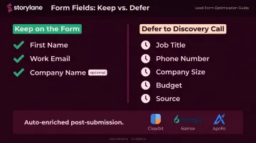
For a SaaS demo request form, the essential fields are:
- First name — personalizes the follow-up
- Work email — enables routing and enrichment
- Company name (optional) — useful but deferrable
Job title, phone number, company size, and "how did you hear about us?" can all be deferred. A skilled sales rep collects this in the first two minutes of a discovery call. Modern CRM enrichment tools (Clearbit, 6sense, Apollo) fill in firmographic gaps automatically the moment a work email is submitted.
The Multi-Step Form as a Middle Ground
If your sales team genuinely needs one or two qualifying questions before routing a lead, use a multi-step form: step one captures just the email, step two asks the qualifying question. HubSpot cites an experiment showing a 59.2% increase in conversions after switching to this format.
The psychology is straightforward: once someone completes step one, step two feels like a natural continuation rather than a new commitment — not a fresh ask.
Three Small Form Changes With Outsized Impact
- Use action-oriented button copy like "Book My Demo" or "See the Product" — never the generic "Submit"
- Strip navigation menus from the demo page so visitors have one choice: convert or leave
- Remove footer links that hand prospects an easy exit to the rest of your site
Best Practice 3: Let Prospects Experience the Product Before They Fill Out the Form
The biggest source of friction on a demo request form isn't the fields — it's uncertainty. A prospect who doesn't know whether your product is relevant to their use case won't commit time to a live demo. They need a signal of fit first.
Gartner reports that 61% of B2B buyers now prefer a rep-free buying experience — meaning a significant portion of your demo page visitors want to evaluate the product before they ever talk to a human. An interactive preview on the demo page meets them where they are.
What an Interactive Preview Actually Is
This isn't a recorded video (passive) or a full product sandbox (too much). It's a short, guided walkthrough of the product's most compelling moments — enough to surface the "aha moment" that makes the visitor confident the full demo is worth their calendar.
Storylane enables SaaS teams to embed exactly this kind of interactive preview directly on their demo request page. Prospects click through the product themselves before filling out the form, arriving at the request step already pre-qualified and engaged — which improves both form completion rates and the intent quality of leads passed to sales.
Entrust uses Storylane's interactive demos so prospects don't lose interest before the actual sales call. The goal: visitors "don't just see the features, they experience them — arriving at live demos already primed."
How Engagement Data Sharpens Sales Conversations
Interactive previews also generate behavioral data you can act on. Storylane captures engagement metrics and pushes them directly to Salesforce or HubSpot, including:
- Time spent per session
- Completion percentage
- CTA clicks and drop-off points
Sales reps can see what a prospect explored before the discovery call and tailor the conversation accordingly.
When Whispli's prospects went through their Storylane demo, the sales team could see exactly which features each prospect had engaged with — then opened discovery calls around those specific areas rather than starting from scratch.
Best Practice 4: Place Social Proof at the Exact Point of Hesitation
Trust anxiety peaks right before a visitor fills out a form. That's the moment they're weighing the commitment — "is this going to result in an aggressive sales follow-up?" — and generic testimonials buried below the fold miss the moment entirely.
Social proof belongs adjacent to or just above the form. Not in a separate section. Not at the bottom of the page. Where doubt is highest.
What Works on Demo Pages
G2's 2025 Buyer Behavior Report found that review sites are the top research source for enterprise buyers at 56%, and the second most influential shortlisting source at 15.1%. Prospects are already checking third-party reviews — surfacing those signals on your demo page reinforces what they're finding elsewhere.
The most effective social proof elements for demo pages:
- Outcome-specific customer quotes — "We reduced onboarding time by 40%" beats "Highly recommend this tool." One answers an implicit question. The other doesn't
- Recognizable customer logos — particularly if they're names your ICP will recognize
- G2 or Capterra rating badges — third-party validation from a source prospects already trust
Micro-Trust Signals Near the Form
Small additions near the form that reduce friction:
- "We never share your data" — addresses privacy anxiety directly
- "Our team responds within 1 business day" — removes fear of the unknown
- A 3-step "what happens next" sequence: Submit → Calendar invite sent → 30-min call with [Name]
Best Practice 5: Craft a CTA That Reduces Perceived Risk
"Talk to Sales" positions the next step as a sales interaction. For prospects who aren't certain yet, that's a deterrent.
The CTA copy on a demo page needs to reduce perceived commitment, not amplify it. Compare:
- "Talk to Sales" → implies pressure, judgment, a pitch
- "See a 20-Minute Walkthrough" → describes the actual experience
- "Get a Personalized Tour" → frames it as being served, not sold to
- "See the Product" → focuses on what they get, not what they're signing up for
The language choices above aren't arbitrary. CXL cites Wingify research showing CTA test winners average a 49% lift — making copy one of the highest-leverage variables on a conversion page, and one of the cheapest to test. The underlying principle: lower-commitment language reduces the perceived cost of clicking. Run the test on your traffic — the winning version may surprise you.
Best Practice 6: Offer an Alternative Path for Visitors Who Aren't Ready
Not every visitor landing on your demo page is ready to commit to a live sales conversation. Some are in early research mode. Some want to see the product before they talk to anyone.
G2's 2025 data shows 62% of buyers prefer contacting sales only during evaluation or decision stages — up 17 percentage points year over year. A demo page with only one conversion option loses everyone who isn't at that stage yet.
The Secondary CTA Structure
Offer a lower-commitment path: an interactive self-serve tour, a recorded demo, or a free trial. This captures visitors who are interested but not ready to schedule time with a rep.
Structure the visual hierarchy carefully:
- Primary CTA (live demo request form) — dominant, above the fold, visually prominent
- Secondary CTA (interactive tour or recorded demo) — text link or ghost button, visually subordinate, positioned below the primary
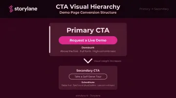
The secondary option shouldn't compete with the primary. Keep it visually subordinate — a ghost button or inline text link, not a second hero CTA.
ContactMonkey took this approach after discovering that visitors "just wanted to look under the hood" before committing to a live demo. They embedded Storylane's self-serve interactive tour as the secondary path.
The result was twofold: the tour captured visitors who would have otherwise bounced, and it acted as a qualification signal. Prospects who completed the tour before requesting a live demo arrived at that call already educated and engaged.
Best Practice 7: Run Structured A/B Tests on Your Demo Page
Demo pages are high-leverage targets for testing. Because demo requests feed directly into sales pipeline, a modest conversion rate improvement compounds quickly — a page converting at 3% instead of 2% on the same traffic represents 50% more pipeline opportunities.
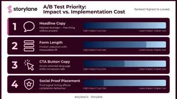
What to Test First
Prioritize in this order (highest impact, lowest implementation cost):
- Headline copy — test outcome-led vs. action-led framing, and ICP-specific vs. generic messaging
- Form length — 2 fields vs. 3 fields, single-step vs. multi-step
- CTA button copy — risk-reducing language vs. standard "Book a Demo"
- Social proof placement — adjacent to form vs. below the fold
Testing Discipline
Bad testing produces false confidence, which is worse than not testing at all.
- Test one variable at a time. Changing headline and form simultaneously makes it impossible to know what drove the result
- Run tests to statistical significance. Optimizely recommends 95% confidence as the accepted standard — use a sample size calculator before you start to determine how long to run
- Don't stop early. A variation that looks like a winner after three days is often noise. Traffic patterns vary by day of week; tests need at least 1-2 weeks to account for this
- Document everything. Losing tests are as informative as winning ones — they tell you what's not worth testing next
Heatmaps and Session Recordings as Inputs
A/B tests tell you what is performing better. Heatmaps and session recordings tell you why.
Three signals are worth watching before you design any test:
- Scroll depth — reveals whether visitors are reaching the form at all
- Click maps — shows if CTA elements are being ignored or missed
- Rage clicks — flags UX friction that suppresses conversion before your test variable has a chance to matter
Use these signals to shape your next hypothesis. Tools like Hotjar and VWO support this workflow natively.
Frequently Asked Questions
What does CRO mean in business?
CRO (Conversion Rate Optimization) is the practice of systematically improving a webpage so more visitors complete a desired action (such as filling out a demo request form) without increasing ad spend or traffic. The goal is extracting more value from existing traffic, not buying more of it.
What is a good conversion rate for a SaaS demo page?
B2B SaaS demo request pages typically convert at 1.5% to 4%, with high-touch pages reaching 5% to 7%. These rates vary significantly by traffic source (branded paid search often converts 1.5x to 3x higher than cold organic traffic) and by how well the page reduces friction and communicates value.
How many form fields should a SaaS demo request form have?
Two to three fields is the practical target: first name, work email, and optionally company name. Each additional field introduces friction that suppresses submissions. Qualifying questions around job title, company size, and budget are better collected by the sales rep in the discovery call or enriched automatically via CRM integrations post-submission.
What is the biggest CRO mistake on SaaS demo pages?
Over-qualifying at the form stage: asking for too much information before a prospect has enough context to decide whether it's worth providing. That friction shrinks total submissions and thins the top of the sales funnel. Qualification belongs in the sales conversation, not the form.
How does embedding an interactive demo preview improve conversion rates?
It removes uncertainty before the ask. Prospects who've explored the product already know whether it fits their use case, lowering the barrier to booking a live demo. Those who still request one after self-exploring are also higher-quality leads than cold form submitters.
How long should I run an A/B test before drawing conclusions?
Until you reach 95% statistical confidence and a sufficient sample size per variation. Use a sample size calculator (Optimizely's is free) before launching the test to determine the required duration based on your baseline conversion rate and minimum detectable effect. Never declare a winner based on a few days of data — early patterns rarely hold.