.svg)

Why the leave-behind is the most important part of your sales motion (and why most AEs are getting it wrong)
A sales rep at a B2B messaging company described her post-demo follow-up to us this week WITHOUT mentioning the demo even once.
“When I send over a capabilities deck, it’s a PDF so I lose all the visual aspects. And if I send a Google Slide with videos, it doesn’t look professional. On top of that, I’ve been working with more enterprise clients, and I want to know who they’re passing our stuff to internally.”
That last sentence is where the real problem lives. The demo was the least of her worries but what happens after the demo in rooms she's never in? That’s something that really got her goat.
The meeting after the meeting
The person you demo to is rarely the person who signs. The champion has to sell internally to IT, finance, procurement, and their VP without you. They're doing it with whatever you left them.
Here's what most AEs leave behind:
- A slide deck that seemed fine on the call and looks rough when forwarded.
- a Loom that the champion pulls up in front of their CFO to highlight a feature, but ends up getting betrayed by faulty video.
- Platform access that opens a security conversation before the deal is anywhere near closed (plus a full onboarding before anyone even sees value).
We heard variations of this across multiple calls this week.
A pre-sales team at a mid-market housing software company told us their buyers keep asking for the same thing: "I just want a quick look at some process or something without having to watch an hour-long demo recording."
Buyers want on-demand access to precisely what they need.
What the best AEs are doing instead
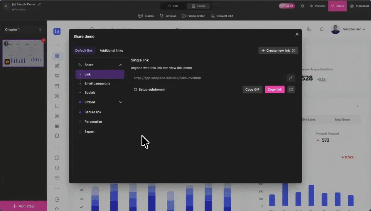
The reps closing more consistently have landed on a specific format: a reusable interactive demo that’s personalized for each prospect and sent after every call as leave-behind.
What makes it different from a Loom or a slide deck is that it's clickable, it identifies who views it by name and email, and it can be locked to specific email domains so only verified stakeholders from the prospect's company can access it.
That domain-restriction detail lands differently than you’d expect. When a pre-sales engineer at a mid-market software firm saw it for the first time, her reaction was immediate: “We like this.” Because it changes what you’re actually sending. The champion gets a curated asset instead of a generic link. It has an expiration date, the company’s name in the welcome screen, and it tells the AE exactly who opened it.
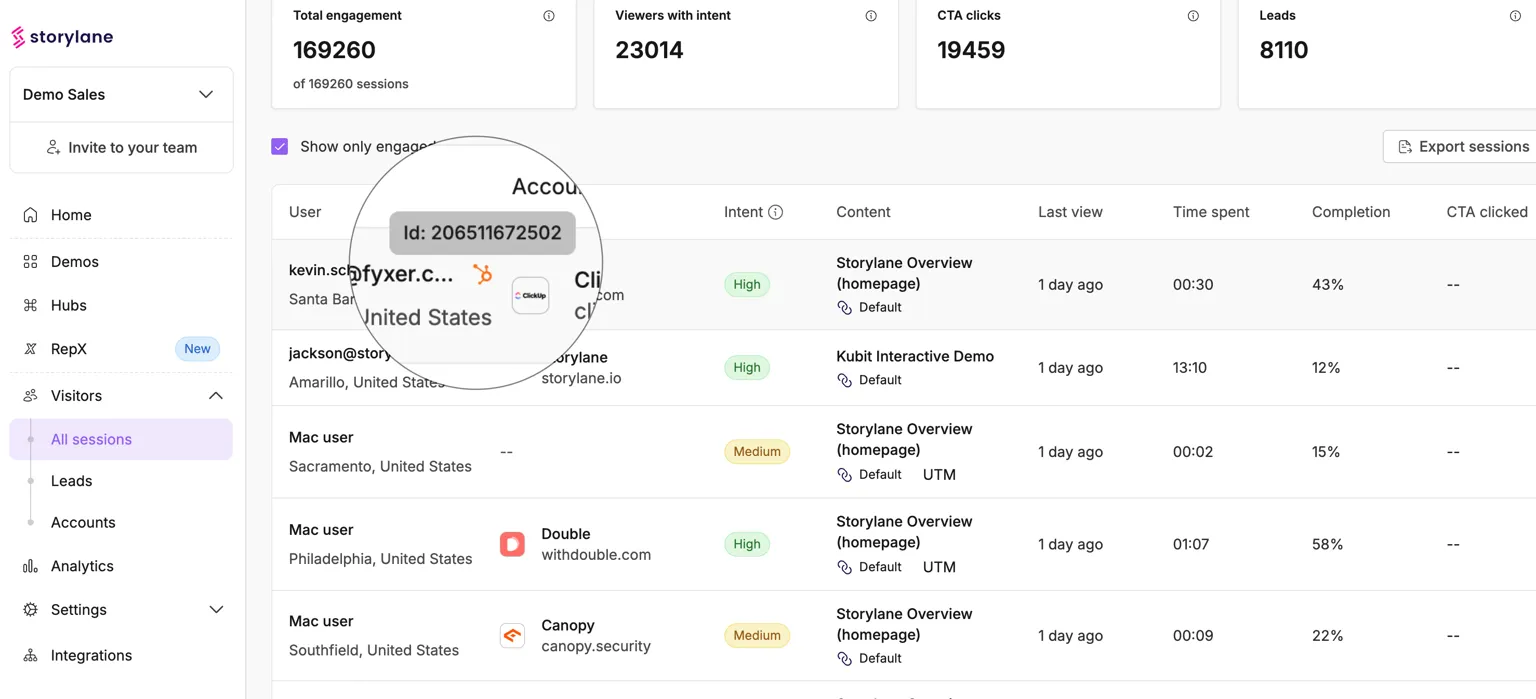
The analytics are more useful than most AEs expect
Here’s a fun story:
After building their first leave-behind demo, the pre-sales team tested it. Three team members played the role of a buying committee and clicked through the experience. Within seconds, the AE could pull up data from the visitor dashboard including total time spent, completion rate, chapters viewed, CTA clicked, intent level, etc.
These metrics tell you exactly who's been looped in before your next call, which sections got skipped, and what the buying committee cared enough to click at the end. The AE who sent a Loom has none of this and they were flying blind into the next conversation.
Parting words
The deal doesn't close in the room where you gave the demo. It closes in the meeting after the meeting that your champion runs without you.
The question is whether you've given them something that can actually sell on your behalf.
You can’t track PDFs and Loom videos get forwarded without context. Platform access is a whole other can of worms so let’s not even go there. But interactive demos? They’re trackable, personalized, domain-locked, and fun to look at. That is also what the best AEs are leaving with.
"You don't get another chance, life is no Nintendo game." If Eminem were a B2B tech sales bro, he’d have probably said the same about post-demo shenanigans and advised you to pick your sales leave-behinds carefully.
And what could be better than a killer Storylane interactive demo?
Storylane is a demo automation platform used by thousands of GTM teams. These insights come from conversations with customers and prospects building and optimizing demos across sales, marketing, and customer success.