Product Led Growth Metrics: Everything You Need To Track in 2026

Nidhi Kala
June 29, 2026
Table Of Contents

If your SaaS operates on zero interactions with users, it’s quite tricky for you to understand their challenges and fix them. 

That’s why you need product-led growth metrics to track your progress and amplify your company’s growth over time. 

But the problem? You don’t really have the idea of the right metrics apart from the churn rate and retention rate. 

In this article, we list down the best product led growth metrics you need to track and accelerate to make your product-led growth company a rising ninja! 

What Are Product-Led Growth Metrics?

So you have developed a PLG strategy for your product-led business. Yay!🥳

But does that mean your responsibility is over? Nope. You need to track product-led growth metrics.

Product-led growth metrics measure the impact and success of your product-led growth strategy. These key metrics can measure progress, reveal areas of improvement, and amplify SaaS growth.

For example, Kissmetrics’s sales team noticed that Google Analytics users doubled their demo requests. Digging further, they realized that these folks who scheduled the demo visited the Kissmetrics vs Google Analytics page before scheduling the demo.  

The Importance of Measuring the Right Product Led Growth Metrics

Measuring the right product led growth metrics keeps your PLG strategy on track.

  • Cross-functional teams — Cross-functional teams succeed by optimizing their tasks and responsibilities based on metrics.
  • Growth aspects — It helps you understand different aspects of growth—user engagement, customer satisfaction, net revenue retention, and more.
  • Growth targets — It allows you to track progress against growth targets and optimize the PLG strategy accordingly.

For example, when you track lower customer acquisition costs, you’ll know customer growth comes from word-of-mouth referrals—which means attracting new customers is cost-effective for your business.

Also Read: Low Touch Sales: The Future of Product-Led Growth

Who Owns Product Led Growth Metrics?

Here’s the thing: sales, marketing, customer success teams, product, and engineering—each function contributes to PLG strategy in one way or the other. 

Here’s an example of what Atlassian’s GTM team looks like.
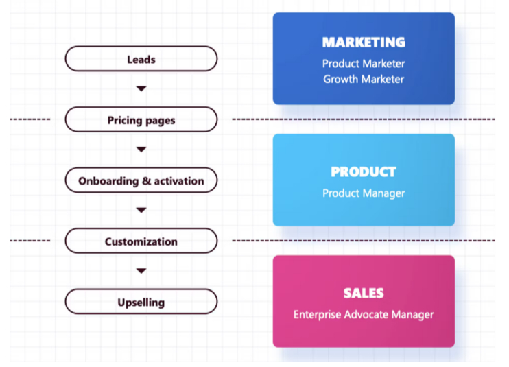
How Atlassian’s GTM team and their functions look like
  • In the marketing team, product marketers are responsible for generating new leads to enter the pipeline; growth marketers are responsible for revenue growth and onboarding.
  • In the product team, product managers are responsible for engagement within the product—dedicated to trial and user experience
  • In the sales team, sales reps respond to inbound customer requests and track what kind of customers come in from different campaigns.

You see? Each function has something to offer to the PLG strategy of your organization, which means each department owns the product led growth metrics.

Best Product Led Growth Metrics to Track in 2026

Here are the key product led growth metrics you need to track and optimize your product-led growth model:

Product Stickiness

Product stickiness measures how many users find value in your product and return regularly. 

The product stickiness ratio signifies the number of users who have used your product regularly and integrated it into their workflow. 

Measuring product stickiness will help you:

  • Visualize your product value and usage
  • Understand what makes users stick to your product
  • Map the differences in product usage among different user personas

For example, when a user started using Wordtune and liked how the product helps rephrase sentences but also offers features like expanding their ideas, they came back to the product and started using it frequently.  

Here’s the formula to calculate product stickiness:
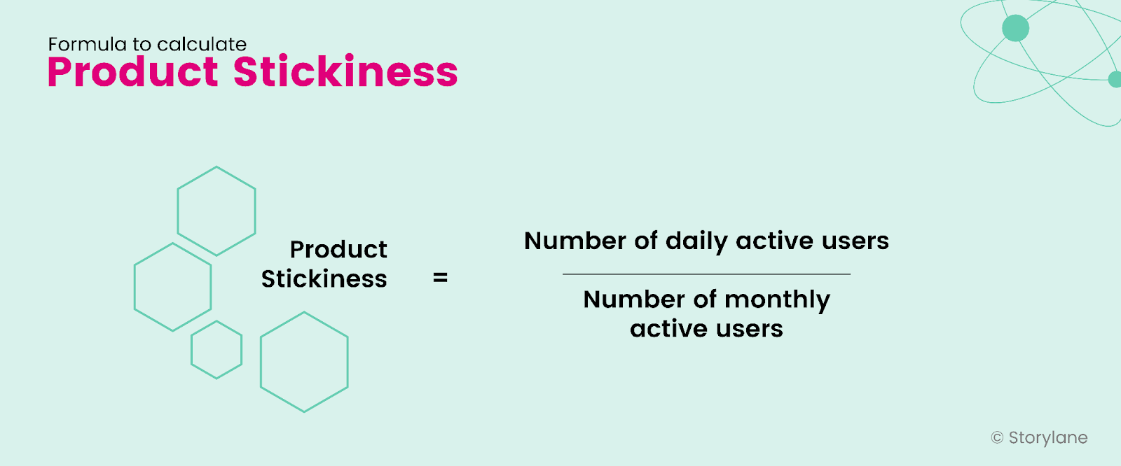
Formula for product stickiness

Churn Rate

Churn rate measures the number of users who leave your product to never return—leading to revenue churn. Customer churn happens when the user is unhappy with your product, doesn’t find value in your product, has found a better solution, or realizes their changing needs that don’t match your product. 

By measuring the churn rate, you can:

  • Identify product drop-off points to optimize your product experience
  • Collect user feedback to identify product changes for different user personas

For example, a user who was actively using Calendly for booking appointments switched to 3veta. They found it to be a 3-in-1 solution where they could book appointments, view shared team calendars and conduct video calls with their team.

Here’s the formula to calculate the churn rate:
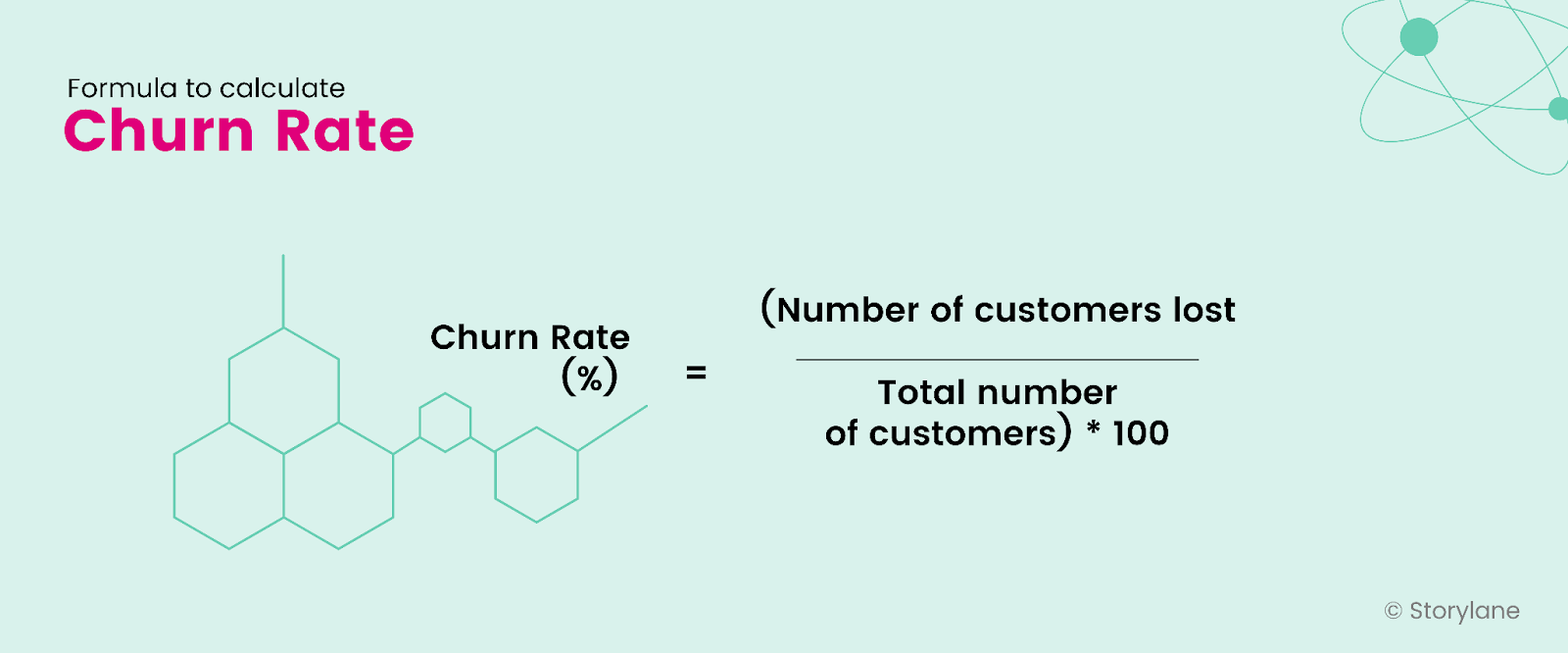
Formula for churn rate

Time To Value

Picture this: You go to Puma’s outlet, look through the range of sports shoes, select three options, and try each one—and ask yourself:

  • Does this shoe color look good on me?
  • Are the shoes comfortable?
  • Do the shoes have a strong grip?

While asking these questions to yourself, you try the first two options. And when you try the third option, there’s the instant bell, “Oh, this is exactly what I was looking for ”, and BOOM. You have found the right pair of shoes for you.

That’s exactly what happens when companies measure the time to value (TTV) metric. It determines the user's ability to gain value from the product or reach their aha moment. 

By calculating the time to value metric, you can:

  • Identify areas of friction in the initial customer journey
  • Enhance and simplify the user onboarding experience
  • Create proactive support to guide new users

💡Pro tip: Having an interactive demo embedded on your website helps visitors get to the aha moments sooner, thereby reducing the TTV

Here’s the formula to calculate the time-to-value metric:
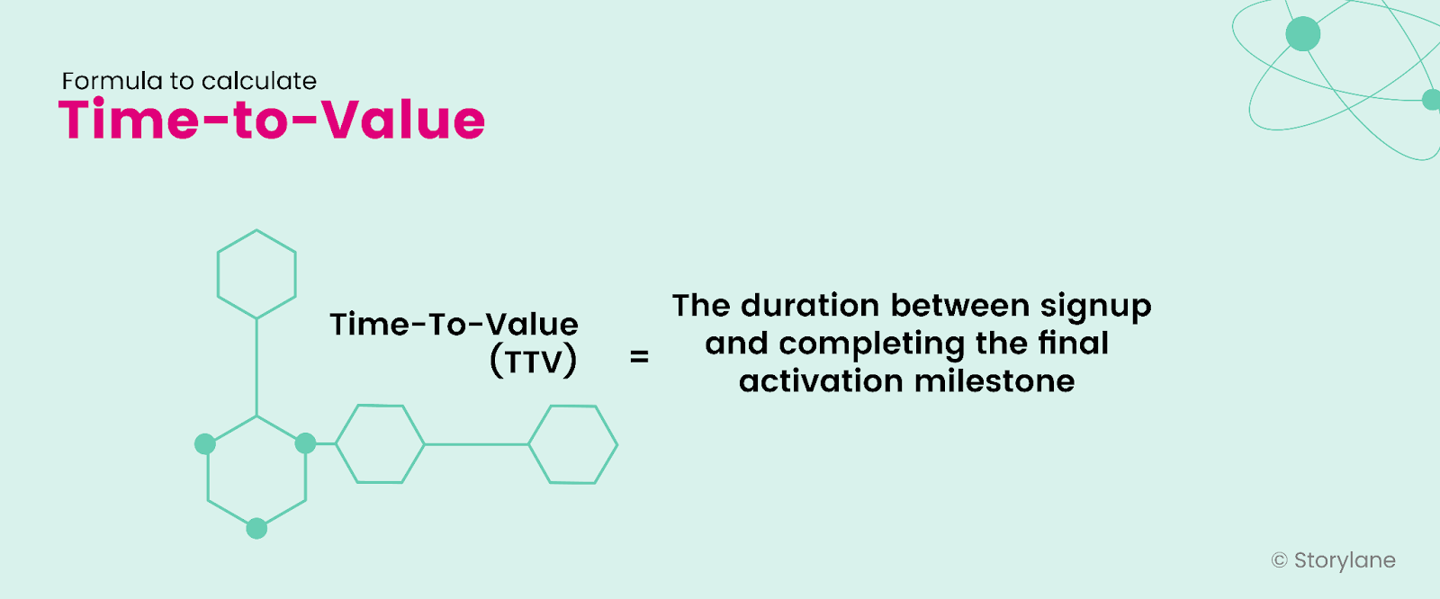
Formula to calculate time-to-value

Product Adoption Rate

Product adoption rate indicates the percentage of users who have become your regular users—to the extent that they have integrated your product into their workflow and won’t easily switch to other software in the future. 

By measuring product adoption rates, you can:

  • Maximize customer delight and retention
  • Build relevant resources to educate customers
  • Change your product roadmap based on customer feedback

For example, content writers integrate Grammarly into their writing workflow even when products like ProWriting Aid offer similar benefits.

Here’s the formula to calculate the product adoption rate:
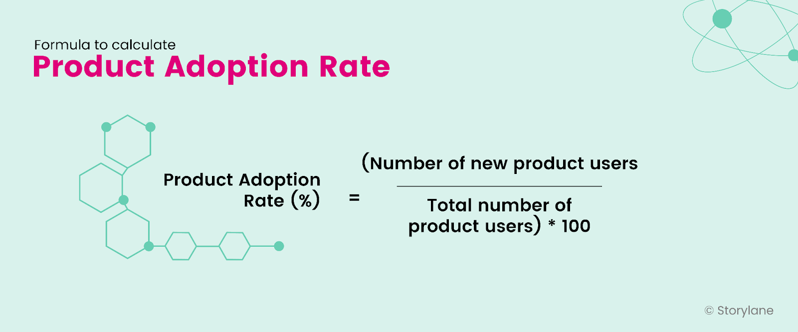
Formula for product adoption rate

Retention Rate

Retention rate is just like a best friend who sticks by you even when several other friends chose to leave🥺

Retention rate indicates how happy your customer is with your product to stick by it. Simply put, the retention rate measures customer loyalty to your product. 

Customer retention rate is a critical product led growth metric as it indicates that users who find value in your product stick by for the longest time. 

By calculating the retention rate, you can:

  • Identify the key points to retain users and leverage them more
  • Invest more resources in retention
  • Understand how well your product delivers

Here’s the formula to calculate the retention rate:
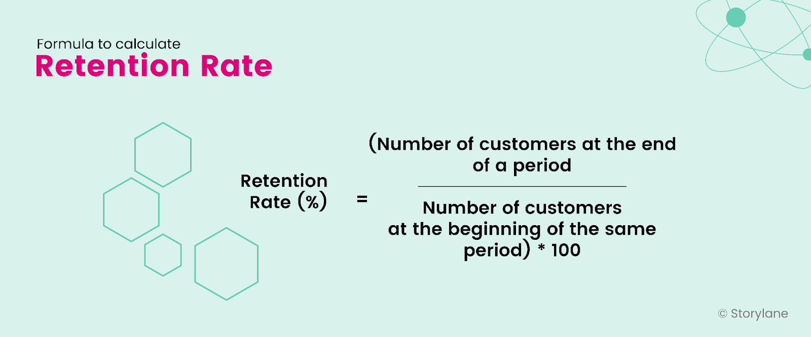
Formula for Retention Rate

Natural Rate of Growth

Natural rate of growth is a valuable product led growth metric for SaaS companies. It measures the speed at which a company grows without any efforts—in the form of marketing and sales—or external investments. 

It determines what percentage of the company’s recurring revenue comes from organic channels and begins with the product. 

With natural rate of growth, you can:

  • Measure a company’s growth potential
  • Set realistic growth goals for organizations
  • Track company progress over time and optimize it

For example, if a company does not use its sales and marketing function yet gets product signups through referrals.

Here’s the formula to calculate natural rate of growth:
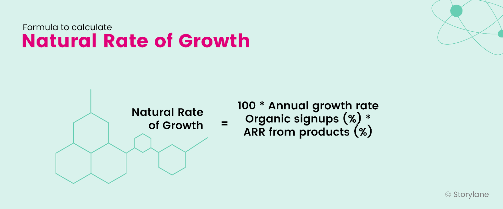
Formula for Natural Rate of Growth

Expansion Revenue

Expansion revenue measures the revenue from existing customers beyond regular payments. Usually, this revenue comes from upgrades and add-ons the existing customer uses for your product. 

Measuring the expansion revenue helps you:

  • Measure the impact of upselling and cross-selling
  • Understand how invested the user is in your product to upgrade their plan
  • Increase revenue beyond regular payments

For example, if an existing user using Storylane’s Starter plan decides to upgrade to the Growth plan, the revenue Storylane generates from this user is expansion revenue.

Here’s the formula for expansion revenue:
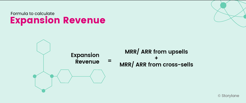
Formula for expansion revenue

Net Promoter Score

Net promoter score measures customer satisfaction and loyalty. It helps you understand whether the user is happy, enthusiastic, neutral, dissatisfied, or unlikely to recommend your product to others. 

To leverage this metric, you can send out an NPS survey to users—which usually consists of a series of questions and scores the user gives you. Here are a few questions you can use to track this metric:

  • What is the primary reason for your score?
  • What’s one thing we could do to make it better?
  • What could we do to improve your user experience?
  • Which features do you like the most?
  • What should we do to WOW you?

Answering these questions gives you an understanding of your product's after-effect on the customer.

For example, Hotjar asks its customers this question: “What should we do to WOW you?” to understand what every single customer want in their product. 
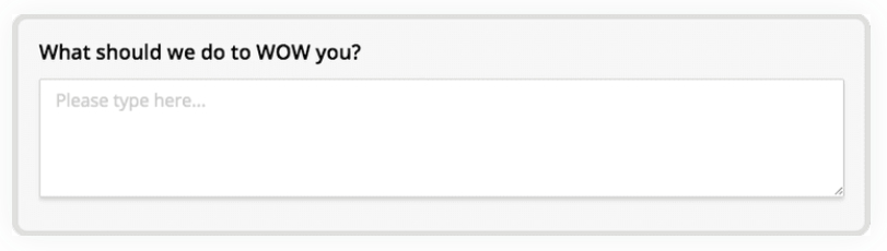
NPS survey question asked by Hotjar

Here’s the formula to calculate the net promoter score:
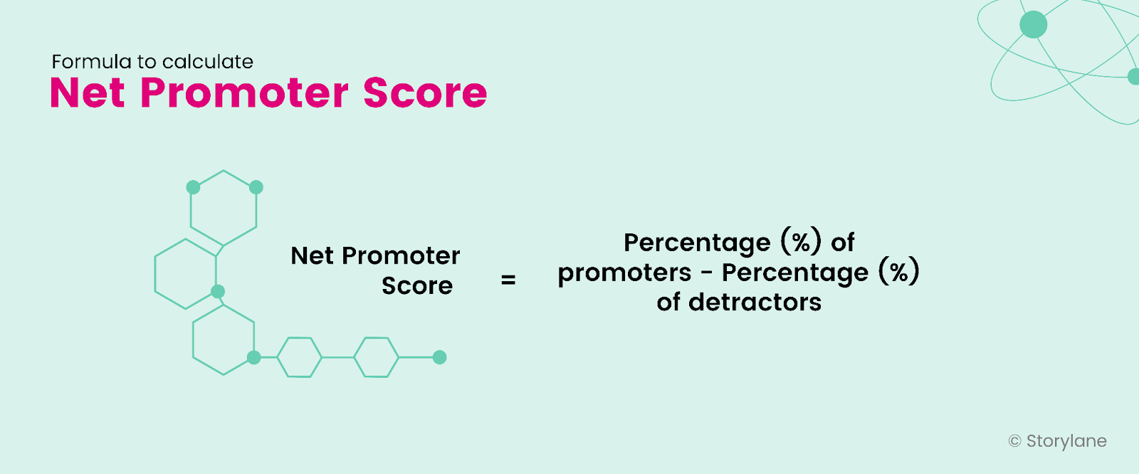
Formula for Net Promoter Score

Trial Conversion Rate

Here’s the thing: not every user who opts for your product’s free trial converts. That’s why you need to track how many users complete their journey from free trial to paying customers. 

Trial conversion rate metric indicates the number of free users that get converted to paying customers. The converted free users usually come from free trial or are freemium users.

By calculating the trial conversion rate, you can understand:

  • Number of users who found value in your product and switched to paid plans
  • How well users understand your product
  • The effectiveness of offering a free trial and its overall impact

For example, if a user using ClickUp’s freemium plan decides to opt for their Starter plan, it will be called a trial conversion rate. 

Here’s the formula to calculate the trial conversion rate:
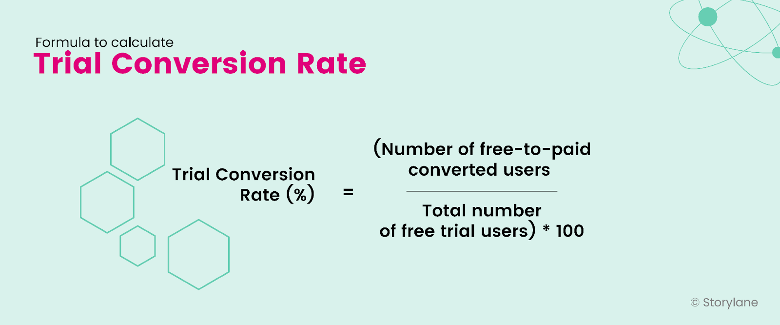
Formula for Trial Conversion Rate

Also Read: 5 Awesome Interactive Demo Examples 

Feature Adoption Rate

Feature adoption measures which feature of your product the user values and enables product stickiness. With this metric, you analyze each product feature individually to identify your SaaS's valuable features.

By measuring the feature adoption rate, you can:

  • Identify the most and least used product features
  • Identify the gaps in the market for new feature development
  • Reshape your product positioning based on the most liked features

For example, Mixmax’s most liked features include shared calendar scheduling, templates, and Salesforce integration—which count as feature adoption metrics.

Here’s how to calculate the feature adoption rate:
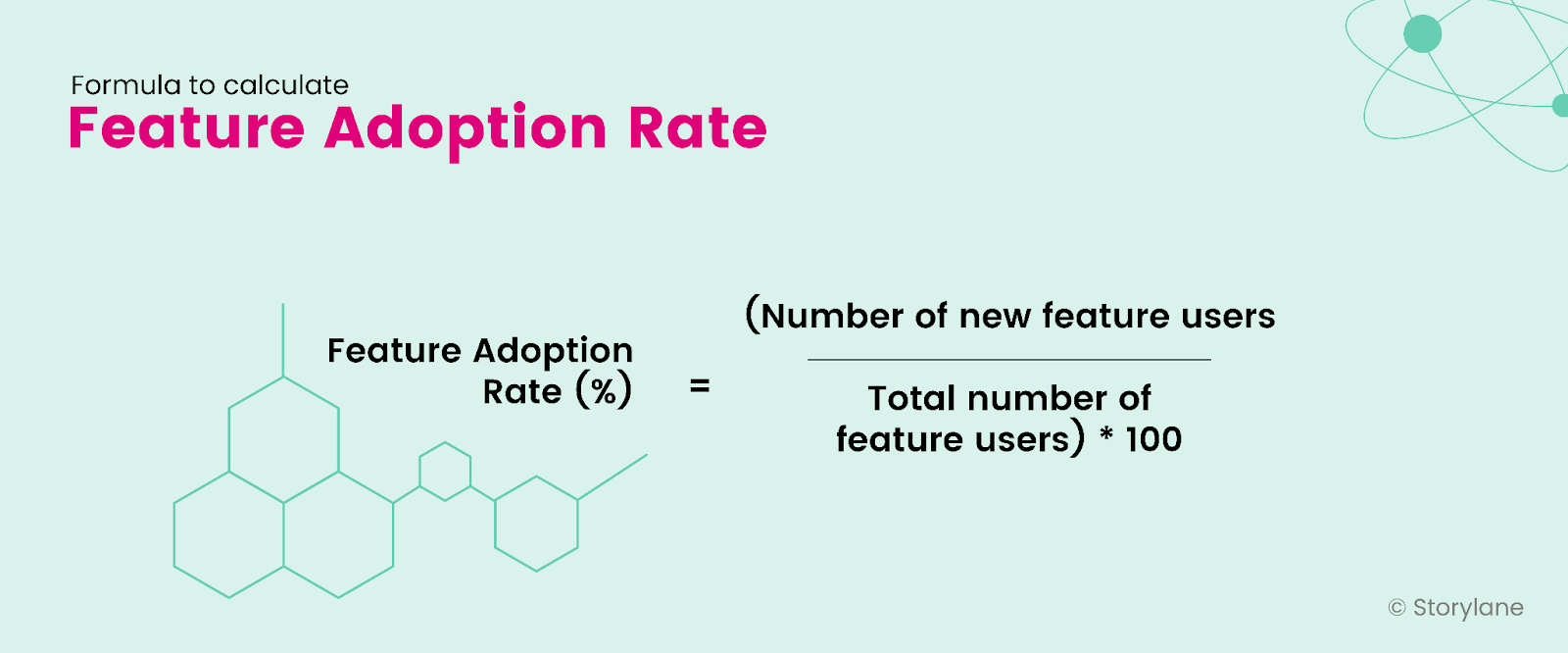
Formula for Feature Adoption Rate

Product Qualified Leads

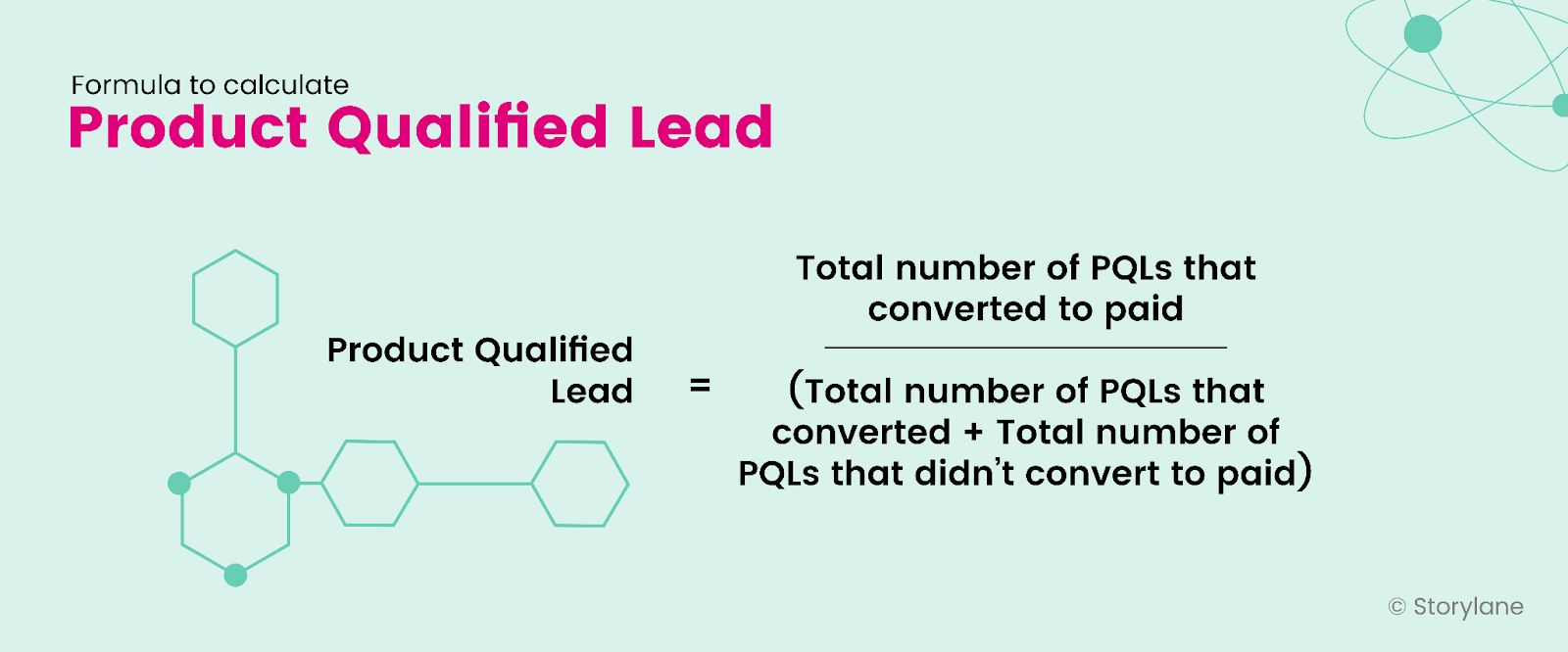
Product-qualified leads have reached their aha moment and so they’re likely to buy your product. In short, they are your potential customers.

To identify product-qualified leads, you need to take into account the demographics, actions taken, source, etc., and use a point system. The higher these points, the more qualified they are. 

By tracking product-qualified leads, you can:

  • Measure how effective your product-led growth strategy is
  • Understand what features or actions lead to product activation
  • Align your product, marketing, customer success, and engineering teams at different stages of the customer journey.

For example, a user uses xTiles because of their tile format. This makes it easy to view everything organized right in front of them instead of constantly scrolling. The user had their aha moment with xTiles, and hence they are product-qualified leads.

Here’s the formula to calculate product qualified leads:
Formula for Product Qualified Leads

Customer Lifetime Value

Ever got excited about calculating your fictional salary for your dream company? Well, that's customer lifetime value. But the only tweak? The calculations you do are real.

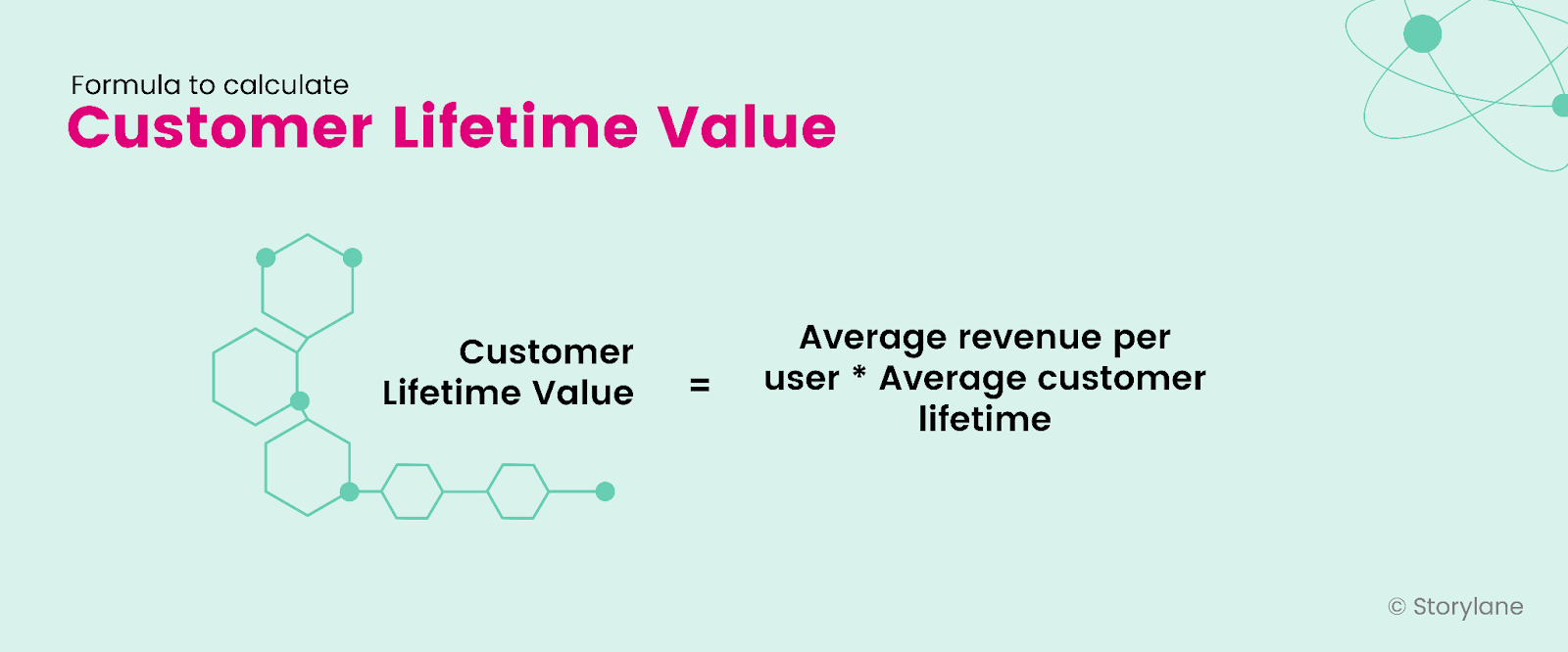
Customer lifetime value (LTV) shows how much revenue you can expect from a prospective customer. 

By measuring the customer lifetime value of your product, you can:

  • Monetize the timeline and tell the worth of the prospective customer 
  • Track your growth and optimize for better performance
  • Analyze the ROI of your marketing efforts.

Here's the formula to calculate customer lifetime value:
Formula for Customer Lifetime Value

CAC Payback Period

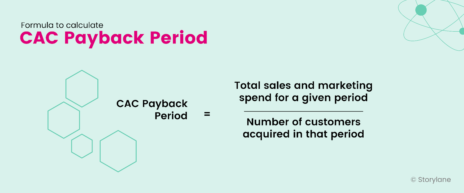
CAC payback period measures the time it takes for a company to earn back their spending on new customer acquisition—mostly made through marketing and sales like paid ad campaigns.

Most SaaS companies have CAC payback periods shorter than 12 months. Companies should ideally have a lower CAC payback period.

  • If your company has a lower CAC payback period, it has longer profitability
  • If your company has a higher CAC payback period, it is likely to lose profits

Measuring the CAC payback period helps you:

  • Identify the key areas where you’re overspending
  • Find out where you experience churn and retention
  • Create the right pricing strategy

Here’s the formula to calculate CAC Payback Period:
Formula for CAC Payback Period

Burn Multiple

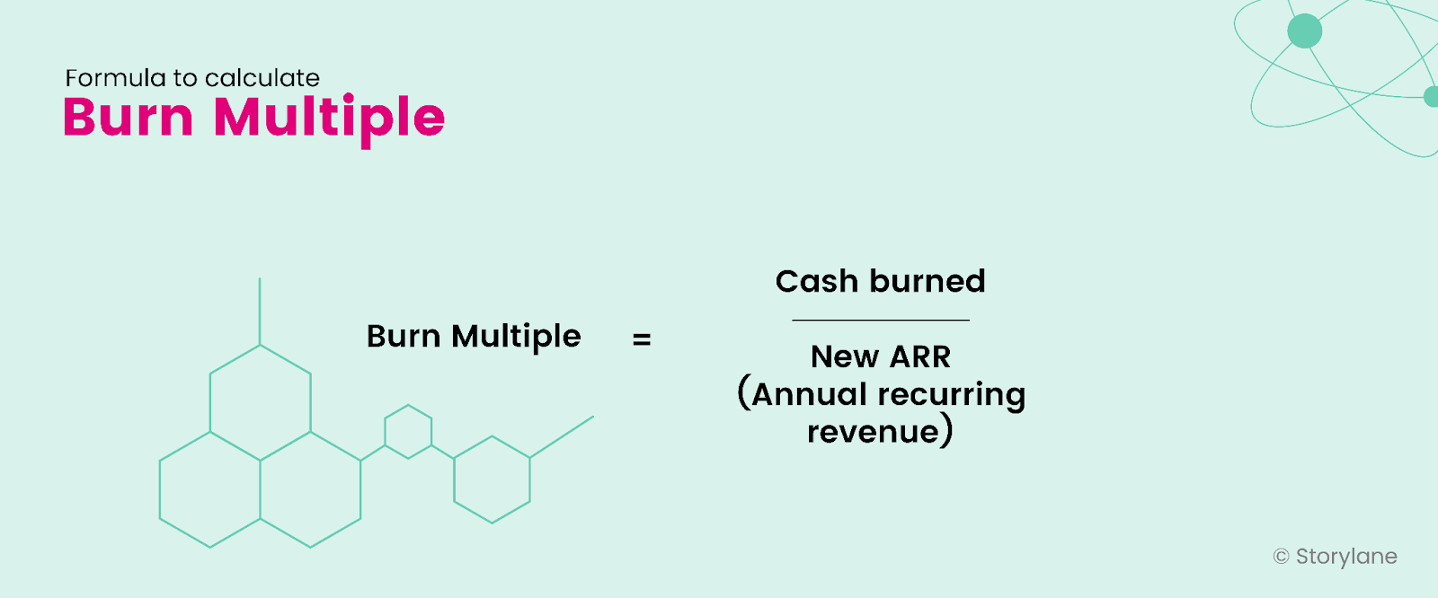
Burn multiple measures the company's efficiency and sustainability. If a company has a high burn multiple, it burns through the capital to grow. If a company has a lower burn multiple, it indicates more efficient growth. So, aim for a lower burn multiple. 

By measuring the burn multiple, you can:

  • Determine where the money is coming from and where it is going—helping you improve your SaaS company’s cash management
  • Create a well-defined budget and allocate resources efficiently
  • Helps you make informed decisions about several aspects of your business that require allocating resources like marketing, product development, and hiring

Here’s how you can calculate burn multiple:
Formula for Burn Multiple

Activation Rate

Activation rate measures the percentage of individual users who have successfully completed a certain milestone in the onboarding journey. This milestone differs for each SaaS company—it could be booking the first appointment for appointment software, creating the first workspace in project management software, etc.

Measuring the activation rate helps you:

  • Determine how quickly new users achieve value from your product
  • Find the number of users who have performed a specific action with your product in a certain timeframe

Here’s the formula to calculate the activation rate:
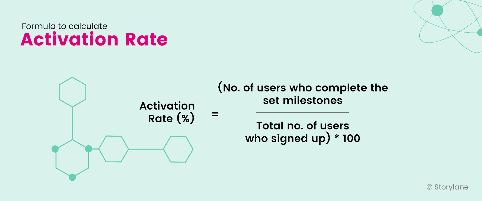
Formula for Activation Rate

Activation Velocity

Activation velocity shows how and when the user reaches their activation stage. Measuring the activation velocity of your product indicates the speed and efficiency of a company’s onboarding and activation experience.

Sure, the time to value metric applies to SaaS companies in the world of onboarding experience, but it provides incomplete information. It gives ample information on how long users take to progress from onboarding to activation. 

But, it fails to give you an overview of onboarding performance or impact on customers. 

When you know the activation velocity metrics for your product, you can answer a few questions:

  • Number of monthly activation events forecasted
  • Impact on revenue growth
  • Leading indicators to improve onboarding activation

By measuring the activation velocity, you can:

  • Find blockers in the onboarding journey
  • Revise your activation definition based on the user journey

Here’s how to calculate the activation velocity formula: 
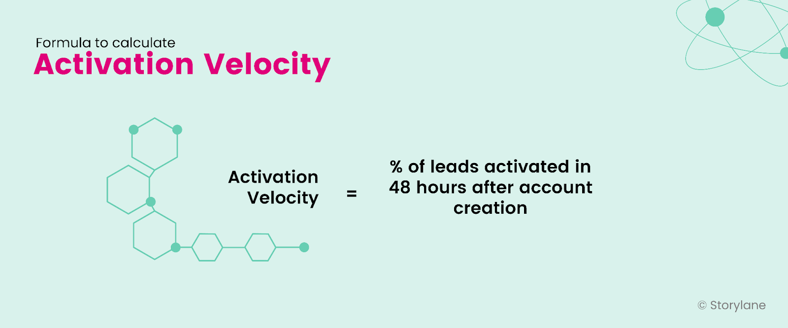
Formula for Activation Velocity

Also, check out: How to perform a successful product demo

How to Measure Product Led Growth Metrics

So now you know the product led growth metrics you need to track. But how will you track them?

Well, you need tools to get the job done!

Here’s a list of tools that measure product led growth metrics:

Mixpanel

Mixpanel captures how users interact with your product. It lets you analyze product data with interactive reports and visualize it. It provides you with enough data to track and analyze user behavior on websites and identify key areas of improvement. 

Mixpanel offers three tools: segmentation, engagement, and retention analysis, which provide in-depth insights into user behavior.  

Baremetrics

Whether you want to track signups, churned users, and metrics like LTV, ARR, or ASP, Baremetrics pulls all your revenue data into one easy-to-view dashboard. It offers plenty of features like forecasting, trial insights, cancellation insights, and augmentation that help you improve and drive more growth for your business.

Storylane

If you want to understand whether visitors to your website are moving forward in their journey, you need to get demo analytics.

  • With Storylane’s demo performance analytics, you can calculate CTA percent and final step completion percent. These two metrics will help you understand how close or far visitors are from getting the free trial or freemium version of your product.
  • With Storylane’s demo usage analytics, you can gather insights for each demo like impressions, CTAs clicked, time spent, completion, and more. 

Wrapping Up

It’s easy to get lost in the plethora of metrics floating around but the most crucial product led growth metrics include:

  • Natural rate of growth
  • Burn multiple
  • Product adoption rate
  • Feature adoption rate
  • Time to value
  • Activation velocity

Track these metrics to know *just* find how your product is performing and how the user behaves but also to keep a bird’s eye on the overall business growth.

Killer demos for every stage

Build demos and agents that turn curious buyers to closed won
Book a demo

Related Articles

Read All Articles
Research
July 3, 2026
6 min read

68,000 deals, 3 findings: Measuring the ROI of interactive demos

This report analyzes ~68,000 deals (~50,000 of them closed) across 20+ anonymized B2B SaaS pipelines to measure what interactive demos actually do for pipeline metrics..
Ranga Kaliyur

This report analyzes ~68,000 deals (~50,000 of them closed) across 20+ anonymized B2B SaaS pipelines to measure what interactive demos actually do to pipeline metrics. Most demo benchmarks stop at engagement rates and time on page. I wanted the part that matters: do deals where buyers use a demo do better than deals where they don't?

My approach is simple. Using aggregated, anonymized Deal Intelligence data, I connected demo activity to real CRM outcomes, then compared deals with Storylane demos against deals without, inside each pipeline.

In summary

When buyers use an interactive demo, deals tend to...

  • Win 20% more often (38% vs 46% win rate), and it climbs the more they engage.
  • Reach 60% more of the buying committee (more stakeholders on the deal).
  • Land 2.75x bigger specifically in enterprise motions (flat in SMB and mid-market).

Methodology

  1. Using Storylane's Deal Intelligence, I connected demo engagement to CRM deal records (HubSpot and Salesforce) across 20+ anonymized pipelines: ~68,000 deals, nearly 50,000 closed.
  2. For each deal, I compared two groups: buyers who engaged with a demo (at least one demo session tied to the deal) and buyers who didn't. I measured win rate, deal size, and number of stakeholders.
  3. I report the median within each pipeline, then across pipelines, so a handful of large accounts don't skew the average (Simpson’s Paradox). The findings come from the 20 pipelines where the demo-to-deal link was clean enough to compare.

One caveat worth stating up front: this is a pattern, not proof of causation. Reps demo the deals worth demoing, so demo use partly reflects deal quality. Read these as strong, repeatable signals.

1. Conversion Lift: Buyers that engage with interactive demos close 20% more often

This is the big one: deals where the buyer engaged with an interactive demo won 46% of the time, versus 38% for deals with no demo  (about 20% more often), and it held in 14 of 20 pipelines analyzed.

The most interesting part is that the impact compounds with every session. The more a buyer returned to the demo, the higher the win rate. In our own pipeline the climb was steady: 87% (no demo) → 90% (1 session) → 91% (2–3) → 96% (4+ sessions). 

Across the dataset, deals with 4+ sessions won more often than zero-session deals in 71% of pipelines analyzed. A single view nudges the odds; repeat engagement moves them.

The logic is intuitive: a buyer who keeps coming back to a demo is a buyer building conviction. A static page can tell someone your product is good; a demo lets them prove it to themselves, and repeat visits usually mean they're selling it internally too.

🥡 Takeaway: Treat repeat demo use as a buying signal. When an account keeps coming back, get Sales in early.

2. Stakeholder Reach: Demos bring 60% more people into the deal

Deals with an interactive demo carried about 60% more stakeholders: a median of 1.6 contacts per deal vs 1.0 without, and more stakeholders in 15 of 17 pipelines. The gap was widest in enterprise pipelines, where one averaged 4.6 stakeholders per interactive demo-influenced deal vs 2.7 without, and another 5.2 vs 3.8.

Here's why it matters: B2B software isn't bought by one person anymore, it's bought by a committee. A demo is the rare sales asset that's easy to forward and relevant across functions, so it travels. One champion shares it, and suddenly the economic buyer, a security reviewer, and two end users have all seen the product for themselves. Deals that reach more of the committee are the deals that close.

🥡 Takeaway: Multi-thread on purpose. Send shareable, role-specific demos so the whole committee sees the product firsthand, not just your champion's secondhand pitch.

3. ACV Lift: In enterprise, deals with a demo are 2.75x bigger

Demos don't inflate every deal, and that's the honest part. The deal-size effect depends entirely on who you sell to.

  • Enterprise motions (large, complex, multi-team deals like GRC/compliance and enterprise healthcare): deals with a demo were 2.75x bigger at the median, and larger in 4 of 5 such pipelines. In one, median deal size went from roughly $16k without a demo to $127k with one; in another, from about $170k to $468k.
  • SMB and mid-market: no size difference. Demos there still won more deals and reached more people, they just didn't make deals bigger.

This tracks with how big deals actually get done. The larger and more complex the purchase, the more people and the more scrutiny involved, and the more room a demo has to do the explaining across stakeholders, functions, and weeks of evaluation. In a quick self-serve motion there's simply less for it to move.

🥡 Takeaway: if you sell enterprise, use demos as a late-stage lever, not just a top-of-funnel asset. That's where they move deal size.

How to read this report

The honest question is cause versus correlation. Demos land on the deals worth demoing, so some of this reflects deal quality alongside demo impact. To me that's what makes it worth taking seriously: across dozens of independent pipelines, the same three patterns keep showing up next to the deals that win, spread, and grow.

A few caveats. This is a first look at a subset of pipelines, deal values span multiple currencies, and a handful of accounts run against each trend. I've held an industry-by-industry breakdown for the next version, once there's enough data per vertical to say something solid.

What's next

A larger, cleaner dataset and a proper apples-to-apples comparison of similar deals with and without a demo, to turn these patterns into measurable lift, with industry and company-size cuts.

Guides
June 29, 2026
6 min read

Five ways B2B teams are using interactive demos that nobody talks about

What a conference booth in London, an EHR rollout for a differently-abled community, and a fintech triage system have in common — and what it tells us about where demo automation is actually going.
Ranga Kaliyur

What a conference booth in London, an EHR rollout for a differently-abled community, and a fintech triage system have in common — and what it tells us about where demo automation is actually going.

The standard demo automation playbook is predictable: marketing website tour, sales leave-behind, email nurture embed. That is what most companies start with.

But spend time in actual customer conversations and you see something different: teams using demos to solve problems the standard playbook never imagined.

This week, we reviewed a working session with an engineer at a large cloud computing company preparing for a technology summit in London. Her problem: she needed a product demo to play on a loop at her conference booth (no clicks, no one to navigate it, just a screen running in the background while conversations happened around it.)

Nobody markets demo automation as a conference booth tool. But that's exactly what she needed it for. And it wasn't the only unexpected use case this week.

1. Trade show and conference booth displays

The conference loop use case has specific requirements: autoplay enabled, 4-6 second transitions on title cards and pause slides, video clips set to 1.5-2x playback speed for longer recordings, and the entire thing downloaded onto the device. Conference WiFi is unreliable. You need the offline version ready before you walk in the door.

The structural formula that worked: technology stack slide (static) -> 4-second pause slide (blank) -> demo 1 with title card framing the problem ("Can I detect performance issues before they cause outages?") -> demo 2 -> repeat on loop. The problem-framing title cards are what make this work at a booth — a passerby reads a question they recognize and stops.

2. Staff onboarding for organizations with diverse accessibility requirements

A director of organizational performance at a nonprofit came to us mid-EHR transition. Her organization (200-plus staff, statewide) was moving to a new electronic health records platform and needed tutorials for everyone from clinicians to program administrators. Complicating factor: their staff includes a deaf and hard-of-hearing community.

Her requirements were specific: self-paced clicking rather than auto-advancing video, AI voiceover as an optional layer, and demos organized by function and embedded in SharePoint so staff could browse by department and role.

The training-center use case of interactive demos replacing annotated PDFs  is not new. The accessibility angle is. When a demo is self-paced, the viewer controls the speed versus video. That's a meaningful accommodation for populations that need more time, and it requires zero additional effort from the team building the content.

3. Multi-system integration demos

"We get asked all the time: what do these integrations actually look like?" said a co-founder at an early-stage health tech company. They had been answering that question in live demos, switching between systems in real-time and hoping nothing broke.

What they discovered: you can capture from multiple platforms in a single demo session. Finish recording in system one, click "add to existing demo," then capture from system two. The viewer moves between platforms seamlessly — without any live switching, without any risk of a broken environment. 

Live integration demos are high-risk, tedious (from a data management pov) and unrepeatable. Captured integration demos are neither. For a company whose primary sales objection is "show me exactly how the integration works," this is not a minor workflow change; it's a competitive differentiator.

4.Inside sales automation for long-tail accounts

An inside sales leader at a fintech company described a problem his team lives with daily: they manage accounts "where we're seeing very less revenue and more effort going from an account manager's point of view." His team's solution was a self-serve portal paired with interactive demos that replace human demos entirely for lower-priority accounts. Reps focus on the accounts with revenue potential; the demo handles the education and qualification for everyone else.

He had used this approach at a previous company and was replicating it here. The key insight: he was not evaluating demo automation as a way to improve existing demos; He was using it as a triage mechanism for a coverage problem. Interactive demos let you maintain a presence in accounts that don't justify a rep's time. That's a fundamentally different value proposition than "make your demos better," and it's one that VP of Sales audiences will understand immediately.

5. Localized demos for non-English-speaking markets

An inside sales team at a fintech company with a large India-based sales operation had one specific question: how many languages does the AI voiceover support? The answer, over 30, prompted an immediate workflow: build the demo once in English, then translate and duplicate into regional languages.

In markets where English-language demos create friction in the sales process, this is not a nice-to-have. It is a conversion rate issue. Prospects engage more deeply with content in their first language. The ability to generate a localized demo without re-recording or hiring a voice actor changes the economics of localization for inside sales teams that are already stretched thin.

Research
June 29, 2026
6 min read

Interactive demos vs. product videos: why revenue teams are switching over

Should you use interactive demos or product videos for sales? Compare creation time, maintenance, personalization, and analytics to decide.
Ranga Kaliyur

When sharing async product demos, sales teams have traditionally reached for a couple of options: quick and dirty screen recordings (think Loom, Vidyard, etc.) and high-end video productions (think Camtasia, Consensus, etc.). While there’s a time and place for both; AEs, SEs, and PMMs are increasingly adopting a third format — interactive demos — as a “better than both worlds” alternative. Here's why:

Interactive Demos vs Video: Feature Comparison
Compare Interactive demos
(Storylane)
Screen recordings
(Loom, Vidyard)
Video productions
(Camtasia, Consensus)
Time to create ✅ Fast, capture and creation often completed in minutes ✅ Fast but requires narration, timing, retakes, etc. ❌ Slow, can take weeks to script, shoot, and edit
Editing ✅ Self-serve, easy: replace screens, tweak text, reorder steps; no re-recording ❌ Limited scope: re-recording, trimming, stitching clips, fixing audio ❌ Technical dependency: needs expertise in pro editing software
Polish and branding ✅ Professional, consistent themes built-in; no editing software needed ❌ Low production value. Harder to maintain consistency; requires design/video tools ✅ Cinematic quality but requires video editing expertise
Publishing ✅ One-click publish; instantly updates everywhere ❌ Requires re-uploading and re-sharing new versions ❌ Requires re-uploading and re-sharing new versions
Maintenance & Updates ✅ Replace screens and content in minutes, auto-update instantly ❌ Requires re-recording entire sections/full-video ❌ Requires re-producing entire sections/full-video
Personalization ✅ Personalize at scale with dynamic tokens ❌ Hard to scale: Requires re-recording ❌ Impossible to scale: Requires re-production
Analytics ✅ Granular: Track views, interests, completion, and time-spent per step ❌ Limited to views, no actionable analytics or Opinions ❌ Limited to views, no actionable analytics or Opinions
Buyer experience ✅ Interactive, two-way experience ❌ Passive, one-way experience ❌ Passive, one-way experience
Ideal for… Across the board Ad-hoc touches, quick Q&A Top-of-funnel brand awareness campaigns

Why revenue teams are adopting interactive demos

Since our inception, we've noticed revenue teams of all sizes, from early-stage startups to Fortune 500 enterprises, switch over from videos to interactive demos. Here are the most common reasons we hear from customers.

Reason #1 - Speed without sacrificing quality

Screen recordings are quick and easy to produce but lack the polish and quality needed for high-value deals. On the other hand, producing polished video demos means days of planning, hours of environment prep, multiple recording attempts, and extensive editing. Interactive demos eliminate this friction entirely, especially now with AI, to instantly generate product-specific content (Guides, voiceovers, etc) from captured screens — no need for multiple takes. 

"Video is really strong at capturing people's attention and welcoming them into your story. But the thing that video can't do is provide a “click-through experience” allowing users to actually get their hands on the product — to feel it, to see it, to understand what the actual day in and day out of working with your tool is going to be like. Especially with its AI and automation, Storylane allowed us to build demos in such a quick amount of time."
- Michael DeMarco, PMM, Phenom

Reason #2 - Asset maintenance and scalability

Traditional videos are like baked cakes — once ingredients (product screens, click path, narrative) are combined into a video, it’s difficult to swap individual components. When your product UI changes six months from now, you face full reproduction from scratch.

Interactive demos keep these elements separate. Update a screen in minutes without touching the narrative. Adjust messaging without re-recording. Reorder workflows without starting over. This durability enables demos to stay current as your product evolves.

Further, creating persona-specific, industry-tailored, or localized video content means producing multiple versions of each asset — a multiplication problem that quickly becomes unmanageable. Storylane's AI editor recontextualizes entire demos for different personas or industries in seconds. Dynamic tokens automatically swap prospect information without creating separate versions. One base demo adapts to dozens of scenarios without manual overhead.

Reason #3 - Modern buying preferences 

Interactive demos respect buyer time by letting them jump to relevant sections, skip familiar concepts, and control their pace. Video forces a fixed timeline — even if viewers only care about one feature, they must scrub through the entire recording to find it. This level of control and self-serve flexibility reflects the preference of modern buyers, who'd rather click around a product tour for themselves than rely on a passive, one-way video.

"Nobody wants to watch a 5-minute video anymore. So my team sends a Storylane demo and the prospect sees the demo in 5 clicks."
- Jon Dolan, Sales Director, Cognism

The difference in analytics is equally striking. Video platforms show watch time and opens. Interactive demos reveal which features prospects explored, where they spent time, which stakeholders engaged, and where they dropped off. These step-level Opinions enable targeted follow-up conversations that video simply can't support.

Make buying easy with Storylane