Quick summary
A pivot table in Power BI is created using the Matrix visual, which lets you summarize and cross-tabulate data across rows, columns, and values. This step-by-step walkthrough shows how to configure the Matrix visual inside any Power BI report to produce a pivot-style data summary.
Steps
- Open your Power BI report to get started.
- Navigate to the Visualizations pane on the right side of the report canvas.
- Click the Matrix icon in the Visualizations pane to add the visual to your canvas.
- Drag and drop your fields into the appropriate Rows, Columns, and Values areas of the Matrix visual.
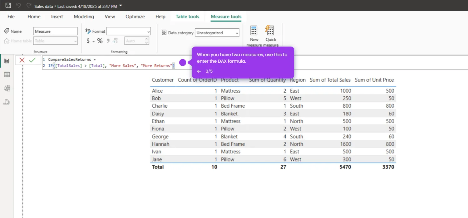
- Review the completed Matrix visual — it now displays a pivot-style summary of your data.