Agentic demo automation is here.
Meet Lily
This interactive demo was created free with Storylane in 2 minutes. Create your own demo
Start free

How to Create Data Visualizations From Tables in Coda

‍

‍

It is very easy to create data visualizations from tables in Coda. Here’s a short tutorial on how to do it:

‍

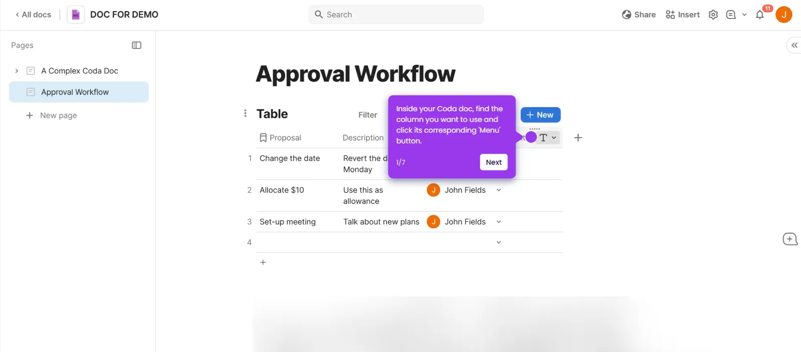
  1. Inside your Coda doc, hover your mouse cursor over the table and tap its corresponding 'Options' button.
  2. After that, go to the right-side panel and click 'More'.
  3. Select 'Chart' from the list of options.
  4. Subsequently, configure the chart settings based on your preferences. Use the options under Chart Display, Filter, and Sort to customize the style of your data visualization.
  5. After completing these steps, the data from your Coda table will be visualized based on your input.
Similar Articles

How to Connect Coda to Google Analytics

How to Optimize Large Tables in Coda

How to Troubleshoot Formula Errors in Coda

Build Killer Demos in 2 Minutes
Chrome Extension Icon
Try our Chrome extension
DOWNLOAD

Desktop app for macOS
DOWNLOAD
Backed by
Y combinator
AICPA SOC
GDPR
Products
Guided DemosSandbox DemosDemo Hub
Featured
Account RevealPersonalizationIntegrations
Solutions
EnterpriseGrowth & Demand
MarketingProduct MarketingSalesPresales
Resources
BlogTutorialsHelp DocsWhat’s NewDemo DundiesPlaybooks
Company
CareersPricingPartnersContactTrust CenterDemo Abuse
Customers
Demo ShowcaseCase Studies
Built in San Francisco Bay Area - ©2025 Storylane
Backed by
Y combinator
AICPA SOC
GDPR
Privacy PolicyTerms & Conditions
X Corp (formerly Twitter)LinkedIn
This website uses cookies to ensure you get the best experience on our website. Learn More
Got it