This interactive demo was created free with Storylane in 2 minutes. Create your own demo
Start free
All Tutorials /Figma

How to Use Components in Figma

Updated on:
May 12, 2026
By:
Madhav Bhandari
Use this interactive demo to learn how to find and insert reusable components into your Figma design.

Quick summary

Figma components let designers reuse UI elements like buttons and objects across a project for faster, consistent design. To insert a component, open the Assets panel, select the component you need, and click Insert to place it on your canvas.


Steps

  1. Navigate to the bottom section of your Figma design canvas and click the Actions button.
  2. Tap the Assets tab to open the component library.
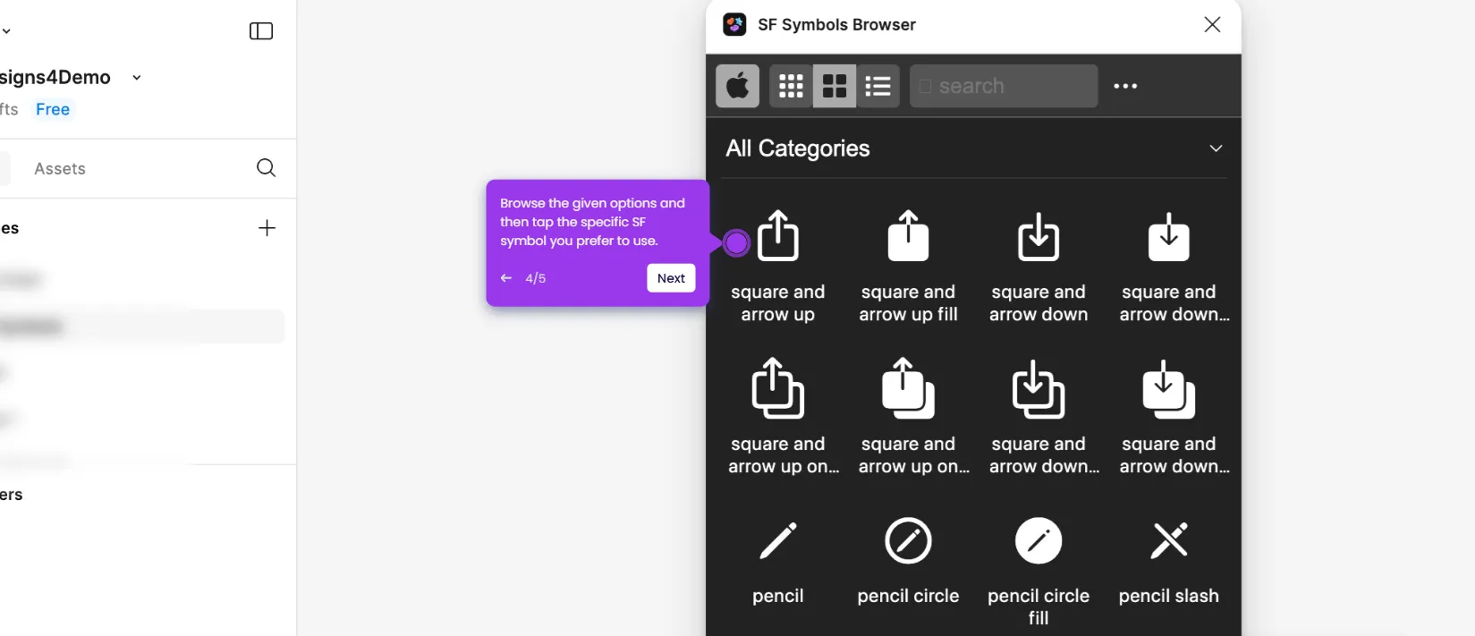
  3. Select the component you wish to use from the available options.
  4. Click Insert to add the component to your design canvas.
  5. The selected component is now added to your design and ready to use as a button, object, or any other UI element.

📌 Why this matters

Figma components are the foundation of scalable, consistent UI design — they allow teams to define reusable elements once and deploy them across every screen instantly. Using components correctly reduces design debt, speeds up handoff to developers, and ensures brand consistency across complex projects. For any designer working in Figma, knowing how to access and insert components from the Assets panel is an essential workflow that directly improves productivity and output quality.
Your product deserves an interactive demo
Start free
Similar Articles
Figma

How to Create a Figma Plugin

Madhav Bhandari
Director of Marketing @ Storylane
Figma

How to Use SF Symbols in Figma

Madhav Bhandari
Director of Marketing @ Storylane
Figma

How to Embed a Figma Prototype in Google Slides

Madhav Bhandari
Director of Marketing @ Storylane
No items found.
Platform
Interactive Demos
Sandbox Demos
Buyer Hub
RepX
Integrations
Solutions
Product Marketers
Growth & Demand Gen
Sales Reps & AEs
Presales & SEs
Customer Success
Product Managers
Customers
Demo Showcase
Customer Stories
Finer Demos Club
Features
Demo Signals
Personalization
Deal Intelligence
Resources
Blog
The Plot
Tutorials
Events & webinars
Help Docs
What’s New
Demo Dundies
Company
Careers
Pricing
Partners
Contact
Trust Center
Backed by
Chrome Extension Icon
Chrome extension
Download
Desktop app
Download
Built in San Francisco Bay Area - ©2026 Storylane
Privacy PolicyTerms & Conditions
X Corp (formerly Twitter)LinkedIn
This website uses cookies to ensure you get the best experience on our website. Learn More
Got it
This website uses cookies to ensure you get the best experience on our website. Learn More
Got it