.svg)
How Respond.io increased trial clicks by 162%


Respond.io serves customers across ecommerce, healthcare, travel, financial services, and more. Every visitor landing on their homepage is there for a slightly different reason.
Before they had an interactive demo, there was no way for anyone to experience the product before signing up for a free trial. And with only seven days to find their "aha moment," the window was short.
The risk Nabilah kept coming back to: show everything, communicate nothing.
Here's exactly how they solved it — and what they had to unlearn along the way.
.svg)
The challenge: too much to show, too little time
Respond.io is an AI-powered customer conversation platform. It helps businesses manage messages from WhatsApp, Instagram, Facebook, TikTok, website chat, and email — all in one place. AI agents handle conversations automatically; human teams step in only when it matters.
The product is genuinely broad. That breadth is a selling point. It's also a demo problem.
With visitors arriving from different industries and use cases, and no way to experience the product before committing to a trial, Respond.io faced the classic dilemma: a comprehensive demo risks losing people before they reach anything meaningful. A focused demo risks leaving value on the table. And with only a seven-day trial window after sign-up, the cost of a weak demo wasn't just a low completion rate — it was a short runway to the aha moment.
Nabilah was assigned to fix this. There was no formal project, no big recurring meetings. She pulled in whoever she needed, when she needed them.
Building V1: it takes a village
It took about a month to go from blank canvas to a live demo on the homepage. Five groups were involved:
The product team defined the three core USPs and determined which features were worth showing. Marketing writers owned the copy and language positioning. The sales team verified that the copy matched what they actually heard on demo calls — a step most teams skip, and one that meaningfully improved the accuracy of the guide text. Management did a final review. And the Storylane CSM helped onboard the team and get them up to speed on the platform.
"Nobody wants a product tour. They want to see how their problem gets solved. The feature is just the how. They want to know the why."
The first major decision was format: one chapter or three? They went with three. Three chapters felt thorough, comprehensive, user-friendly without sacrificing depth. Each chapter covered one of Respond.io's core modules.
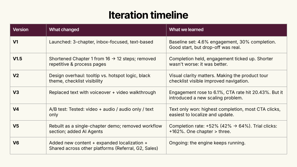
V1 launched and, by any reasonable measure, it was a good start. 4.6% engagement. 30% completion. Real people clicking through a real demo.
Then they looked at the drop-off data. Seventy percent of visitors weren't reaching the good stuff.
The iteration engine
Rather than treat each version as a one-time overhaul, Nabilah built a lightweight system to keep improving continuously. Every two weeks, the same Slack report went out to everyone who'd been involved — same metrics, same observations, same recommendations. Same context.
The framework had three parts:
- Signals (what to track): engagement rate, demo completion rate, average time spent, drop-off points by step, and CTA clicks on both "Book a Demo" and "Start Free Trial."
- Diagnosis (what to ask): Where exactly are people leaving, and why might that step be losing them? Is the drop-off a content problem or a format problem? Are the right people clicking CTAs? Does the current version still reflect the most important value proposition?
- Action (what to do after): Cut pages that are repetitive, process-heavy, or anatomy-focused. Restructure chapters when completion data signals friction. Run A/B tests when there's a genuine hypothesis. Update design, embed style, and localization based on what the data — not opinion — warrants.
One rule kept things moving: "If no feedback by Friday, we proceed." Built-in deadline. No chasing approvals. No surprises.
The result was something Nabilah hadn't fully anticipated. The reporting cadence made people feel informed rather than forced. And over time, what started as a PM-led project became something different: a shared asset five teams cared about.
"Visibility replaced anxiety. Stakeholders became comfortable with 'we don't know yet — let's try.'"
V1.5 and V2: tightening the screws
Between the major versions, Nabilah made two rounds of targeted improvements.
- V1.5 shortened Chapter 1 from 16 steps to 12 and removed pages that were repetitive or too process-heavy. The insight was simple: shorter wasn't worse — it was better. Completion held, engagement ticked up.
- V2 was a design overhaul: tooltip versus hotspot logic, a darker visual theme, and making the chapter checklist visible so visitors could see where they were in the demo. Visual clarity mattered. Navigation improved.

Neither change moved the needle dramatically. But each one tightened the experience and improved the baseline for what came next.
V3: humanizing the demo(and a new problem)
While reviewing metrics during one of the biweekly cycles, Nabilah noticed a new Storylane feature: video walkthrough with voiceover. She brought the idea to management. Maybe adding a human voice would improve completion. Nobody knew, but the answer to "we don't know" had become "let's try."
They recruited Jess, Respond.io's head of sales. The guide text became action-oriented — what to click, where to go. Jess's video handled the outcomes and value: why this action matters, what it unlocks.
The numbers moved. Engagement rose to 6.1%. CTA rate hit 20.43%.
Then a new problem surfaced. Respond.io has customers across LATAM, EMEA, Spain, and elsewhere. The demo was built around Jess speaking English. How do you localize that?
The localization challenge forced a harder question: was the video format actually the right one, or had it just produced a local improvement?
V4: the A/B test that changed everything
To settle the format question properly, Nabilah ran a three-way A/B test: video and audio together, audio only, and text only.
Everyone expected video to win.
Text won. Highest completion rate. Most trial clicks. Easiest to localize and update.
The test ran for about six weeks — long enough to reach statistical significance, roughly 2,000 visitors per variant across three demos running simultaneously. The data was unambiguous.
"Text won, everyone. You would think otherwise — but for our audience, they actually prefer text. A lot of them like that self-paced experience. They scroll. They click around. That's what resonated."
It made sense in retrospect. Respond.io's audience spans global markets with varying bandwidth and language preferences. They also skew toward self-directed, technically-minded buyers who want to explore at their own pace — scroll, click, go back, skip ahead. A video locks them into a pace they didn't choose. Text gives them control.
Worth noting: across more than 3,500 A/B tests run on Storylane in Q1 2026, voiceover demos outperformed non-narrated ones by 19% on completion rate. Respond.io's result went the other way. The lesson isn't that voiceover doesn't work — it's that no benchmark replaces running the test on your own audience.
V5: one story, one chapter
With the format question settled — text, self-paced — Nabilah made the biggest structural change yet: she scrapped the three-chapter structure entirely.
V5 was rebuilt around a single chapter, a single story, a single value proposition: the omnichannel inbox. Respond.io had just launched AI Agents, so that became the centerpiece feature. The workflow chapter was cut. The demo got shorter, more focused, and faster to reach the moment that mattered.
The results:
Completion rate jumped from 42% to 64% — a 2.1x increase from the V1 baseline of 30%.
Trial clicks increased 162%.
Same product. Same platform. Different demo.
Where it lives now
The current demo isn't just on the homepage. Respond.io distributes it across G2 and other review sites, in referral programs, and in sales conversations when reps are speaking with prospects. The homepage version drives the most impact — Nabilah points to a noticeable increase in self-serve customers who find their own way to a trial without external referrals, reviews, or a sales assist.
V6 is already underway: expanded localization, new content, and broader distribution. The engine keeps running.
What to steal from this
- Start with the story, not the features. Nobody wants a product tour. They want to see their problem solved. Features are the how. Visitors want the why.
- Completion rate and trial starts are your most honest metrics. Impressions lie. Engagement can be accidental — a misclick, a hover, someone who opened the tab and walked away. Completion tells you whether the story held. Trial starts tell you whether it converted.
- Don't assume a format. Test it. Every audience is different. What works for a technical, self-serve buyer in Southeast Asia may not work for a sales-led enterprise buyer in North America. Run the test. Let the data win.
- Build for iteration, not perfection. Version 1 was never going to be the best version. The system Nabilah built — biweekly reviews, shared metrics, a culture of "let's try it" — that's what generated the result. The demo improved because the process was designed to improve it.
"I'm more proud of the fact that we have a system to review, analyze, and improve as we go. That system is the product."