


%20(1).webp)
Getting potential customers to request a demo through your website is crucial. But a wrong move can send them straight to your competitor.
Whether you're looking to increase demo requests from your existing website traffic or improve demo request conversions on your landing pages, we've compiled 6 proven strategies along with expert product marketer insights to help you optimize every step of the demo request journey.
What is a demo request?
A demo request is when a potential customer asks for a live demo of your product. This helps them understand how it addresses their specific needs, workflows, and goals. Through a demo signup page, they can request a demo in exchange for their contact information.
During the demo, your sales or pre-sales team will show your product's capabilities and explain how it solves the problem that your prospects have.
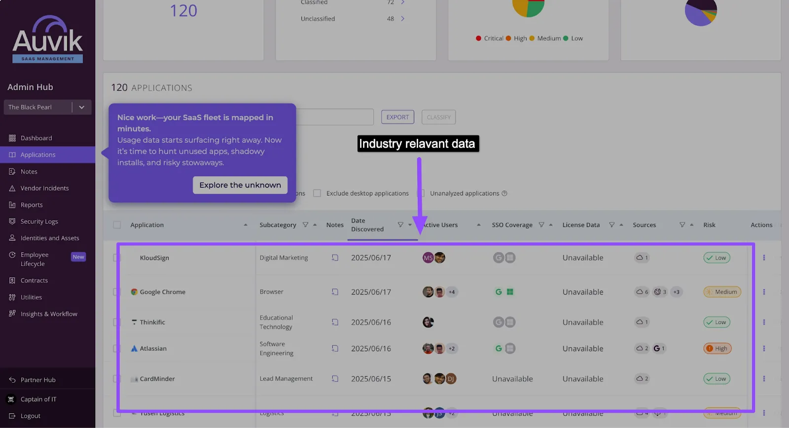
5 Ways to increase demo requests on your website (+ expert tips)
Placing a lead capture form on your pricing or feature pages doesn't guarantee visitors will sign up for a demo. Here's how to nudge them in the right direction:
1. Offer interactive product demos on homepages
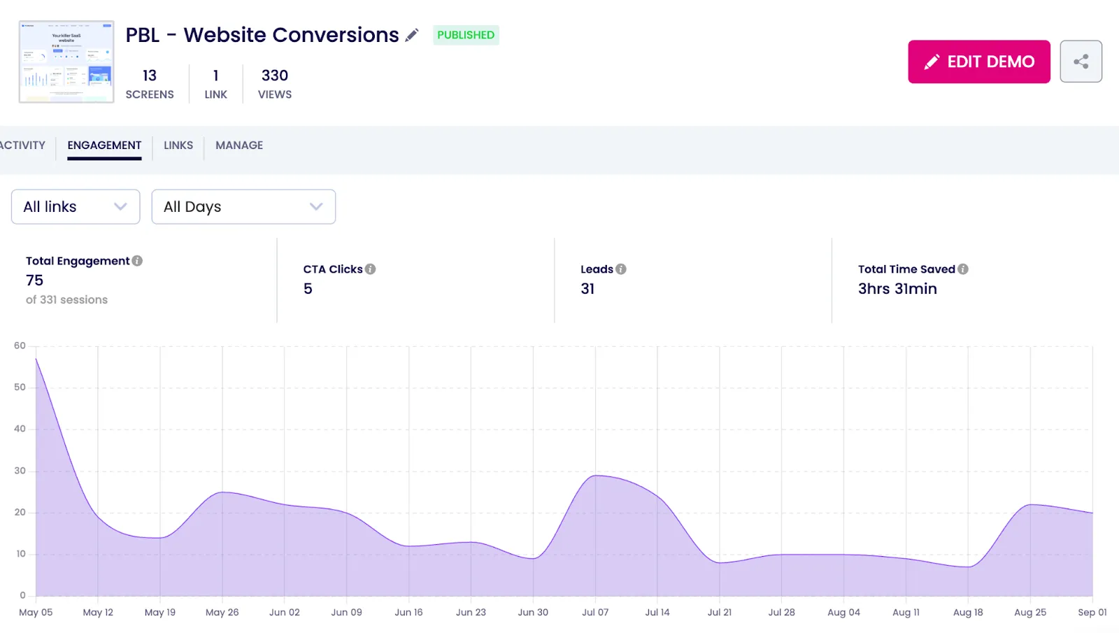
Attention spans are short. Most visitors won't commit to a 14-day trial right away. Interactive demos provide a taste of your product, convincing them to book a live demo without the hassle of a trial.

Fulcrum's website demo resulted in 32,000 impressions, 280 hours of watch time, and most importantly, over 400+ qualified leads .
When you first show your product in action, prospects get to decide if the product is best for them. And thus, only those with high buying intent would book a live demo, making it easier for you to close them.
2. Optimize copy and visuals for conversion
Here's a fact - if you want more signups, don't hide your demo CTAs. Add one in the hero section and another one towards the end of your landing page. This ensures that no matter how they scroll, your prospects never miss it.
Gong places its demo button in multiple, easily accessible places, including at the header, the middle, and the footer of their landing page.
CTA at the header:
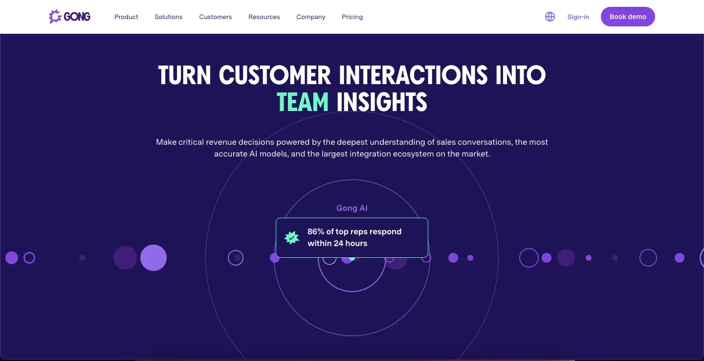
CTA at the footer:
Use easy-to-understand demo button CTAs for better conversion.
"People coming to your homepage for the first time will probably give you a few seconds to grab their attention, and your CTA must be obvious, trustworthy, quick, and easy to execute."
— Paul Gordon, founder of Mypresences, in Databox's blog on increasing free trial signups.
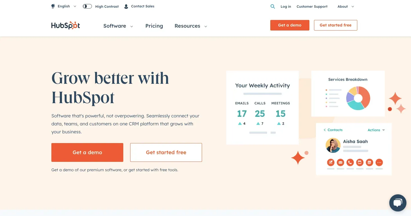
That means CTAs like 'Book a Demo' or 'Get a Demo' are better than something creative but misleading. HubSpot's demo call-to-action is the perfect example of this.
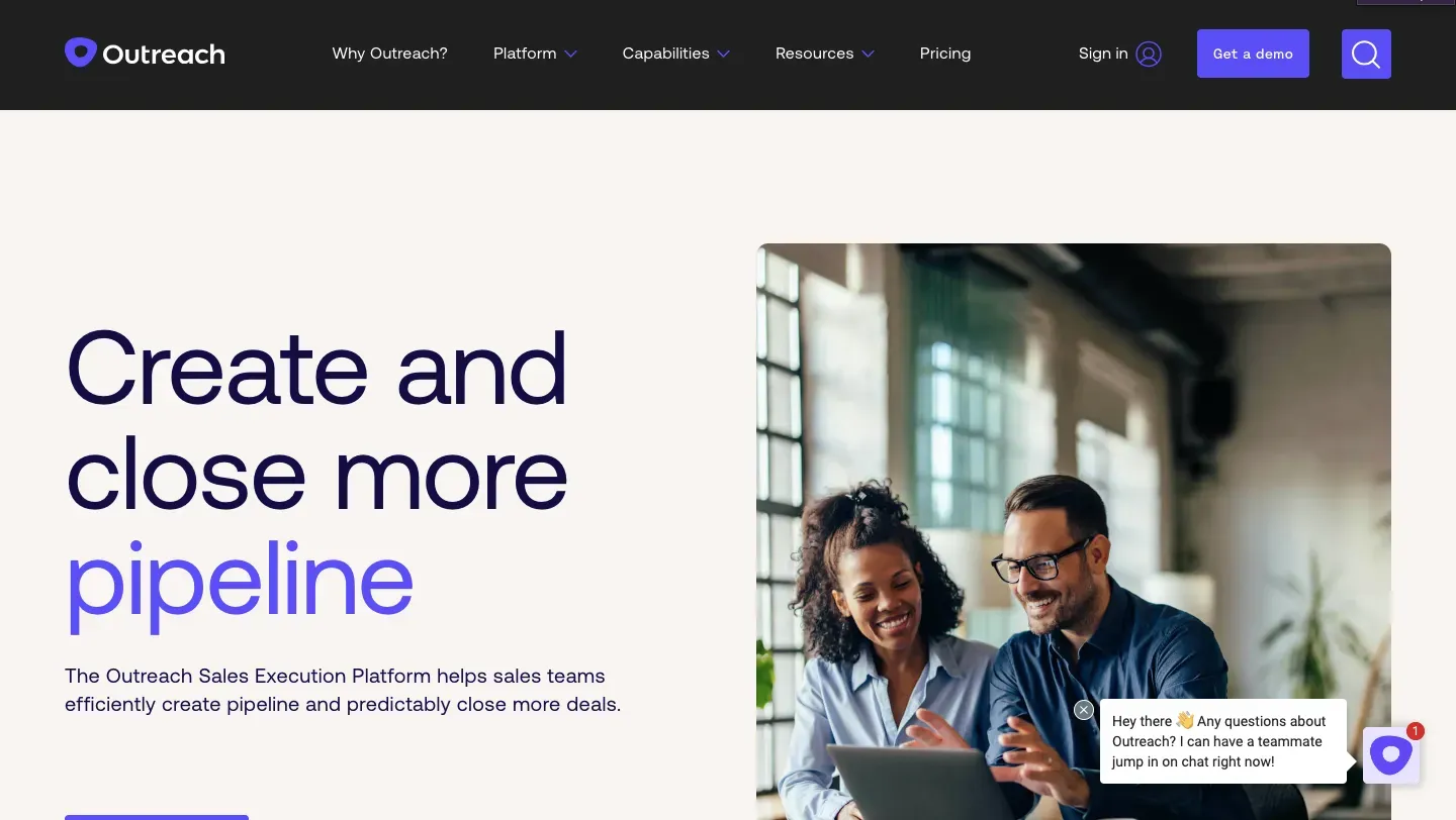
It's not always the demo button; sometimes, it is a timely pop-up asking prospects if they want help that does the trick. Nudging them with a live chat option this way is especially effective if they've spent some time on your website.
Outreach, the sales execution platform's live chat, appears to ask if you want help from their sales team every time you enter their website.
3. Reduce friction in your lead capture form
What makes every demo-ready prospect regret their decision to check out a demo and bounce off the website? A demo signup form with multiple fields asking prospects every single detail about their business.
"Keep it simple and clear. Use precise CTAs that tell prospects exactly what to do. A prominent and bright CTA button also helps."
—Krithika Raj, a Product Marketer at Klenty
For SaaS websites looking to increase demo request submissions, the key is striking the right balance between gathering qualification data and maintaining a frictionless user experience.
So, ask only the most basic details through your demo signup forms, like their email address.
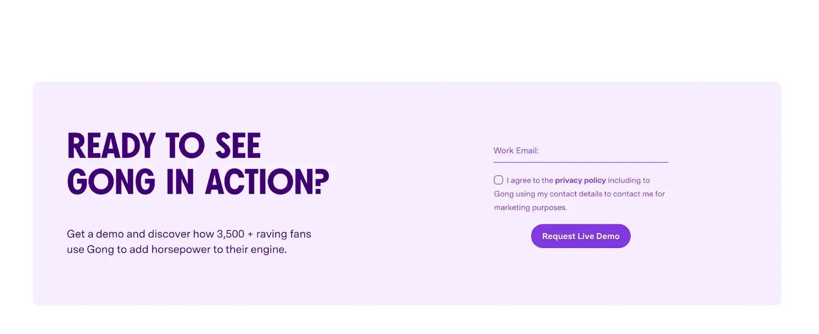
Bonus: consider adding a meeting scheduler to your 'Request a Demo' page
The demo booking and the meetings booking can often be a game of email back-and-forth, which creates a lot of friction. Meeting schedulers help avoid this.
Give your prospects the control to pick a convenient date and time.
No one has to wait for the sales team’s response — if they’re convinced, they will get a slot right away.
Scheduling tools like Calendly, Chili Piper, or Hubspot allow prospects to book their favorable slot.
Here’s how effective product demo scheduling should look on your ‘Request a Demo’ landing page —
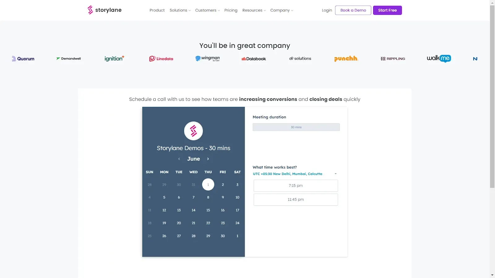
Take note of the following when offering the slots through the scheduler:
- Maintain a range of 3-7 business days.
- Keep default time slots of 30-45 minutes.
- Consider the time zone factor for international prospects.
4. Optimize Bottom of the Funnel (BOFU) pages for conversion
If the demo page is the final destination of your prospect's journey, bottom of the funnel (BOFU) pages are the milestones they should cross to get there. And they won't care about getting to the demo page if going through your BOFU pages feels like a chore.
To avoid this, optimize each of your BOFU pages for better conversion. Here's how:
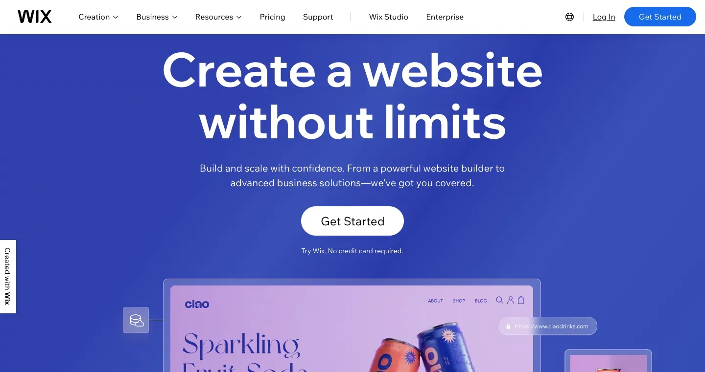
A. Home page
If you lose your prospects here, you lose them forever. So, always ensure your home page is captivating enough to nudge them to check out other BOFU pages or, in the best scenario, book a demo directly. This includes streamlining everything from the page load speed, UI, white space, brand colors, fonts to the copy.
Wix's landing page is the perfect example of this. It has:
- Great user interface (UI)
- A perfect balance of negative space and design elements
- Usage of complementary colors, and just 2 primary colors
- Great contrast of white against blue
- Copy is short and inclusive of their main value proposition - that is, anyone can build a website.
B. Top feature pages
Here's a cardinal rule- never ward them off with jargon-heavy feature pages. Stress on the difference your product will make in your prospect's current process and not on the nuances of every feature. And like any other page, focus on striking the right balance between white space and design elements.
Next, decide on the number of pages you need depending on the complexity of your product. For instance, if it is a simple tool with a single use case, you can explain all your features on one page. On the other hand, use multiple pages if it is a complex one with multiple use cases. The end goal is to make your prospect aware of the results your product can deliver in the most lucid way.
Airtable's feature pages are a good example, as they have:
- Creates a visual hierarchy by using extra-large fonts in the title.
- A clear navigation bar, ‘Home> product> Interface Designer’ to keep the reader in the loop about where they’re at all times.

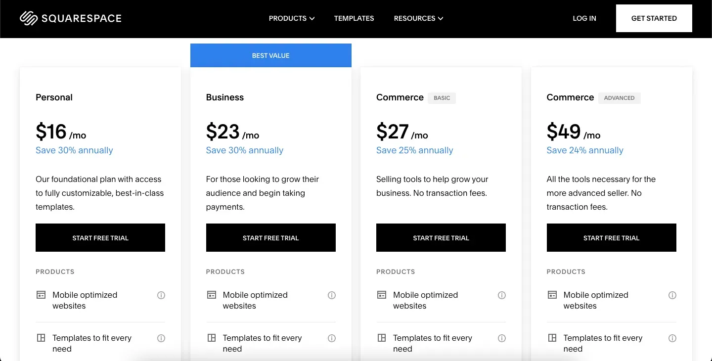
C. Pricing page
Your prospective customers crossed the home page milestone, visited the feature pages, and are headed towards your pricing page before signing up for a demo. And the question is will your pricing page make the cut? Definitely, yes, if you follow the following optimization tips:
- Name your plans to make them memorable.
- Use the technique of anchoring, where you bring an expensive pricing tier to make another tier look affordable.
- List out only the key features in the first fold to make sure the page is scannable. (Note: detailed features can come in the second fold in a pricing-feature comparison table.)
Squarespace's pricing page is the best example of this. They have highlighted the USD 23 version as “Best Value”.
"Most SaaS user journeys involve the pricing page as a near-final step. Ensure your pricing page is well-highlighted with CTAs for both 'Book Demo' and navigating to the pricing page.“
—Karan Chaudary, Product Marketer at Uniqode
Karan suggests keeping them easily accessible alongside your demo signup button. This compels users who are engaged with your pricing and features to take the next step and book a demo.
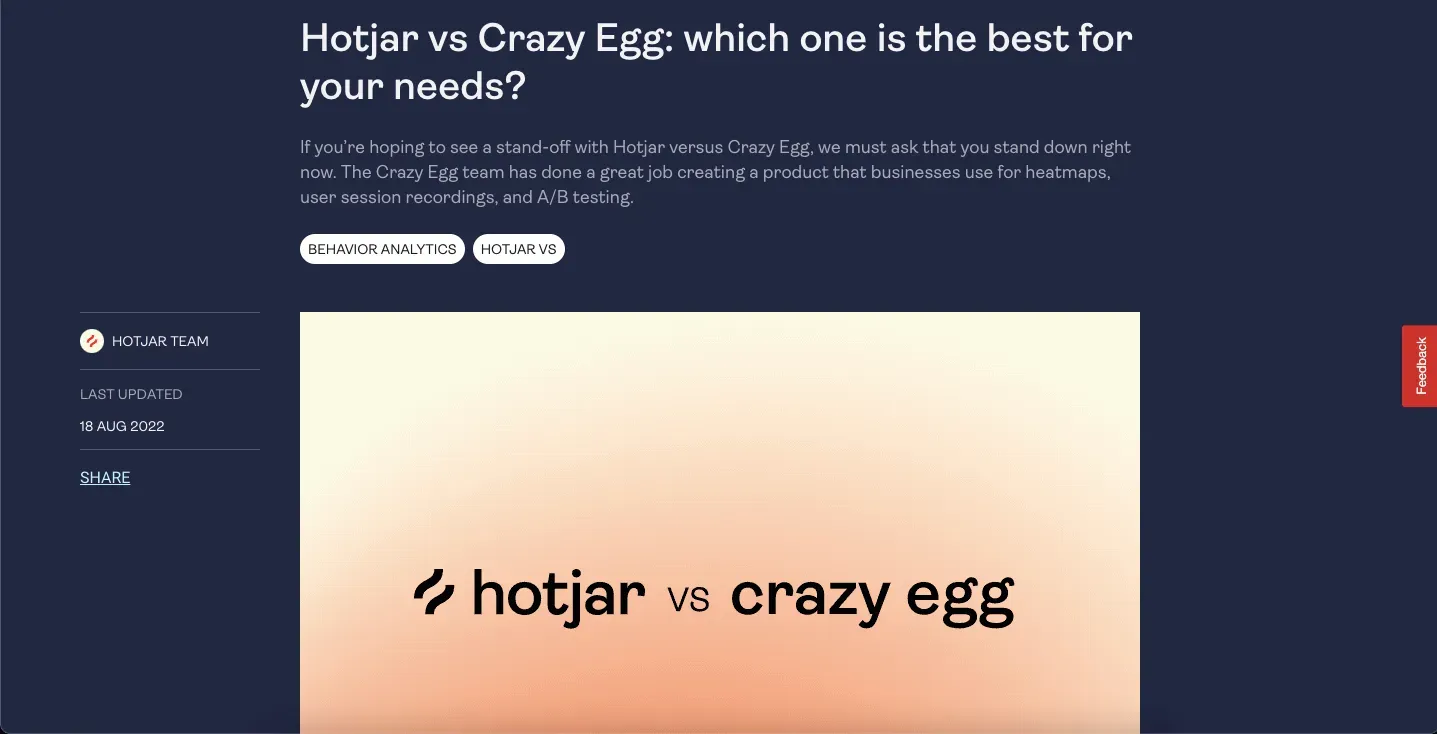
D. Competitor comparison pages
A word of caution: a competitor comparison page is not a place to boast at length about your product or take a jibe at your competitors. And when visiting this page, your prospect wants to know one thing - 'is your product better suited for them than your competitor's?" The best way to convince them about this is through a clean UI and engaging copy.
Here are some tips to optimize your competitor comparison pages:
- Define your unique selling proposition (USP) and focus your narrative around that.
- Focus only on the most important product features to ensure you are not confusing the prospect.
- Establish a clear distinction between your ideal customer persona and your competitor's.
- Use software marketplace reviews and customer testimonials to base your claims.
Hotjar's page comparing Hotjar with Crazy Egg is an example of a well-optimized and engaging competitor comparison page.
BONUS: If your product offers multiple solutions, showcase them all! Create targeted BOFU pages addressing each use case.
This helps more people understand the value proposition and the need to buy your product without diluting the value prop by being everything to everyone.
"Create a variety of BOFU content to appeal to a broader audience. Develop customer stories and case studies that showcase how your product solves problems.”
—Gowthami Vasu, CRO at Klenty
5. Leverage Account-Based Marketing (ABM) campaigns to increase signups
Even with optimized BOFU pages, some visitors won't convert to demo requests. But that doesn't mean they're lost forever. Targeted ABM campaigns can help recapture their interest and nudge them towards a demo.
Here's how to utilize ABM for increased demo requests:
- Use sales intelligence tools to identify potential buyers who visit your BOFU pages.
- Develop personalized content like webinars or case studies tailored to their specific needs.
- Run targeted ads to stay top-of-mind and re-engage these prospects.
By optimizing your ABM efforts, you give yourself a second chance to convert website visitors into demo bookings.
Optimize your demo request landing page for higher conversions
Driving traffic to your demo pages is only half the battle. The real challenge lies in converting those visitors into qualified demo requests through strategic on-page optimizations.
While your homepage, feature pages, and BOFU content bring prospects to your demo request page, the landing page itself needs to be optimized to turn interest into action. Here's how to improve demo request conversions with proven design and conversion tactics:
Design elements that drive conversions
Your demo request landing page needs to make visitors stay, engage, and ultimately sign up. Here are the critical design elements:
I. Use clear and concise headlines in your demo pages
A short and smart headline goes a long way, and your demo sign-up page deserves to have one!
It serves as the first impression and determines whether visitors will stay and explore further or bounce away.
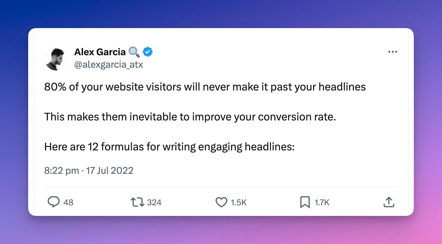
To create headlines that convert:
- Craft a clear and concise headline that captures attention and communicates the value of the demo.
- Avoid generic phrases and highlight your product's unique value proposition
- Aim for clarity and brevity to capture attention quickly (humans have an attention span of just 8.25 seconds)
- Make sure it is speaking to your target audience
II. Make sure to use high-quality visuals
Add product video or, preferably, interactive product demos on your demo request page for a better experience.
For instance, Productboard uses Storylane's interactive demos to create an immersive experience that showcases the product before prospects even book a live demo.
When adding demos to your landing pages:
- Aim for a demo length of around 45-60 seconds
- Focus on highlighting key benefits and features that differentiate your offering
- Craft a narrative that resonates with your target audience - use success stories to add credibility and relatability
- Ensure the demo is responsive and mobile-friendly
- Include a prominent CTA after the video, such as "Request a Demo" or "Get Started Today"
III. Add social proof to gain trust
9 out of 10 customers trust reviews and testimonials on landing pages. Customer testimonials and reviews can significantly impact the conversion rates of demo request pages.
Things to include in social proof:
- Results achieved or problems solved - show direct value
- Client logos, profile pictures, or video testimonials - enhance authenticity and engagement
- Client testimonials ideally near the CTA - so visitors can easily access them
- Add relevant reviews (Scour G2, Capterra, and other review sites; you might be sitting on a goldmine of social proof)
Demo request page examples and key takeaways
Let's analyze 3 popular tools’ demo request landing pages and what makes them work:
1. Notion
Let's take a look at Notion’s ‘request a demo’ landing page example:
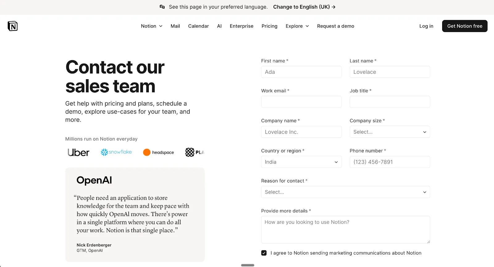
Notion's demo request page showcases several strengths:
- The copy cleverly incorporates a bulleted list of what's on offer
- The black CTA button stands out and contrasts nicely with the white background
- Notable logos
How it could be better:
- Instead of the generic "Submit" button text, options like "I Want a Demo" or "Schedule My Demo" could create more urgency and excitement <this is minor, but adds personality + it works with Notion’s playful brand identity>
Important nuance: The Number of form fields might seem a lot, but for Notion’s sales context, this is strategic. Their freemium motion is already frictionless, so this serves to ward off potential tire kickers.
2. Segment
When we search for "best marketing automation," we land on the following page:

Segment's demo landing page demonstrates strong conversion principles:
- Features prominent social proof (25,000+ businesses) with recognizable company logos to build trust
- Well-balanced white space makes the page easy to skim and provides a pleasant user experience
- A clear value proposition is immediately visible
- Just 4 critical fields—as frictionless as it gets
How it could be better:
- Adding media elements, like hero images of the platform, increases visual appeal
- Removing footer links helps prevent distraction and improve conversion rates
3. HockeyStack
Finally, let's take a closer look at an older demo landing page of HockeyStack. (They have since changed it, but it’s still gold.)
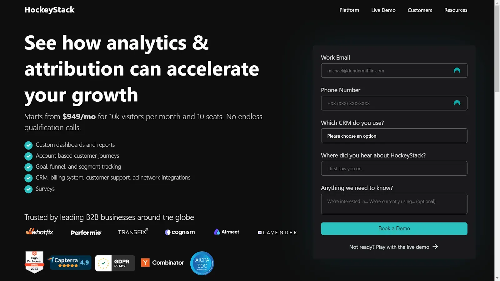
HockeyStack's demo request page excels in transparency:
- A compelling headline immediately communicates the offering and package value
- Bullet points draw attention to important information, making the benefits quickly digestible
- Pricing range is clearly mentioned, so prospects can self-qualify based on budget
How it could be better:
- Adding a product video or interactive demo would enhance the prospect's experience
- Providing an embedded scheduler would reduce friction and drive faster conversions
Key Takeaway: The most effective demo request pages combine clear value propositions, minimal friction, strong social proof, and strategic use of visuals. Test these elements on your own page to see what resonates with your audience.
Frequently asked questions about improving demo requests
“How long should a demo request form be?”
Keep it to 2-4 fields maximum. Collect email and company name at a minimum. Only add fields like job title or company size if they're critical for sales qualification—but know that longer forms will reduce conversions.
“What's a good conversion rate for a demo request page?”
Average conversion rates vary by traffic source: homepage visitors convert at 2-5%, pricing page visitors at 10-15%, and BOFU content at 5-8%. If you're below these benchmarks, focus on reducing form friction, strengthening your value proposition by showing your product, and adding social proof.
“Should I include pricing on my demo request page?”
If you have transparent pricing, mentioning the starting range helps pre-qualify leads and saves time on unqualified prospects. For custom/enterprise pricing, focus on value and ROI instead. A middle ground is stating "Plans start at $X/month" to set basic expectations.
“How do interactive demos impact live demo request rates?”
Interactive demos typically increase live demo requests by 15-30%. They pre-qualify prospects and build confidence before booking a sales call. The key is ending your interactive demo with a clear CTA to book a live demo, highlighting what they'll get in a personalized session.
"How do I reduce no-shows for scheduled demos?"
Send confirmation emails immediately after booking and reminder emails 24 hours before the demo. Keep the time between booking and demo under 48 hours when possible, and use calendar invites with clear meeting links to set expectations and improve attendance rates.
"How do I qualify demo requests before wasting sales time?"
Use interactive demos for pre-qualification—they filter out tire-kickers naturally. In your form, ask 2-3 qualifying questions: company size, role, and use case. Meeting schedulers also force commitment. Finally, check email domains and job titles before confirming the booking.
"Do interactive demos reduce or increase live demo requests?"
Interactive demos increase live demo requests by 15-30%. They don't cannibalize sales calls—they improve lead quality. Prospects who explore your product first come to sales conversations better informed, with specific questions. This shortens sales cycles and reduces no-show rates significantly.
"How soon should I schedule demos after request?"
Within 48 hours maximum. Interest decays fast—every day you wait reduces show-up rates. Offer a 3-7 day booking window in your scheduler, send automated confirmation immediately, and trigger a 24-hour reminder. Faster response times correlate directly with higher conversion rates.
You've learned the strategies—now it's time to implement them. Show your product and boost demo requests with interactive demos—get started with Storylane for free.
Related Reading
- Awesome Interactive Demo Examples
- Live Sales Demos: All You Need to Know


.svg)

.webp)