.svg)

A free trial landing page is your real estate to win product signups. And to do so, you need to:
- Focus on your design and copy
- Include social proofs to build upon credibility
- Embed product tours to elevate the chances of signup
But, the question stands still—HOW?
In this article, we'll break down for you:
- The different elements you need to include in your free trial landing page
- Examples of stunning landing pages to take inspiration from
Why Use a Free Trial Landing Page?
Picture this: you enter your favorite store for shopping. You go through their collection and pick a few clothes to try on.
And the moment you go to the trial room, the salesperson comes in to tell you that you can only try the product once you have paid for it. 😶
Do you think you'd pay for the trial? Probably not. Reason? Even if you liked the clothes you picked, you still don't know whether it will fit you perfectly or suit your personality.
And that's also, surprisingly, the same for software products. You need a free trial to assess what the product looks like, how it functions, and whether or not it fits your unique needs.
But how would the visitor who *just* landed on your website to know whether or not they can get a free trial for the product? This will naturally leave the visitor confused and they might leave the website without taking further action.
Result? You lost a new lead.
For example, when a visitor explored Fitbit's website, they failed to understand how to activate the free trial. Reason being, no free trial landing page. The directions were unclear because they could only activate a free trial by clicking on the 'premium' option.
While this visitor reached out to Fitbit's team on Twitter, most prospective users don't.
SaaS companies with PLG motion aim to reduce friction, and that's why you need to prevent such scenarios from unfolding.

The best way to do so is by building a free trial landing page.
With the help of a free trial landing page, you can:
- Provide relevant information about your product to get the visitors to sign up for the product.
- Convert the traffic on your website to product signups.
Even if these prospects who signed up for the free trial do not convert, you can nurture them further to convert them to paying customers later.
What should your free trial landing page include?
We observed a pattern that most free trial landing pages include. Below are the elements that even you should include when building landing page:
- Sign up form. Your sign-up form should be succinct. It should include the most important you want to capture about the prospect—their full name and email address. However, if you want to filter out leads based on your sign-up form, you can include additional fields such as company name and designation of the person.
- Work email. Mention work email clearly especially, if you want to filter out prospects who do not use their professional email address. Provide two different options to the prospects to fill up their details—Google and work email sign-up.
- Credit card information. For users, having to add their credit card information is friction and they are likely to leave the sign-up page. To avoid this scenario, clearly mention whether credit card info is needed or not.
- Number of clicks required to sign up. Some websites use multi-step forms for signup. And when this happens twice or thrice, prospects tend to leave the sign-up page. So, minimize the number of clicks required for signup.
How to Build a Free Trial Landing Page
Below are some of the best practices that will not only help you build your effective landing page but consistently help improve it for conversions.
- Don't clutter the page with too much text/visual elements
Too much text or visuals on the landing page can overwhelm the visitor.
Some visitors even find such landing pages spammy. And the rest of them find it boring enough to leave without taking any action. So, you should find a balance between the textual and visual representation on your landing page.
For instance, AIPRM, a prompt management tool’s homepage is loaded with big blocks of text.

The bigger chunks of text make the landing page overwhelming for the visitor, ultimately forcing them to leave the website.
Instead, take a look at this Filestage's homepage.

When the visitor lands on this page, they get a cleaner look. It has:
- Shorter texts
- Visuals
- White spaces
- Hyperlinks to CTA
- Write conversion-focused copy
With an impactful copy, you can win more free trial signups. But for this to happen, you need a high-converting landing pages copy that helps you achieve your goal
When we asked two copywriters how to write a conversion-focused copy. Here’s what they say:
Dana Nicole, Copywriter who wrote the landing page copy for Moovly shared, "I spent lots of time researching before I wrote a single line of the copy.
I had the client fill out a questionnaire that I used as the base of my research. From there, I spent hours in the spaces my client’s customers hung out. I wanted to figure out their goals, their pain points, and what they wanted from the software they used.
- I combed through online reviews (for both their software and their competitors), relevant Reddit forums, Facebook groups, Slack channels, and anywhere else where I could learn about their target audience.
- By doing this, I discovered their biggest pain points, which served as the basis for the landing page. I also found common phrases and words the target audience used to describe their pain points. This is known as the voice of customer (and I integrated it into the landing page to make it more impactful).
To write an ROI l-driven copy, you need to double down on research as the first step, and only then draft your copy.
Besides this, Dana also shares the two most important things your landing page should include:
- Social proof
"Although free trials are low risk, the prospect still might have reservations as to why they wouldn’t want to sign up (and you’ll uncover those reservations through your research). For example, they might worry the software has a steep learning curve. So, include testimonials (from people just like them) to hammer home how easy it is to use."
- Voice of customer
"Always include the voice of the customer (VoC) in your free trial landing page (and any landing page, for that matter!). VoC makes your prospect feel understood, and it helps you take a more empathetic approach to your landing page copy.
Lizzie Davey, a SaaS Content Writer and Strategist has a similar take when asked about the most important element of free trial landing page:
“It’s the social proof. A free trial is free, so it’s not a huge decision for someone to make. However, the decision is made a lot easier if you can show people they resonate with enjoying the tool/solving their problems with this. I always suggest having a dedicated free trial signup page for different use cases so that you can get really hyper-specific with problems, use cases, language, and testimonials/reviews.”
- Pay attention to the visual hierarchy
When a visitor sees the unclear visual hierarchy on your landing page, they feel confused. They don’t know what their next action should be on your landing page—eventually forcing them to drop off the page.
Yes, you may be told that the copy of the landing page is the most important element that leads to conversion. But what about the design? It is the visual hierarchy of the landing page that appeals to the visitor first encouraging them to decide whether they should take the first action or not.
The visual hierarchy of your landing page is the deal breaker for user experience, which directly impacts conversion rate optimization.
When your landing page has a clear hierarchy, the visitors know where to look first and what action to take next making their navigation on your website easier.
For a clear visual hierarchy, make sure your designers follow the 6 core principles:
- Reading patterns
According to a study called Visual Hierarchy and Viewing Behaviour: An Eye Tracking Study, humans view design patterns in two different cognitive processes: searching and scanning.
The first phase, searching requires the reader to find the entry point. For example, when visitors land on your homepage, their entry point in this phase will be the CTA ‘free trial’.
The second phase, scanning requires the reader to extract the information around the entry point. For example, on the homepage, after seeing the CTA, they’ll read the headline and sub-headline, and then click on the CTA.
There are two common reading patterns that people use to search and scan on websites: F-pattern and Z-pattern.
- F-pattern: It consists of two long horizontal scans and one long vertical scan, resembling the letter F. To use this reading pattern, align your most important information needs to be on the left, and make use of short headlines, bullet points, and paragraph blocks. This pattern is mostly used in articles and blog posts.
- Z-pattern: It consists of two long horizontal scans and one vertical scan in slant, resembling the letter Z. To use this reading pattern, information is not presented in block paragraphs. The most important information is first placed at the top, then goes to the opposite corner at a diagonal, and then moves to the lower part of the page for a horizontal scan. Most copywriting formats such as ads, websites, and landing pages use this reading pattern.
- Scale
Scale determines the relative size of each element in your landing page design. This helps viewers scan your design easily and understand your message faster.
That's the reason your headline or tagline on the homepage is bigger.
On your free trial landing page too, the scale of your headline will be bigger as compared to the signup form.
- Color Contrast
The colors you use on your landing page impact viewers' attention.
For instance, when you use dark-colored text over dark-colored background or light-colored text over light-colored background—it impacts the visibility of the landing page.
The rule of thumb should be to use lighter and darker colors together.
- White Space
According to the proximity design principle, visuals or texts that are closely placed together are seen as single, even when the two are separate units.
On a landing page, if you neglect white spaces, it tends to create visual clutter—impacting the visitor's reading experience.
That's why, one of the best practices is to leave white spaces between both the visuals and texts.
- Content Format
When designing the landing page, you need to focus on the content format. This format will go in descending order for visibility i.e.,
- Videos and GIFs
- Images with faces
- Images
- Icons
- Shapes/ lines
- Text
If your free trial landing page has two sections—the first section is, the sign-up form, and the second is, a video with a testimonial at the bottom.
The viewer will focus on the video first, then the signup form (as it has action buttons), and lastly, the text.
- Layout
How you position each element matters. Above, we talked about the reading pattern that follows a cognitive system. It's the same for the positioning of each element. Humans tend to focus on the highest visibility areas i.e., top left to bottom.
Think about yourself: have you ever opened a landing page, scrolled down to the bottom, and then scrolled up? No, right!
That's why you need to follow this positioning pattern so that the viewer focuses on the elements with the highest visibility first.
6. Put all attention on the signup form
On your free trial landing page, besides the design and copy, the most important element is the signup form. Prioritize it.
Be thoughtful about the fields you include in the form and the types of questions you ask. Make sure your form is as short as possible. Prospective users don't like to fill out the signup form that will take the next 5 minutes to get started.
Your signup form should include an email address field, and the hyperlinked CTA button to access the product. That's it!
To make sure you get the most out of your signup form, ask yourself the conversion goal of the form. Is it to capture the visitor's details or is it to qualify the MQLs?
If it's the latter, you'll include some additional fields in your signup form such as:
- Nature of work (self-employed, contractual, enterprise, small business, student, and so on)
- Company Name
- Designation
- Purpose of using the tool (you'll give a few options based on your use cases)
These fields will help you understand the user better, qualify them, and nurture them later.
When you create and add these fields to your form, be mindful of the types of fields you include:
- Short text
- Long text
- Drop-down
- Multi-select
Having these distinctions of fields will help you build your form better.
Also Read: How to Improve Your MQL to SQL Conversion Ratio?
7. Generate UTM Parameters for the Links
It's good to see visitors coming to your free trial landing page and signing up for your product.
But the question is, how are you tracking these visitors? How did they find you?
Maybe they found you through one of your social media channels—but which one?
Maybe they read a content piece you wrote—but which content asset? It could be a case study, a social post, a webinar, or something else.
You need to know the exact source to be able to track your marketing efforts and improve conversion rates. Using UTM parameters can help you identify this.
For this, you can simply use platforms like Bitly or Cuttly.
Simply paste your landing page URL and add UTM tags such as utm_medium, utm_source, utm_campaign, utm_term, and utm_content.
For example, for your free trial landing page, your UTM tags would look something like this:
- utm_source: website-case-study
- utm_medium: website
- utm_campaign: product -signup
- utm_term: free-trial
- utm_content: case-study-free-trial-button
Once you add these UTM tags, a UTM link will generate—which you can shorten and use.

Later, you can track these UTM tags in Google Analytics and track the landing page performance for ROI and conversion optimization.
Side note: When adding UTM tags, you can skip a few tags such as utm_term and utm_content.
8. Add Typeform/CRM integration to collect data and send it to CRM
When a prospective user signs up for the free trial of your product, you naturally want to collect the data. You can capture this information into your CM, for which, you need to automate the data collection process.
To do this, use form builders such as Typeform or Jotform that will help you create your free trial sign-up form and embed it onto your website.
When you embed the signup form on your landing page, the information of visitors (who have filled out the information) gets captured in the Typeform or Jotform database.

But if you want to further elevate the process, you can use integration with your CRM. For example, these form builders provide direct integration with some of the common CRMs such as Hubspot and Salesforce. In case, direct integration is not available, you can integrate the platforms with Zapier automation.
9. Test, Improve, and Iterate on Your Design Based on User Behavior
A landing page is the test drive for your target audience. For sure, having a free trial landing page will improve your product signup conversions for you. But here's the thing: visitors might be dropping off without converting too.
Maybe they took the first action i.e., clicked on the CTA, and filled out the first two fields of the form, and dropped off. That's disappointing.
When we asked Lizzie about a best practice to create the free trial landing page, she continued, “I’d also recommend testing out the signup page with your target audience. This will help you understand if they have any questions, what information they’re looking for, or whether you’re giving them everything they need to make a decision.”
You need to constantly check the performance of your landing page. Analyze the points where the visitors are dropping off, interpret the reason behind it, and improve.
Use tools like Hotjar to visualize your landing page conversion and spot where most users drop off your landing page. This will help you identify the real reason behind the drop-off.
Tweak the elements of your free trial landing page and create different variants to test against each other. By A/B testing the different elements, you can identify what works for your target audience, and which elements of the landing page lead to better conversions.
5 Best Free trial landing page examples for inspiration
We observed five free trial landing pages that we are sharing with you and breaking down the landing page elements used.
Example #1: Mailmodo
Mailmodo's vibrant purple color CTA, 'Try FREE for 21 days' draws attention as soon as you land on the homepage. It is clubbed with another CTA on the side 'Talk to a Human' with the faces of Mailmodo's team members—making the homepage more interactive.
Below this, Mailmodo shares the results they have achieved, which strengthens the prospect’s trust in the brand.
Besides these CTAs, you’ll see a video chat option. In the video, you’ll see a real human interacting with you through his actions.

When you click on the chat option, you'll see two options— to leave a message for support agents or to book a meeting.
On clicking the 'Try for Free for 21 Days' CTA, you'll land on the signup form.

Here are the elements featured on Mailmodo's landing page:
- No credit card required checkmark
- Two types of sign-ups—Gmail and Work email
- The password which instructions to have at least 8 characters
Why does this work: It removes friction by mentioning 'no credit card required' and 'no commitment' on top.
Example #2: Storylane
Storylane's homepage features two buttons on the header 'Book a Demo' and 'Start Free'.
Below the sub-headline, it features two CTAs again—’Book a Demo’ and ‘Take a Tour’.
When you click on the ‘Take a Tour’ button, it will direct you to Storylane’s guided product tour. After showing you the inside view of the product and how you can navigate through the platform, it shows a dialog box with a ‘Book a Demo’ button.
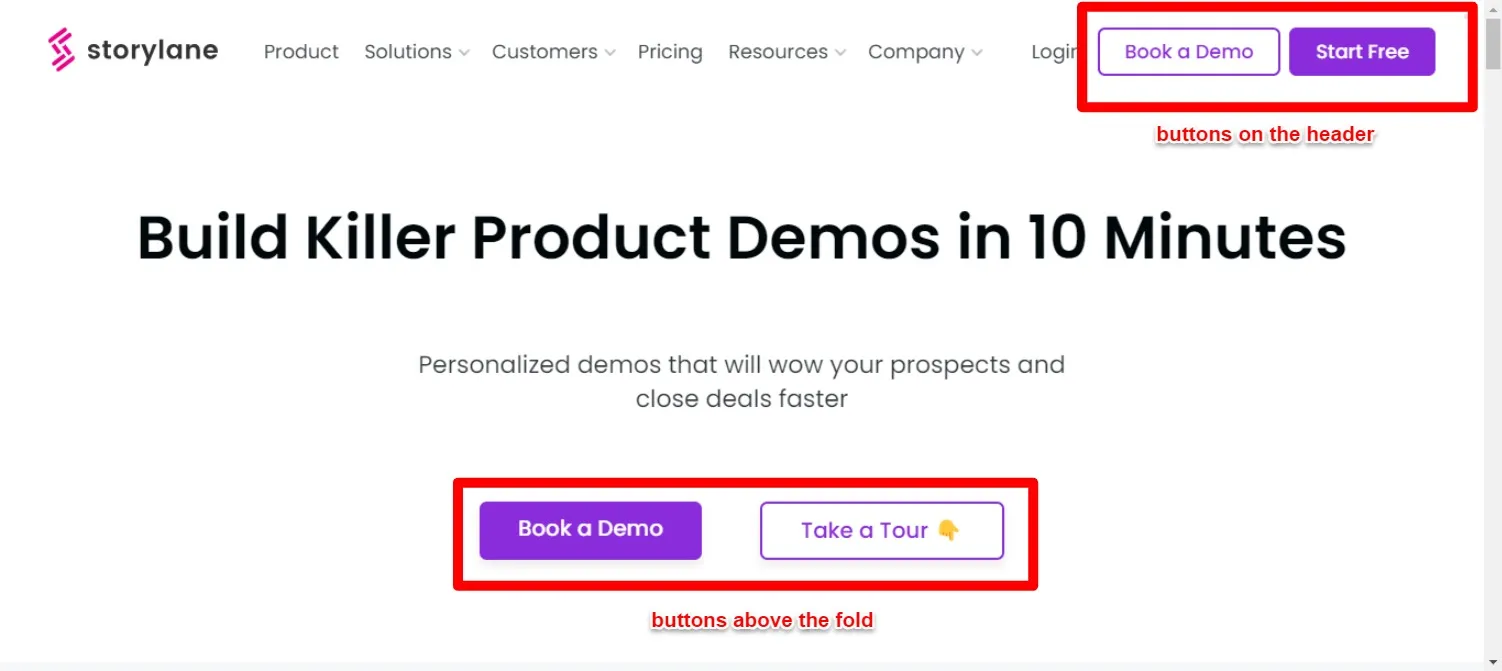
When you click on the 'Start Free' button, you'll be directed to Storylane's free trial landing page.

Here you'll see elements the following elements:
- Sign-up form, which includes two options—Google sign-up and work email
- Social proof that showcases the number of trusted customers Storylane has, customer logos, and a testimonial.
Why does this work: When the landing page displays the exact number of trusted customers Storylane has, it confirms to the visitor that they can trust the brand.
Plus, the customer testimonial strengthens the brand's credibility which further encourages the prospects to sign up for the free trial.
Example #3: Fireflies.ai
Fireflies.ai showcases two buttons on visiting the homepage—' Get started for free and 'Request demo'.

On clicking the 'Get started for free' button, you'll see the landing page. This page features a tagline and sub-headline highlighting the benefits.

Here you'll see elements such as:
- Two sign-up options—Google and Microsoft
- Visual and social proof on the side
- Hyperlinked question note below the signup options sharing why the product needs access to the user's calendar
Why does this work: It builds credibility by displaying customer reviews. Plus, they showcase transparency by sharing why they need access to the user's calendar.
Also Read: 7 Tips to Boost Conversion Rates on ‘Request a Demo’ Landing Page [With Examples]
Example #4: Moovly
When you explore Moovly’s homepage, the first element you’ll see is its tagline, headline, and pink color ‘Get started for free’ button.
Below the fold, you’ll see an interactive explainer video Moovly has embedded to deliver its message about what the software does.

On clicking the ‘Get started for free’ button, you’ll be directed to Moovly’s free trial landing page.
Here, you’ll see some of the elements such as:
- The sign-up form includes fields like the prospect’s first and last name, the language they’d use the software in, their work type, and email address.
- Social proof i.e., awards Moovly earned from G2 and the list of customer logos.

Why does this work: Instead of a customer testimonial, Moovly features the awards they earned from G2.
This showcases their strengths i.e., the company has been the best performer and provides the best support to small businesses. When they club these awards with the list of customers they have worked with, it encourages the prospect to sign up for their product.
Also, with the help of their sign-up form, they are qualifying the prospects who are signing up for their product. The question about the nature of work the prospect does tells whether the prospect is MQL or not.
Here’s where it gets interesting: when the prospect selects the option ‘Large Enterprise (500+ employees)’, they see another additional field ‘What type of video would you like to make?’ This gives them insights about the prospect and how they can leverage this information to nurture the prospect further.

With this information, Moovly can qualify the prospects based on the nature of the organization and nurture the qualified prospects further.
Example #5: Filestage
On visiting Filestage’s homepage, you’ll see two buttons in green bright green color—’ Start free trial’ and ‘Book a demo’.
Below these buttons, you’ll also see three checkmarks:
- 7-day free trial period
- No credit card needed
- GDPR-compliant

When you click on the ‘Start free trial’ button, you’ll see Filestage’s landing page.
The free trial landing page features the following elements:
- Sign-up form with two options: work email and Google sign-in
- Mentions that the sign requires no credit card
- Social proof on the side with custom graphics—Firestage’s customer logos

Why does this work: The landing page mentions that the prospect doesn’t need to enter credit card details, which removes the friction. Plus, the social proof of the side encourages them to take action i.e., sign-up for the free trial.
Ready to Increase Your Product Signups?
Based on our observation, we can say the most common element almost every free trial landing page has included are the two opt-in options for the email address - Google signup and work email address signup which asks the potential customer to create a password.
However, suppose you are currently following the same pattern on your landing page, and want to increase the product signups. In that case, we recommend you to include either of the two elements: product tour or customer reviews. Now, go—optimize your landing page and elevate your signup rate👯