
Quick summary
Making a Framer website responsive means configuring layouts, text, images, and breakpoints so your design automatically adapts to any screen size. This walkthrough covers every key setting — from New Project setup to hitting Publish — so your site looks great on mobile, tablet, and desktop.
Steps
- Click New Project to start a Framer project with responsiveness in mind from the beginning.
- Add a Text element that dynamically resizes based on viewport width.
- Name your project to keep track of your adaptive design work.
- Use the preview to see how your changes respond to different screen dimensions.
- Use the hex code selector to customize your color palette for consistent styling across devices.
- Open Layout options to control how elements behave across different viewports.
- Add a responsive Image element that scales proportionally with the viewport.
- Click Choose Image to upload images that resize dynamically without losing quality on any device.
- Use the Crop tool to focus on image areas that remain important across all screen sizes.
- Apply Crop again to ensure images look great on everything from phones to desktops.
- Create touch-friendly call-to-actions that work on both mobile and desktop devices.
- Adjust your layout to maintain visual flow across different screen sizes.
- Use Add Stack to organize elements that automatically align on different screens.
- Set TRBL (top-right-bottom-left) spacing controls so padding adapts to screen sizes.
- Position elements with relative units instead of fixed pixels for better responsiveness.
- Style your Body text to ensure readable typography on all devices.
- Select the Inter typeface for legibility that scales well across all device sizes.
- Use Link To for navigation that works seamlessly across all device types.
- Toggle to Tablet view to check how your design adapts to mid-sized screens.
- Set responsive Breakpoints for different screen sizes.
- Check content overflow and readability at each breakpoint before finalizing.
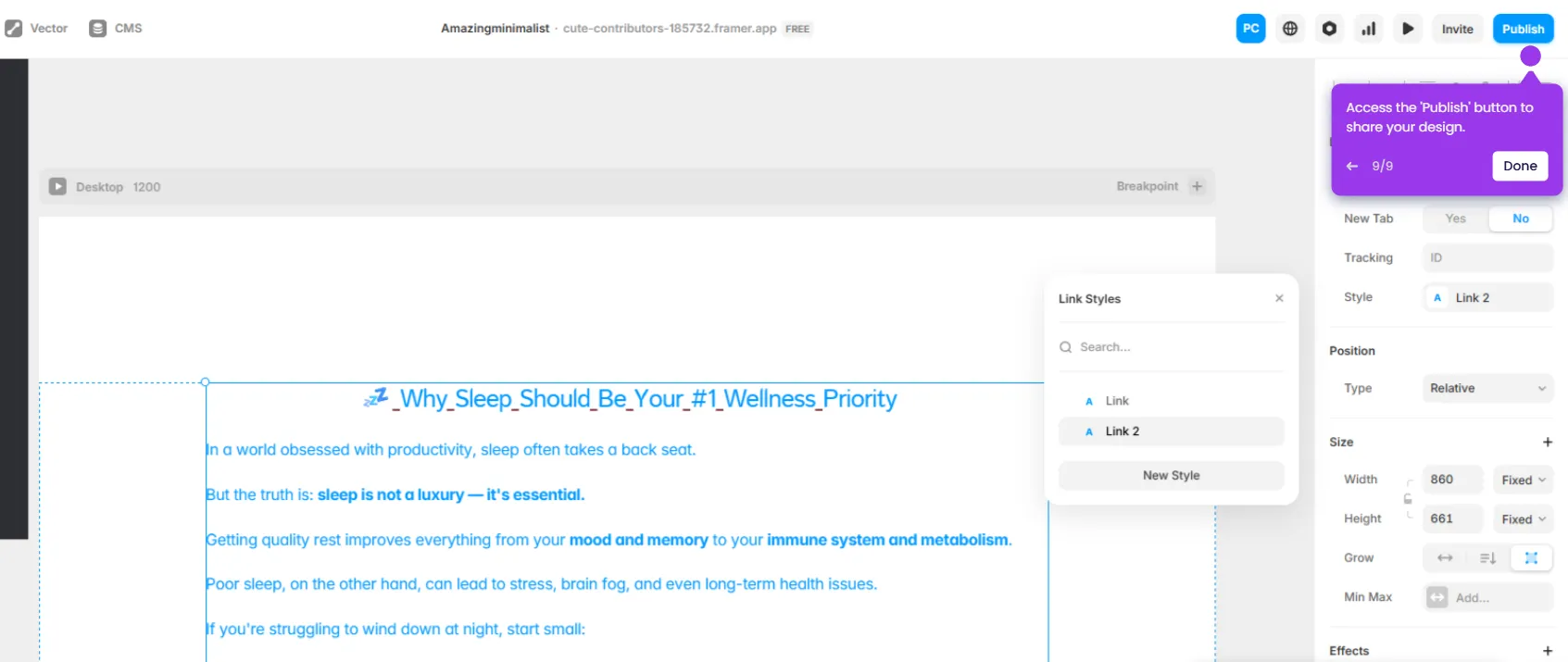
- Click Publish in the top-right to make your responsive website live on all devices.