This tutorial shows how to connect a map visualization to other charts and filters in Qlik Sense so that selections on the map filter data across your entire sheet.
Note:
Map linking in Qlik Sense works through Qlik's associative model with no special configuration required. Clicking a region or point on a map applies a selection that filters all other visualizations on the sheet. You can also use a map as a filter, combined with a filter pane, for layered selections.
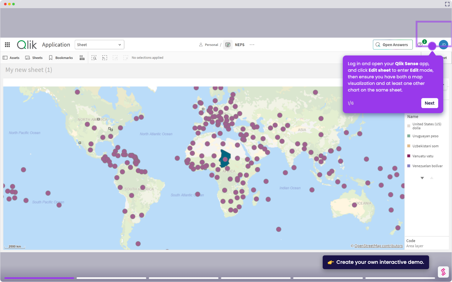
- Log in and open your Qlik Sense app, and click Edit sheet to enter Edit mode, then ensure you have both a map visualization and at least one other chart on the same sheet.
- Click Edit sheet again to exit Edit mode, then click on a point or region in the map to make a selection.
- Observe that all other visualizations on the sheet, such as bar charts and KPIs, update automatically to reflect the selected location.
- To add a filter pane alongside the map, return to Edit mode and drag the Filter pane chart onto the sheet from the Charts panel.
- Add your location field as a dimension in the Filter pane so users can select regions from both the map and the filter pane at the same time
- Click Edit sheet again and test the combined interaction; selections in either the map or the filter pane should filter the full sheet in sync.