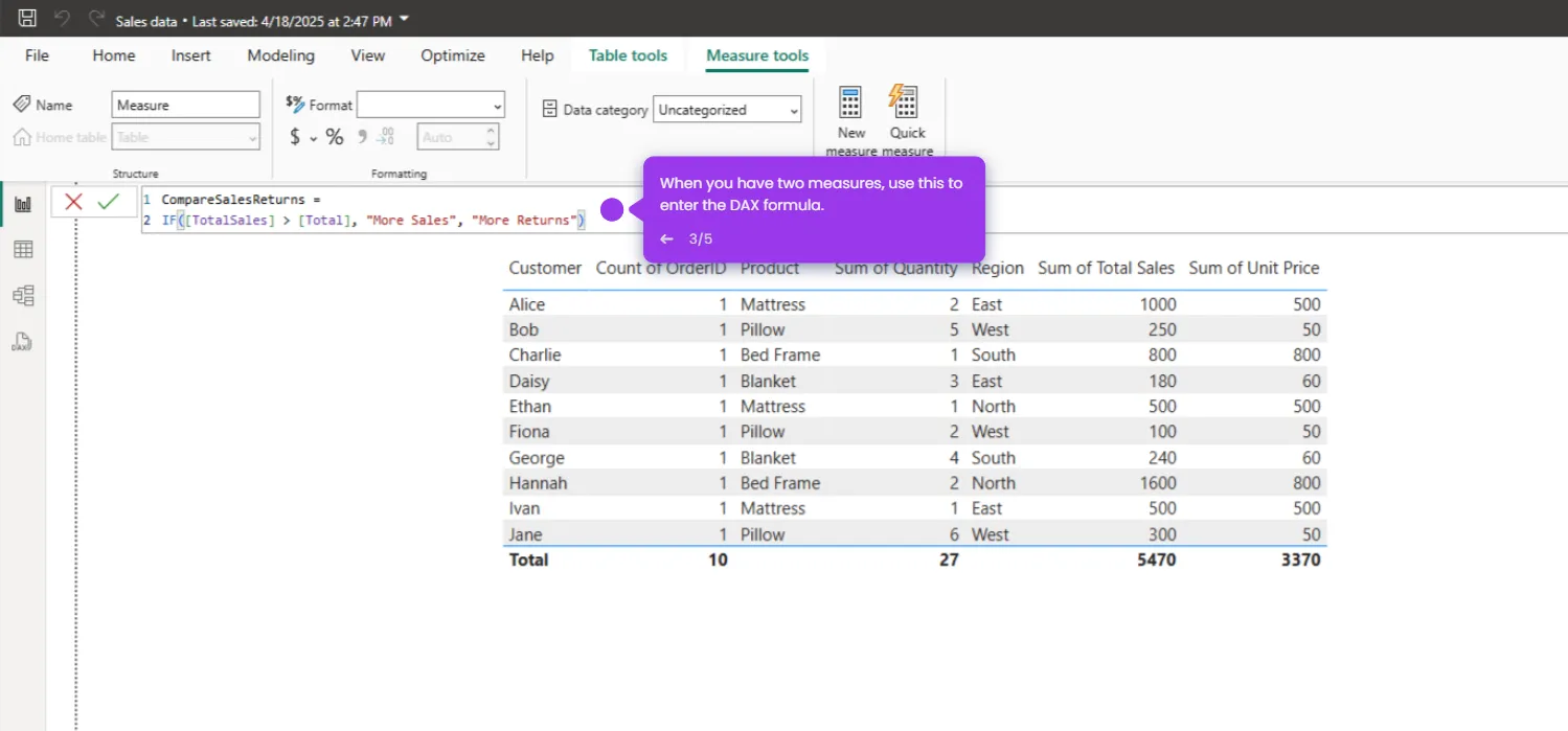
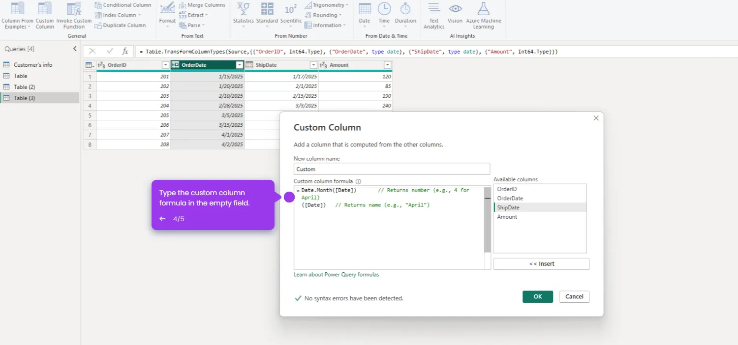
To create a Line Chart in Power BI, follow these steps:
- Navigate to the 'Report' data to begin working with your visualization workspace.
- Click the 'Edit' tab to customize your report and create impactful visualizations.
- Open the 'Visualizations' pane to explore the various chart types available for your data story.
- Select a visualization type that best represents your data patterns and insights. Click 'Line Chart'.
- Access your dataset fields to select the metrics you want to visualize.
- Select the 'Table' visualization for a detailed view of your raw data values.
- Select your first data field to begin building your visualization foundation.
- Your line chart is ready to visualize trends and patterns.

.svg)
.svg)


