What is a Walkthrough Tour? [Examples and Best Practices]
written by
Payal Gusain
reviewed by
|
Table of contents
Trialing a new product is like going on a second date. It’s a familiar environment for a second run, but you’re not feeling comfortable just yet.
After all, adopting a new technology takes time. No matter how intuitive, there is usually a learning curve to the software AND it’s not always frictionless.
This is why user onboarding is a critical touchpoint in the customer journey. Depending on how well the onboarding goes, the user will either sing your praises after getting an early win or leave you a 2.5-star rating on G2 for being “too complex”.
The best solution to the problem?
Interactive product walkthroughs! These virtual tours are the secret sauce to helping first-time users learn and experience the product value or the “aha!” moment hands-on. You can also quickly drive users to activation and encourage product adoption.
Now, if only people came with a professional guide like products do. . . .
Here’s everything you need to know about interactive, quality walkthrough tours and how to create killer ones.
What is an Interactive Product Walkthrough?
An interactive product walkthrough (or simply awalkthrough tour) is a type of step-by-step, in-product guidance to help a newly onboarded user engage and interact with the core features and workflows of the said product.
It is usually short and showcases 3 to 4 core product sequences in a step-by-step manner. With each new step, the user gets to learn how a specific feature works and complete a related task in the next one. This reduces the time to value, speeds up the adoption process, and boosts user retention.
Interactive Product Walkthroughs Vs. Product Tours: Top Differences
To make the long story short: interactive walkthrough tours are user onboarding tools while product tours function as salesenablement assets.
This is an interactive product walkthrough of Adthena built using the Storylane demo platform.
Now, for the longer version…
Here are the top differences between the two types of product guides.
The primary difference between product tours and interactive walkthrough tours is their use cases. While walkthroughs serve as customer onboarding experience tools in the sales process, product tours are mostly used to provide demos and showcase valuable features on website landing pages.
Walkthroughs tend to focus on three to four workflows depending on the user persona. In contrast, product tours offer detailed overviews of the core features and how they’re helpful.
Product tours typically offer a linear experience, showing the users what feature A does and what feature B does in a passive manner. It’s more or less a passive flow of information. High-quality video walkthrough tours, on the other hand, offer a more interactive, hands-on experience where users learn to use features A and B as they progress through the tour.
Interactive Product Walkthroughs Vs. Product Tours: At a Glance
How to Make an Interactive Product Walkthrough in 5 Simple Steps
You only need to follow 5 steps to build an interactive product walkthrough from scratch.
To demonstrate, we’re using Airtable’s prescriptive walkthrough tour here.Airtable is a cloud-based, no-code platform for building collaborative apps and managing projects.
Step 1: Start by Understanding the User Needs and Building a User Journey Map
The goal of a successful product walkthrough is to guide the user to reach their “aha” moment as soon as they sign up. If they can experience the product value right away, they’re bound to stay longer.
This is where surveying or speaking to your most successful customers comes in handy.
When building the survey (to be shared in-app or via email), frame questions to understand the following, for example:
What prompted the user to upgrade from the free trial?
What are the common points of friction?
What are the common drop-off points?
Use data from surveys, user testing, and 1:1 customer interviews to get deeper insights into how first-timers are taking in the customer onboarding experience. This will give you enough juice to flesh out the user journey map in a step-by-step manner.
Then, you can go ahead and bucket the product experience into specific use cases and design the virtual walkthrough accordingly. For example, Airtable has divided the initial app walkthrough into the following buckets:
Step 2: Identify the Best Onboarding Flow for User Activation
To identify the best onboarding flow, find out: What are the common sequences or steps that your most successful customers took when they first signed up?
Most users will not experience the product in a linear fashion, but they’re after a specific goal. You have to identify the same goal and create sequences to help users achieve it.
With Airtable, the original walkthrough starts with the creation of a “base”. So, users are provided with the following three options:
And each choice triggers a corresponding “feature” walkthrough. For example, picking the “Event Planning” template triggers the walkthrough tour below, explaining the “value” on offer here.
Now, once you’ve identified the best flow, you want to settle in on:
A sequence of steps,
what key features to highlight,
for which segment of target audience,
and how best to show them in action.
💡Pro Tip: It’s best to keep the walkthrough tour short and sweet, with a sequence of 4 to 5 steps at most. And provide the option to skip.
Step 3: Add Quality Product Content
In the next step, it’s time to fill up the product with relevant, quality product content for different use cases.
To first-time users, a product with zero content or user activity can feel intimidating. By populating it with relevant content, you can provide ample context and reassure the user to take actions confidently. This will also present a more realistic picture of the product from the get-go.
For instance, Airtable gives users the option to start from scratch with empty fields. Or use templates that come populated with relevant fields and data.
Starting from scratch
Starting with a template
Just make sure the content is not “lorem ipsum” and you’re good to go. 🤭
Step 4: Decide on the Microcopy and Design to Include
In a product walkthrough tour, the goal of the microcopy should be to guide and encourage user action, while the goal of design should be to eliminate friction.
With microcopy, it’s best to stick to conversational, clear, and persuasive language to drive user action.
Airtable uses action-oriented, second-person language, for example, focusing on explaining the taxonomy and the premium features with clarity. So, there’s less cognitive load on the user.
Now for the design — when picking your app walkthrough elements, think minimalistic yet attention-grabbing. You can choose from tooltips, modal windows, side panels, and more, depending on the outcome you want to help the user achieve.
This type of efficiency is best seen in Airtable’s onboarding wizard (a series of steps for setting up the product) pattern for app walkthrough, which lets the user create a base, choose a custom theme, add fields, and even automations.
This type of smart default complements Airtable's otherwise complex product onboarding process where users have to set up a workspace. This can be a possible point of friction for new users.
In another case, while sample content is good, deleting the fields can be a hassle. Knowingly, Airtable provides the option to delete the content right at the end of its template walkthroughs.
A final tip! To get the best results, use patterns for app walkthroughs in a way that they stand apart from the main user interface without being obtrusive. And steer clear of tooltip-heavy designs and content-heavy sequences, which often end up causing user frustration instead of helping.
Step 5: Test Out and Improve the Interactive Product Walkthrough
With the onboarding flow, copy, and design part of the walkthrough covered, you can take it for a couple of test runs. The initial user feedback will help you better understand how users are engaging with the walkthrough and improve on the bumps in the user journey map.
Here are three methods of testing you can try:
Internal testing with different teams: This is a quick way to share the virtual walkthrough with different internal teams looking for different outcomes and collecting user feedback.
Test with a group of trial users: You can test the walkthrough with a group of trial users and record their flow experience. Oh, and, don’t forget to incentivize them!
Do A/B testing: This is a more feasible option for mature products. If you’ve got enough users on board, you can experiment by sharing two different iterations of the same walkthrough with two distinct groups and checking for the difference in performance.
Finally, keep retesting and reiterating the original walkthroughs with every product update. Because it’s not a done-and-forgotten task.
Create Personalized Walkthroughs and Track User Engagement with Storylane
If you’d like to run precise walkthrough testing – even after implementing the walkthrough across your broader user base – why not create a quality walkthrough using virtual tour software offering real-time user engagement metrics?
With Storylane, a no-code, interactive demo platform, you can personalize demos at scale, either via lead forms or from URL params. For every interaction with your virtual walkthroughs and materials, get a precise picture of user engagement and optimize the sequence accordingly.
3 Best Interactive Product Walkthrough Examples
All the best interactive walkthrough examples have a lot in common: They’re well-defined, brief, engaging, and action-oriented.
Here are three stellar walkthrough examples to inspire you.
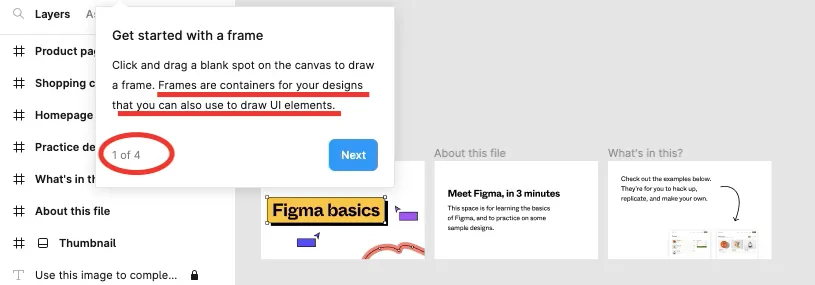
Figma is a cloud-based, collaborative tool for user interface design. It lets you create, prototype, test, and share interactive experiences.
What we love about Figma’s stellar walkthrough tour
Welcome tooltips clearly showing the number of steps in the original walkthrough sequence. Also, explaining the meaning and purpose of a “frame”.
Users don't have to start from scratch. They get “practice designs” to practice on as they progress through the stunning app walkthroughs.
After a short sequence of 4 steps, the closing tooltip offers two choices: Practice more here or Start a new file. This is a clever way of keeping the user engaged in case they couldn’t grasp how the target features worked.
Webflow is a no-code, cloud-based website design and development platform as well as a visual code editor with an in-design tool that lets you build, design, and launch custom websites.
What we love about Webflow’s prescriptive walkthrough tour
The virtual walkthrough sequence is personalized based on the user’s role, type of work, and comfort with CSS and HTML. Accordingly, upon signing up, the user has to answer four questions to get started.
Welcome message sets the expectations right – with a progress bar and a time frame for the interactive guide.
Use of action-driven tooltip modals that encourage the user to follow through the sequence and complete a task.
Clearly contrasted hotspots along with visualization of the action steps in tooltips is a great way of speeding up and improving the feature adoption experience.
Product Hunt is a curation platform, where users can discover, share, and keep up with the latest technology products, websites, and mobile apps.
What we love about Product Hunt’s precise walkthrough tour
A short and clear welcome message that gives the user a choice to take the virtual walkthrough tour or go discover on their own.
Since Product Hunt’s dashboard has a lot going on, it’s easy for a new user to get overwhelmed without the initial app walkthrough. That’s why, these minimalistic tooltip overlays are great for drawing attention to core features and driving user action.
Messaging for every premium feature tooltip has a heading and content body. Even if the user skips the message, they can still learn what the feature does by reading the heading alone.
Wrapping Up
A highly prescriptive, action-driven walkthrough tour will determine whether your second date will fruition into a long-term relationship or fizzle out soon after the sign-up. Just follow these exceptional product walkthrough examples and tips above, and you’ll be able to boost activation rates and convert trialing users into paying customers.
As they say, “You never get a second chance to make a good first impression.”
Copy link
“In a world older and more complete than ours they move finished and complete, gifted with extensions of the senses we have lost or never attained, living by voices we shall never hear.”
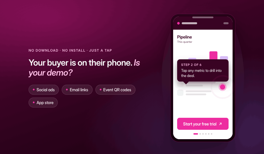
Most B2B interactive demos are built for desktop, but your buyers are increasingly evaluating on their phones, and a demo that breaks at 375px wide is a deal that never makes it into your pipeline.
More than 60% of global web traffic is mobile (Statista, Q1 2026). Yet the average B2B interactive product demo is still designed for a 15-inch screen, a mouse pointer, and a seated evaluator. When a prospect taps into that demo on their phone, they get a shrunken, unreadable mess. They pinch-zoom twice, give up, and move on. You never see them in your pipeline.
A mobile interactive demo is a simulation of your product that a prospect can tap and navigate in a mobile browser, with no download and no install. It's not an interactive walkthrough or a guided screenshot tour. The difference between a demo that happens to load on mobile and one that's designed for mobile is the difference between a dead link and a pipeline opportunity.
This guide covers how to decide which demos need a mobile experience, how to build them, and the design principles that separate demos people finish from demos people abandon. Whether you're running a SaaS demo program or building your first interactive product demo, the framework applies.
Does this demo need a mobile experience?
Not every demo needs a mobile build. Building one when it doesn't matter wastes time. Skipping one when it does matter loses pipeline. The decision comes down to where the demo lives and who sees it.
Desktop evaluators can open a tab and click around. Mobile buyers face three barriers that desktop evaluators don't:
The commitment of downloading and installing an app (iOS impression-to-install rates sit around 3.6%, versus 33.7% once someone reaches the listing page)
Device and OS compatibility uncertainty
Upfront permission requests before the user has seen any value
An interactive demo sidesteps all three. No download, no permissions, no storage. The prospect taps a link and is inside your product in seconds. That's what makes mobile demos worth the effort when the channel calls for them.
Here's how to decide:
The deciding question: Where does the traffic that reaches this demo originate? If the answer is social, email, or a physical touchpoint, build for mobile. If the answer is a bookmarked docs page or a calendar invite, desktop-first is a reasonable bet.
As one verified G2 reviewer noted: "Buyers increasingly expect self-serve experiences, and Storylane enables us to create interactive environments where they can explore on their own." When those self-serve buyers are on their phones, the demo needs to meet them there.
Check your channel analytics before building. If most of the traffic from that channel is mobile, prioritize a mobile-first design. If mobile is a small minority, a well-formatted desktop demo is probably sufficient. For channels where the split is closer to even, consider the "one demo, both audiences" approach described below.
Three mobile situations and what each needs
Matching your build approach to the right situation means you stop wasting time on full rebuilds when a settings change will do, and stop shipping broken experiences when a dedicated mobile flow was needed. There are three distinct situations, and each calls for a different approach.
Situation 1: mobile is the primary channel
This applies when the demo's main audience will be on phones: social ads, QR codes at events, app store listings, or SMS campaigns.
What to build: A short, linear, touch-friendly flow designed from scratch for mobile screens. Think 5 to 8 steps maximum, large tap targets, minimal on-screen text, and a single clear CTA at the end. This isn't your desktop demo shrunk down. It's a different experience built for how people interact with their phones.
Situation 2: mobile is secondary but real
This applies when most viewers use desktop, but a meaningful percentage (30 to 50%) will see the demo on a phone. Common scenarios: website embeds, email follow-ups, blog posts.
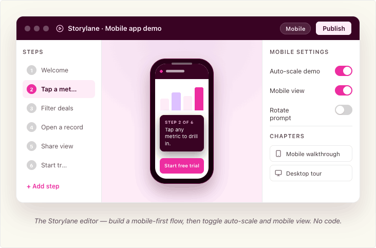
What to build: A desktop demo that's legible and navigable on a smaller screen. You don't need to rebuild from scratch, but you do need to verify that text is readable without zooming, buttons are tappable, and the flow doesn't break at 375px wide. Storylane's auto-scale and mobile view settings handle much of this, but you should still test on your own phone before publishing.
Situation 3: mobile doesn't fit
This applies when the demo content is inherently desktop-bound: complex dashboards, multi-panel admin interfaces, spreadsheet-like views, or deep configuration workflows.
What to build: Graceful expectation-setting instead of a broken experience. Show a short preview or summary screen on mobile with a message like "This demo is designed for a larger screen. Tap to get it in your inbox." Use that screen as a lead capture form, deliver the full demo by email, and let the prospect view it when they're at their desk. Most interactive demo software supports this kind of conditional routing.
How to build mobile-friendly product demos in Storylane
You can build a fully optimized mobile demo without writing a line of code or involving engineering. Storylane's two primary capture methods, screenshot and HTML, both work for mobile demos. The difference is what you're capturing and which display settings you enable.
Start with the right capture type
Screenshot demos capture images with each click along your recording flow. They're faster to build, support multi-media (images, videos, GIFs), and include zoom and blur for focusing attention or anonymizing data. For mobile, screenshot demos are ideal when you want a quick, guided walkthrough and don't need viewers to interact with live UI elements.
HTML demos capture a responsive, editable HTML/CSS replica of your product UI, including buttons, scrolls, and interactions. You can edit text, data, charts, and graphics directly in the demo, add personalization tokens (like {FirstName}), and blur or delete sensitive data. HTML demos are the better choice for mobile when your web product is already responsive, because the captured HTML naturally adapts to different viewport widths (see Google's responsive web design fundamentals for background on how this works).
Both types use the Storylane Chrome extension: open your product, launch the extension, select screenshot or HTML, toggle "Add content with AI" if you want auto-generated guides, and click through your flow. Each click captures a step. When you're done, the demo opens in the editor for refinement.
Capturing mobile screens specifically
The capture method depends on what you're demoing.
If your product is a mobile-responsive web app (most common): Resize Chrome's viewport to a mobile width using Chrome DevTools, then capture with the Storylane Chrome extension as you normally would, in either screenshot or HTML mode. This is the fastest path because you don't need a physical device. Your product's own responsive behavior does the work. Most interactive demo software, including Storylane, captures whatever your browser renders.
If your product is a native mobile app (recommended: iPhone Mirroring via Mac app). This captures the real app with full pixel fidelity, so the resulting mobile app demo feels native to the device. Storylane's Mac app lets you mirror your iPhone screen to your Mac and record directly. You capture the real app as it actually runs, with full pixel fidelity. No SDK, no sandbox, no download on the prospect's device.
To use iPhone Mirroring, your Mac needs Apple silicon or a T2 chip running macOS Sequoia 15 or later, and your iPhone needs iOS 18+ with a passcode. Both devices must be on the same Apple ID with two-factor authentication, Bluetooth, and Wi-Fi enabled. The iPhone should be locked and near your Mac. You can also connect via a wired connection if mirroring isn't available (note: iPhone Mirroring is currently unavailable in the EU).
If you're on Windows: Storylane's Windows desktop app lets you record any screen or desktop app, including mobile emulators.
If you're pre-launch or demoing planned features: Storylane's Figma plugin exports your design frames into clickable, interactive demos. Install the plugin, export frames, and create a demo. Make sure all exported frames share the same dimensions. This is useful for testing a mobile experience before writing code.
For quick, lightweight demos: Take screenshots directly from your phone, upload them to Storylane, and build the demo from those images. This works when you need something fast and pixel-perfect interactivity isn't critical.
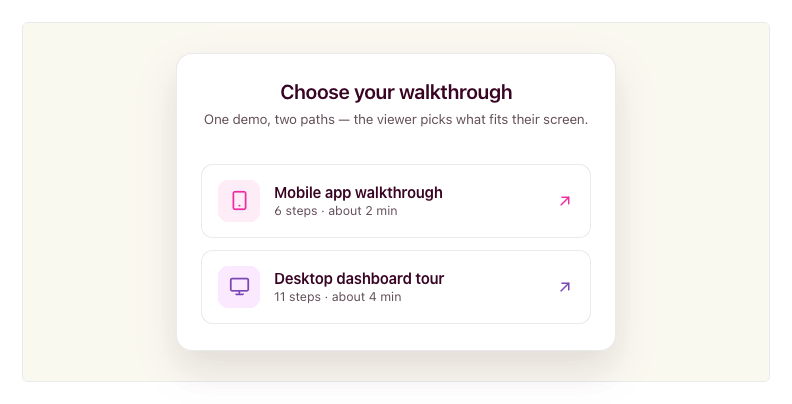
One demo, both audiences
You don't always need separate demos for desktop and mobile viewers. Storylane's Product Tour format lets you combine desktop and mobile captures in a single demo, organized into chapters. When a viewer opens the demo, they see a chapter menu and pick the flow that matches their device or interest. You share one link; the viewer self-selects the right path.
This is useful when you send a single demo link in an email or embed it on a landing page where traffic comes from both desktop and mobile sources. The viewer chooses "Mobile app walkthrough" or "Desktop dashboard tour" from the chapter list, rather than receiving a one-size-fits-all flow.
Making a desktop demo work on mobile
If your demo started as a desktop capture and you need it to display cleanly on phones, Storylane provides three settings in the demo settings panel (the gear icon in the editor).
Screenshot demos: enable Mobile View. This renders the demo correctly on a mobile-sized screen and prompts viewers to rotate their phone to landscape for more horizontal space.
HTML demos: enable Auto-scale Demo. This automatically adjusts the demo to fit the viewer's screen size, so it doesn't overflow or require pinch-zooming. HTML demos can also be responsive, adapting to different viewport widths without manual intervention. Check your Storylane plan settings for availability.
Both types: configure the Small Screen Warning. This setting alerts viewers when their screen is smaller than a width you specify (default is 800px). It's useful for Situation 3 demos where the content genuinely doesn't work on mobile, because you can show a clear message instead of a broken layout. You can adjust the pixel threshold to match your demo's minimum comfortable width.
Embedding and sharing for mobile
Once you've built a mobile-optimized demo, how you share it matters as much as how you built it. Storylane supports inline embeds (the demo auto-starts when the page loads), popup embeds (a CTA button opens the demo full-screen on click), and direct share links. All three work on mobile browsers.
Storylane embeds work on a whole host of tools. For any platform that supports oEmbed (via iFramely or Embedly), you can paste the demo URL and the embed renders automatically.
One detail worth noting for SEO: when copying your embed code, Storylane offers an LLM-Friendly toggle. Turning this on makes your demo content readable by LLMs and search engines, so your product tour can be indexed and discovered organically. Enable it under Share > Embed before copying the code.
Whichever path you choose, always preview the final demo on your own phone before publishing. Desktop preview modes don't catch everything.
Where mobile demos earn their keep
Mobile interactive demos deliver outsized returns in specific use cases where mobile traffic, buyer intent, and evaluation friction intersect. As one verified G2 reviewer put it: "We've seen a noticeable increase in qualified leads since embedding interactive demos on our website and in our outreach." Here's where to prioritize.
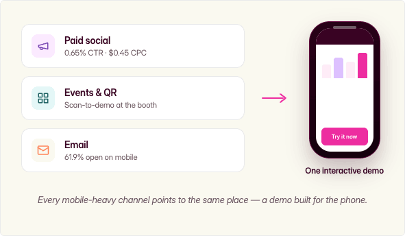
Mobile ad and paid-social landing experiences
Mobile app ad environments deliver a 0.65% CTR at $0.45 CPC, the best cost efficiency in display advertising (Focus Digital, Dec 2025). When you drive that mobile traffic to a static landing page, you waste the engagement. An interactive demo as the landing experience converts that interested tap into a product experience, not a form fill.
Events, field marketing, and QR codes
QR codes are inherently mobile-only touchpoints. A scan-to-demo experience at a trade show booth lets prospects self-serve while your reps focus on high-priority conversations. The prospect walks away having actually used the product, not just picked up a brochure.
Email and sales leave-behinds
With 61.9% of email opens on mobile and 70% of mobile users deleting emails that render poorly on their device (Digital Applied, 2026), an interactive demo link in a follow-up email needs to work on a phone. Storylane makes it easy to share demos via social and email campaigns. When an AE sends a leave-behind after a discovery call, and if the demo breaks on mobile, the deal goes cold between meetings.
One verified Storylane user on G2 described exactly this workflow: "I can send a personalised interactive demo straight after a discovery call, so the product stays front of mind while the champion sells internally on my behalf." Now imagine that champion opens the email on their phone during lunch, taps through the demo, and forwards it to their manager from the same thread. By the next call, two stakeholders have experienced the product, and neither one had to install anything.
Design principles that separate mobile demos people finish from ones they abandon
Building a mobile demo that converts is a design discipline, not just a settings toggle. These five principles make the difference.
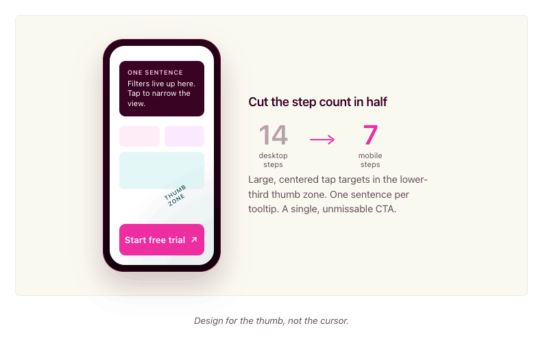
Cut the step count in half
A desktop demo might walk through 12 to 14 steps to show a complete workflow. On mobile, aim for 6 to 8 steps at most. Every unnecessary step is a dropout point. Identify the one or two moments that make your product click for a new evaluator, and build around those.
Ask yourself: if the viewer only completes four steps, will they understand enough to want a full demo? If the answer is no, you have too much setup and not enough payoff.
Write less copy per screen
Mobile screens are small. A tooltip that reads well on desktop becomes a wall of text on a phone. Limit tooltip and annotation text to one sentence or two short lines. Use the demo itself to show what you'd otherwise explain in copy. Let the product's interface carry the story.
Make CTAs thumb-friendly and unmissable
Tap targets on mobile need to be large, centered, and high-contrast. If a CTA button is easy to miss or hard to tap, it doesn't exist. Place your primary CTA where thumbs naturally rest: lower third of the screen, center-aligned. Apple's Human Interface Guidelines cover tap target sizing in detail if you want to go deeper. Avoid placing important buttons near screen edges where accidental taps are common.
Always test on your own phone
Previewing a mobile demo on a desktop browser with responsive mode is not the same as using it on a real phone. The touch targets feel different. The scroll behavior is different. The text size reads differently. Before you publish any mobile demo, pull it up on your actual phone and tap through every step. If anything feels awkward, fix it.
Match the demo to where mobile traffic originates
A demo linked from a paid social ad should be short, visual, and conversion-focused. A demo embedded in a nurture email can be slightly longer and more exploratory because the prospect already has context. A QR code demo at a live event should be fast and self-explanatory because the prospect is standing at a booth. Design the experience to match the context, not just the screen size.
In practice: if your desktop product tour has 14 steps covering five features, your mobile version should focus on the two features that matter most to evaluators at that stage. Build it in 7 steps with one-sentence tooltips and a single "Start your free trial" CTA at the end. Then compare completion rates between the two versions in your analytics. The gap is usually dramatic enough to justify the rebuild.
Measuring what mobile viewers do
Storylane captures step-level engagement data across both desktop and mobile viewers, so you can see exactly where mobile prospects engage and where they drop off. You can identify which mobile demos drive the most leads, which steps have the highest completion rates, and where the experience breaks down. With CRM integrations into HubSpot and Salesforce, you can tie mobile demo engagement directly to pipeline and attribution, connecting a mobile tap on a QR code demo at a trade show to a closed deal three months later.
FAQ
What's the difference between a mobile demo and an app preview video?
An app preview video is a pre-recorded clip that shows your product. The viewer watches passively. A mobile interactive demo lets the viewer tap, navigate, and explore real product screens at their own pace. The difference is engagement: tapping through a demo is active, and active prospects convert at higher rates because they've already experienced the product firsthand.
Do mobile demos need a download?
No. A mobile interactive demo runs in the prospect's browser. They tap a link, and the demo loads instantly. No app store visit, no install, no storage commitment, no permissions.
Can one demo work on both desktop and mobile?
Yes, with the right approach. Storylane lets you combine desktop and mobile captures in a single Product Tour using chapters. Viewers open the demo and choose the flow that matches their device from a chapter menu. For simpler cases, you can enable auto-scale settings so a desktop demo adapts to a mobile screen. If the desktop and mobile experiences are fundamentally different (like a web dashboard versus a companion mobile app), use chapters so the viewer self-selects. If it's the same product at different sizes, auto-scale works.
How many steps should a mobile demo have?
For a primary-mobile demo (social, QR, app store), aim for 5 to 8 steps. For a desktop demo that also works on mobile, keep it under 12. The key metric is completion rate. Check your Storylane analytics: if mobile viewers are dropping off well before the final step, you probably have too many steps. Trim ruthlessly.
Can I demo a native mobile app without asking users to install anything?
Yes. Storylane's Mac app lets you connect your iPhone via iPhone Mirroring or cable and record your mobile app screens directly from your desktop. The resulting demo is an interactive browser experience. Your prospects never download anything.
Do I need a separate mobile demo for every desktop demo?
No. Start with the demos attached to your highest-mobile-traffic channels (email sequences, social campaigns, event QR codes). Check your analytics to see which demos get significant mobile traffic, and prioritize those. Many desktop demos work acceptably on mobile with auto-scale enabled. Only build a dedicated mobile version when mobile is the primary channel or when the desktop experience genuinely breaks on a small screen.
Start building your first mobile demo
Your buyers are already evaluating on their phones. The question is whether they're seeing a broken desktop shrink-down or an experience you designed for them.
Storylane gives you the tools to capture mobile app screens without downloads, combine desktop and mobile flows in a single demo, and auto-scale existing demos for smaller screens. Over 5,000 sales and marketing teams use Storylane to build demos that move deals forward, backed by a #1 G2 rating and 4.8 stars across 1,400+ reviews.
Sign up and build your first mobile interactive demo.
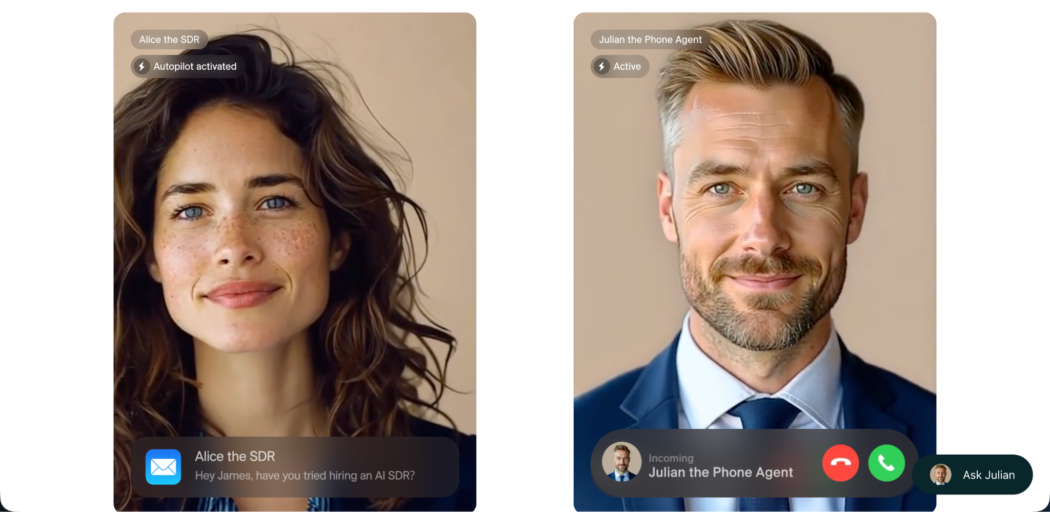
Most Docket alternatives will qualify your inbound traffic. Very few will actually educate a buyer, show your product mid-conversation, or lead a prospect toward a decision the way a great SDR would. I evaluated seven AI sales agents head-to-head so you can pick the one that actually moves your pipeline.
Docket does the basics well. It puts a chat agent on your website and helps qualify inbound visitors. But as AI sales agents get more sophisticated, teams are discovering that the gap between "chat widget" and "AI sales agent" is bigger than it looks. The difference comes down to a handful of things that matter more than any feature checklist: how smart the agent actually is, whether it can show your product (not just talk about it), how fast it responds, and whether it meets buyers in the format they prefer.
What you'll find in this post
The four capabilities that separate real AI sales agents from glorified if-then chatbots
A ranked breakdown of seven Docket alternatives, covering strengths, limitations, pricing, and best-fit use cases
Why mid-conversation demos and proactive agent intelligence are the two biggest differentiators in this category
A clear recommendation for B2B SaaS teams that want to convert high-intent traffic into qualified pipeline
What to look for in a Docket alternative
Before diving into the list, here are the four capabilities I weight highest when evaluating tools in this category. Getting these right is what separates tools that generate pipeline from tools that just collect email addresses.
1. Agent intelligence: proactive vs. reactive
Many chat agents on the market today run on simple if-then workflow logic. A visitor asks a question, the agent matches it to a scripted response, and the conversation follows a fixed path. Here is where that breaks down: if a buyer asks to see the product and the workflow's next step is "collect their email," the agent will keep pushing for the email no matter what the buyer says next. Ask a follow-up question, request a case study, say you are not ready to talk to a human yet. The agent is stuck because it is not actually thinking. It is following a flowchart.
The agents that generate real pipeline work differently. They understand what the buyer is actually asking, and they adjust the conversation in real time. More importantly, they do not just react to questions. They proactively lead the conversation toward an outcome you define, like getting a prospect to book a demo or converting them into a marketing qualified lead. They ask discovery questions, read the buyer's signals, and steer toward that goal without sounding scripted.
Example: A visitor lands on your pricing page and opens the chat. A reactive agent asks "What brings you here today?" and waits. A proactive agent recognizes the pricing page context, asks what use case the visitor is evaluating, surfaces a relevant case study, and guides them toward booking a call with the right rep. One is a form with a chat UI. The other is a sales conversation.
2. Mid-conversation demo capability
When a buyer asks "Can you show me how this works?", most chat agents can only respond with text. They can describe features, link to a help article, or try to route the prospect to a human. They cannot actually show the product.
A few tools in this category can surface interactive demos, case studies, videos, pricing pages, and other sales assets directly inside the conversation, at the exact moment the buyer is asking for them. The agent pulls up the relevant demo right there in the chat. The buyer stays engaged, gets their question answered visually, and moves closer to a decision without a tab switch or a scheduling delay.
The gap between tools here is about depth of integration. Some agents bolt on demo capability through a third-party connector, which limits what content can be surfaced and when. Others have demo capability natively built into the platform, giving the agent much finer control over what to show and how to personalize it.
3. Response speed
This one is straightforward but easy to overlook. If your AI agent takes five to ten seconds to respond, you are losing buyers. People expect the same speed they get from ChatGPT or a messaging app. A slow agent feels broken, and visitors will close the tab before the answer arrives.
The speed gap between tools comes down to architecture. Agents that control their own inference stack, handling answer generation and audio and video rendering in-house, are consistently faster than tools that chain together multiple third-party providers for each response. When you are evaluating agents, test the actual response latency yourself. Sub-second responses feel like a real conversation. Multi-second delays feel like waiting for a loading screen.
4. Multimodal interaction
Buyers have different preferences. Some want to type. Some would rather talk. Some want a face-to-face-style video interaction where they can ask questions and get answers in real time.
Text-only agents work for a segment of your traffic, but they leave out everyone who would engage more deeply through voice or video. Multimodal also means the agent can surface different content formats mid-conversation: not just text answers, but interactive demos, PDFs, slides, videos, and pricing calculators. The richer the set of assets the agent can pull from and present, the more it functions like an actual sales rep rather than a search bar with a chat interface.
How you can evaluate these:
Run a real buyer scenario through each agent's demo. Ask a question, then change direction mid-conversation. Does the agent adapt or get stuck?
Ask to see the product during the chat. Can the agent actually show it, or does it just offer to route you to a human?
Time the response latency. Anything over two to three seconds will frustrate real buyers.
Test all available interaction modes (text, voice, video) and check what content formats the agent can surface.
1. Storylane RepX
An AI sales agent built natively inside the #1 rated interactive demo platform on G2 (4.8 stars, 1,400+ reviews).
RepX is where all four of the criteria above come together in a single product. It is built directly inside Storylane, the platform that already powers demo automation for thousands of B2B SaaS teams, and that native integration is what makes RepX fundamentally different from every other tool on this list.
Why teams choose RepX over Docket:
Proactive, intelligent conversations: RepX does not follow a scripted if-then workflow. It runs real discovery conversations, reads buyer intent, and proactively leads prospects toward a goal you define, whether that is booking a demo, qualifying as an MQL, or exploring a specific use case. If a buyer changes direction mid-conversation, RepX adapts. It asks the right questions, handles objections, and steers toward the outcome without sounding robotic. This is what separates it from chat agents that get stuck the moment a prospect goes off-script.
Natively demo-powered: RepX surfaces live Storylane interactive demos, case studies, PDFs, slides, and videos at exactly the right moment in a conversation. This is not a third-party integration or an API handoff. It is a deep, in-house connection to the #1 demo platform on G2. When a buyer asks "Show me how this works," RepX actually shows them.
Sub-second response speed: Answer generation, audio, and video are all controlled in-house (via LiveKit), making RepX noticeably faster than tools that chain together third-party providers for each part of the response stack. The conversation feels instant, not laggy.
Truly multimodal: Chat, voice, and video avatar in one agent. Docket is text-only. RepX meets buyers in whatever format they prefer, and surfaces a wide range of content formats (interactive demos, PDFs, videos, pricing, case studies) directly inside the conversation.
Rich knowledge ingestion: Trains on thousands of website URLs (via Firecrawl), help center pages, PDFs, case studies, and Q&A pairs. This goes far beyond what Docket's knowledge base supports.
Full CRM push: Syncs enriched transcripts, conversation summaries, and qualified lead data to Marketo, Salesforce, HubSpot, Slack, and Gong.
Part of a full platform: RepX comes as part of Storylane's Demo Suite, including interactive demos, hubs, and personalization. You are not buying a standalone chatbot. You are buying a complete buyer enablement stack.
RepX is purpose-built for B2B SaaS marketing and demand gen teams that want to convert high-intent website traffic with personalized, demo-driven conversations. If your product benefits from being seen, and most B2B products do, this is the agent that lets you show it, not just talk about it.
"Docket gives you a chat agent. RepX gives you a chat agent that can show your product, powered by the #1 interactive demo platform on G2."
Best for: B2B SaaS marketing and demand gen teams focused on inbound conversion, demo automation, and pipeline generation.
Pricing: Starts at ~$2,000/month, scaled by active monthly website visitors.
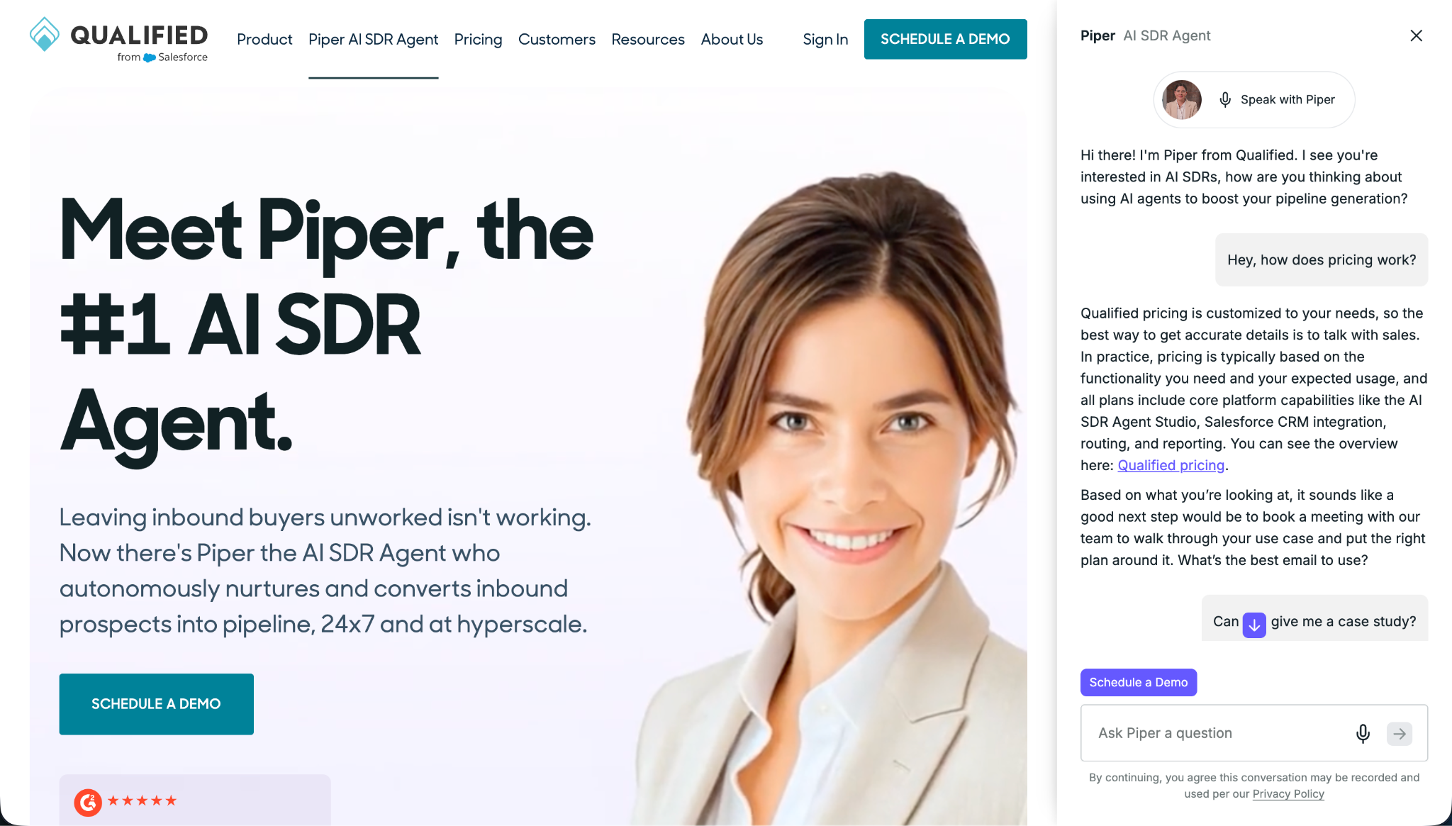
Qualified is one of the most established players in the AI pipeline generation space, and for enterprise teams, it is a serious contender. Built natively on top of Salesforce, Qualified identifies high-value accounts visiting your website in real time and routes them to the right rep, or engages them with an AI agent, based on CRM data, territory rules, and account signals. It is a mature platform with strong enterprise pedigree, and its Salesforce-first architecture makes it a natural fit for revenue teams deeply invested in that ecosystem.
What Qualified does well:
Real-time account identification: Uses Salesforce data to surface who is on your site, their deal stage, account tier, and rep ownership in real time
AI pipeline generation ("Piper"): Their AI SDR can engage visitors in chat, qualify them based on CRM context, and route or book meetings automatically
Enterprise routing logic: Sophisticated territory-based routing, round-robin assignment, and rep availability rules built for large, complex sales orgs
Salesforce-native: Deep bi-directional sync with Salesforce. Conversations, leads, and signals flow directly into the CRM without middleware
Signal-based plays: Can trigger outreach based on intent signals, account activity, or firmographic criteria
Qualified is a well-resourced platform with enterprise-grade infrastructure. Its main constraint is Salesforce dependency. Teams not on SFDC will find limited value. The AI agent itself is primarily text-based chat, with no native ability to surface product demos or rich interactive content mid-conversation. For teams that want to educate buyers visually as part of the conversation, that is a real gap.
Best for: Enterprise revenue teams running Salesforce-heavy ABM programs who want real-time account engagement and sophisticated routing.
Pricing: Starts around $3,500/month; enterprise contracts typically run significantly higher.
3. 1mind
1mind takes a different approach. It focuses on building highly autonomous, human-like AI personas that can handle the full arc of a buyer conversation, from discovery through qualification. Rather than a traditional chat widget, 1mind creates AI agents that can engage in multi-turn, nuanced conversations that feel closer to talking with a real SDR than filling out a form. It is designed for teams that want to hand more of the top-of-funnel conversation over to AI, with less need for human intervention.
What 1mind does well:
Autonomous conversation depth: Handles complex, multi-turn discovery and qualification flows without human handoff
Persona customization: AI personas can be configured with specific tone, knowledge base, and conversation goals to match your brand and buyer profile
Multi-channel presence: Can operate across web chat, email, and other touchpoints
Lead qualification logic: Configurable qualification criteria that can route or flag leads based on conversation outcomes
Scalable top-of-funnel: Designed to handle high volumes of inbound conversations simultaneously without rep bandwidth constraints
1mind is an ambitious platform with strong conversational AI capabilities. It is best suited for teams that want a high degree of autonomy in their top-of-funnel motion. The limitation is that it is not built on top of a demo platform, so there is no native ability to surface product demos or interactive content during a conversation. The agent can talk about your product, but it cannot show it.
Best for: Teams that want highly autonomous, self-running qualification workflows at scale.
Pricing: Available on request.
4. Spara
Spara is purpose-built for one thing: converting inbound pipeline fast. Where some AI agents try to do everything, Spara stays focused on identifying high-intent website visitors, qualifying them quickly, and routing them to the right rep or booking flow with minimal friction. Its strength is in the speed and precision of the handoff.
What Spara does well:
Instant lead routing: Identifies and routes high-intent visitors in real time, with sophisticated logic to match accounts to the right rep, territory, or queue
CRM enrichment: Enriches lead records with conversation data, qualification signals, and contact details before pushing to CRM
Fast qualification flows: Lean, efficient qualification questions designed to get key information quickly without creating friction
Booking integration: Connects qualified conversations directly to calendar booking, reducing drop-off between "interested" and "meeting booked"
Slack and CRM alerts: Notifies reps in real time when a qualified account is active on the site
Spara's focus on speed and routing is a genuine strength for revenue ops teams obsessed with response time. The tradeoff is depth. It is primarily a routing and qualification layer, not a tool designed for multi-turn educational conversations or visual product engagement.
Best for: Revenue ops and demand gen teams focused on lead routing speed, precision, and conversion from first touch to booked meeting.
Pricing: Available on request.
5. Fin by Intercom (AI sales agent)
Intercom's Fin is one of the most widely deployed AI agents in customer support, running across thousands of companies. In 2025 and 2026, Intercom extended Fin's capabilities into pre-sales conversations, launching a sales agent version designed to engage, qualify, and convert website visitors before they ever talk to a human. For teams already running Intercom for support, this is a natural extension.
What Fin does well:
Mature AI infrastructure: Built on years of real-world deployment in support. Fin's underlying AI is battle-tested at scale across thousands of companies
Unified support + sales: One platform for both pre-sales and post-sales conversations
Deep Intercom integrations: Native connections to Intercom's full suite, including helpdesk, CRM, inbox, and outbound messaging
Rich knowledge base: Trained on your existing Intercom help center content, articles, and past conversations
Broad channel coverage: Operates across web chat, email, and mobile
Fin's sales agent is a strong choice if you are already an Intercom customer and want to add AI-powered inbound qualification without switching platforms. The limitation for B2B sales teams is that Fin is a generalist AI, not purpose-built for demo-driven buying experiences. There is no native ability to surface product demos or interactive content mid-conversation.
Best for: Teams already on Intercom who want a unified support and sales agent within a single platform.
Pricing: Included in Intercom plans starting around $29/seat/month; AI agent resolution pricing varies by usage volume.
6. Chili Piper Chat
Chili Piper built its reputation on one of the most widely adopted tools in B2B sales: instant inbound meeting scheduling. Chili Piper Chat extends that core strength into AI-powered website conversation, using chat to engage visitors, qualify their intent, and convert them into booked meetings as fast as possible.
What Chili Piper Chat does well:
Inline calendar booking: Instant calendar booking, round-robin routing, and rep availability management deeply embedded in the chat experience
Fast conversion flows: Lean qualification sequences designed to get buyers from "interested" to "meeting booked" with as few steps as possible
Routing intelligence: Sophisticated routing logic based on CRM data, account ownership, territory, and deal stage
HubSpot and Salesforce integrations: Strong, well-tested integrations with both major CRMs
Speed-to-lead focus: Built around the principle that faster engagement and booking equals higher conversion
Chili Piper Chat is excellent at getting buyers into meetings quickly. The depth of conversation is more limited. It functions as a fast-path conversion layer, not a full AI sales agent capable of multi-turn product education.
Best for: Sales-led teams that prioritize meeting booking speed and rep routing over deep buyer education in the conversation.
Pricing: Starts around $30/seat/month for core scheduling; Chat pricing typically bundled or available on request.
7. GetBreakout
GetBreakout is an emerging player in the AI website agent space, positioned as a lightweight alternative to the heavier enterprise platforms. Its premise: replace passive forms and generic CTAs with dynamic, AI-driven conversations that engage visitors in real time.
What GetBreakout does well:
Quick deployment: Designed to get live on your website fast with minimal setup complexity
Conversational engagement: Replaces static lead capture forms with AI conversations that feel more natural
Lightweight and accessible: Lower barrier to entry for smaller teams or those earlier in their AI adoption journey
Customizable conversation flows: Basic configuration of conversation goals and qualification paths without deep technical requirements
Real-time visitor engagement: Triggers conversations based on page activity and visitor behavior
GetBreakout is a solid starting point for teams looking for something simple and fast to deploy. As an earlier-stage product, it is still maturing. CRM enrichment depth, multimodal capabilities, and reporting are more limited compared to the established players on this list.
Best for: Smaller teams or those earlier in their AI agent journey looking for a lightweight, easy-to-deploy starting point.
Pricing: Available on request.
The bottom line
All seven of these tools will help you do more with inbound traffic than a static form or a traditional chatbot. The right choice depends on your team's size, tech stack, and where the biggest gap in your buyer journey actually is.
Here is how I would frame the decision. Qualified is the strongest option for enterprise Salesforce shops running ABM. Chili Piper Chat wins on meeting booking speed and routing. GetBreakout and 1mind serve teams at different stages of maturity and automation ambition.
The two things that matter most when picking a Docket alternative are agent intelligence and mid-conversation demo capability. An agent that follows a fixed if-then workflow will lose buyers the moment they go off-script. An agent that cannot show your product when a buyer asks to see it is leaving pipeline on the table. RepX is the tool on this list that delivers both: proactive, adaptive discovery conversations with interactive demos surfaced natively inside the chat, powered by the #1 rated demo automation platform on G2 (4.8 stars, 1,400+ reviews).
Qualified was acquired by Salesforce in April 2026. The product now requires Salesforce CRM, and pricing starts at roughly $42,000 per year before infrastructure and implementation costs.
Teams evaluating qualified alternatives fall into three groups: those on HubSpot or another CRM who simply cannot use Qualified anymore, teams who cannot justify the total cost at their current stage, and teams who want a qualification layer that does more than conversational chat.
Six qualified competitors worth evaluating in 2026: Storylane RepX, Warmly, Default, 1mind (the AI Superhuman platform and official Drift successor), 11x.ai, and Artisan. Each solves a different part of the inbound or outbound qualification problem.
RepX is Storylane's inbound AI SDR: a voice and text agent that qualifies website visitors in real time and can walk them through an interactive product demo in the same conversation, with no Salesforce requirement.
Why teams are looking for qualified alternatives in 2026
Qualified built a real product and a defensible position. For enterprise revenue teams running the full Salesforce stack, Piper (Qualified's AI agent) was a credible answer to a genuine problem: website visitors arriving with intent and no one available to engage them at that moment. The product sat on your website, held conversations through chat and voice, routed qualified buyers to your sales team, and surfaced intent signals from the visitor session. It worked, particularly for Salesforce-native organizations where the deep CRM integration justified the complexity.
For buyers evaluating the market today, the acquisition creates a different risk profile than it did six months ago. Qualified is now being positioned as infrastructure for Salesforce's Agentforce platform, which has three concrete consequences.
First, the product roadmap is driven by Salesforce's priorities, not by Qualified's original customer base. Features that mattered to Qualified's mid-market buyers may move slower as Agentforce shapes the direction.
Second, Salesforce CRM is now a hard requirement. Teams running HubSpot, Pipedrive, Zoho, or any other CRM are not candidates for the product. This was always true in practice, but the acquisition has made it structural.
Third, pricing starts at approximately $42,000 per year for the Premier plan, and most mid-market deployments land between $60,000 and $100,000 annually once Salesforce licenses, implementation, and onboarding are factored in. At the low end, you're looking at $40,000 to $68,000 for Qualified itself, plus $30,000 to $60,000 or more for the required Salesforce stack.
The problem these teams are trying to solve has not changed. A Director of Growth at a B2B intelligence platform described it plainly in a recent conversation: "We don't have an SDR team to follow up and we're still getting inbound leads. You can't always get all of the qualification questions answered through an automated email thread or things like that." That is the core pain. Inbound interest exists, but there is no scalable layer to catch it, qualify it, and push it toward a conversation before the visitor leaves.
What has changed is who can actually buy Qualified to solve that problem. For a large portion of the teams who most need this type of solution, the product is now either inaccessible (wrong CRM) or priced well beyond reach. That is driving the evaluation of alternatives to Qualified across the B2B SaaS landscape.
Most teams evaluating inbound AI SDR tools as Qualified alternatives fall into one of three groups. The first is teams on HubSpot, Pipedrive, or any non-Salesforce CRM who have been forced to find a different path. The second is earlier-stage companies (Series A through Series C) who have the traffic and inbound intent but cannot justify a six-figure total cost of ownership for one piece of the GTM stack. The third is teams who want a qualification layer that can show the product and qualify in the same interaction, rather than routing visitors to a form or a human for a separate demo call.
How these qualified competitors compare
Rank
Platform
Best for
G2 rating
Starting price
1
Storylane RepX
Inbound AI qualification with interactive demo in the same conversation
4.8 stars (1,405 reviews)
Free / $40/mo Starter; RepX on Growth tier+
2
Warmly
Website visitor de-anonymization and AI-driven outreach
4.5 stars (250+ reviews)
~$700/month (Business plan)
3
Default
Inbound lead routing, scheduling, and enrichment automation
4.5 stars (63 reviews)
$750/month + $45/user
4
1mind
AI Superhuman for inbound qualification, live demos, and video calls (official Drift successor)
4.9 stars (7 reviews)
~$100K/year minimum (custom)
5
11x.ai
Outbound AI SDR for building new pipeline from cold audiences
4.4 stars (32 reviews)
Custom pricing
6
Artisan
Outbound AI SDR with multi-channel prospecting and personalization
4.0 stars (24 reviews)
Custom pricing
Full feature comparison of qualified alternatives
Feature
Storylane RepX
Qualified (Piper)
Warmly
Default
1mind
11x.ai
Artisan
Primary use case
Inbound AI qualification + interactive demo
Inbound AI qualification via chat and voice
Visitor de-anonymization + AI outreach
Inbound routing, scheduling, enrichment
AI Superhuman for website, in-product, and live video calls
I've been working in B2B SaaS GTM long enough to have watched two cycles of this now. A compelling product gets acquired, gets repositioned as part of a larger platform, and a wave of teams who were either customers or potential customers start looking elsewhere. That is exactly what is happening with Qualified right now. The teams who are well-served by the acquisition are the ones already deep in the Salesforce ecosystem with the budget and IT infrastructure to match. For everyone else, the search for an alternative is a practical necessity, not a preference.
What follows is my honest read on each option, including where Storylane's own product fits and where it doesn't.
1. Storylane RepX: the best AI SDR alternative with interactive demos
Storylane is best known as the #1-rated interactive demo software platform on G2's Demo Automation category, with 1,405 reviews and a 4.8-star rating, used by 5,000+ teams including HubSpot, Microsoft, and Okta. RepX is Storylane's inbound AI agent for sales: a conversational layer that sits on your website and qualifies visitors through voice and text in real time.
Build and train RepX agents by setting up persona, training on resources, and deploying on websites. Create agent under Persona section to determine chat experience appearance. Select AI avatar, assign agent name, and write intro message for conversation start. Configure launcher style, position, and brand color to control website appearance. Use Engagement tab to choose interaction method between video or voice. Add starter questions to guide visitors, upload starter slide, and configure CTAs. Train agent by building knowledge base in Training section. Add content including demos, links, answer snippets, docs, and images to knowledge base. Integrate Storylane demos so agent displays product demonstrations during conversations when visitors request to see product. Add public URLs including website, help center, or documentation with option to crawl single page or follow links within. Configure starter questions that appear to visitors before chat engagement. Set up starter slides and intro messages visible when visitor opens chat. Create Answer Snippets for specific responses to questions about pricing, security, and integrations by writing question as visitors ask it and providing exact answer. Upload documents and images such as one-pagers, screenshots, and decks with instructions for when to surface each asset during conversations. Store all training resources under Product knowledge with searchable and filterable organization that updates as product changes. Deployed agent operates on website answering questions, handling objections, and transferring sales-ready leads to team.
What makes RepX different from Qualified and from other conversational AI tools is what happens when a visitor shows purchase intent. Most inbound AI agents, including Piper, can answer questions about the product and route visitors to a form or a calendar. RepX can do that too, but it can also pull up an interactive product demo and walk the visitor through it in the same conversation. The visitor asks how a specific workflow works, RepX shows them the actual product doing it, continues the conversation, qualifies the lead, and routes to a booking or a self-serve signup. That combination of qualification and product demonstration in a single interaction is something no other tool in this category currently offers.
For GTM teams, the practical implication is a shorter time from intent to understanding. Instead of qualifying a visitor and then scheduling a separate demo call to show the product, the AI handles both in one session. Teams using Storylane (storylane.io) report meaningful improvements in the quality of conversations that reach the sales team, because buyers arrive having already seen the product, not just having answered a few qualification questions.
RepX is available on Storylane's Growth tier and above. The platform starts with a free tier (no credit card required) and a Starter plan at $40 per month, which makes the entry cost substantially lower than Qualified's $42,000-per-year floor. There is no CRM requirement. RepX integrates with HubSpot, Salesforce, and other major CRMs, but none of them is a prerequisite for the product to function.
Where RepX is not the right fit: teams whose primary pipeline problem is cold outbound, rather than inbound conversion. RepX is built for visitors who are already on your website. It does not prospect, find contact lists, or run outbound sequences. If the bottleneck is generating new top-of-funnel demand from scratch, one of the outbound AI SDR tools in this list is a better starting point. For teams that need demand generation tools, pair RepX with an outbound solution.
2. Warmly: best for website visitor de-anonymization
Warmly's primary function is website visitor de-anonymization: it identifies the companies (and in many cases the individuals) visiting your website, enriches that data with contact information and firmographics, and gives your team the ability to act on those signals in real time. The platform has added an AI chat layer that can engage identified visitors directly, which puts it in the same conversation as Qualified and RepX for inbound qualification.
The de-anonymization piece is where Warmly is genuinely strong. For B2B teams with meaningful website traffic and a defined ICP, knowing that the VP of Procurement at a target account just spent 12 minutes on your pricing page is valuable signal. Warmly surfaces that, enriches it, and routes it to the relevant rep or sequence automatically.
The trade-offs are worth understanding. The AI chat layer is less mature than Qualified's Piper or RepX. Warmly's core value is identification and routing, not conversational qualification, and the platform lacks outbound SDR capability.
Pricing starts at around $700 per month for the Business plan, with a free tier that covers up to 500 de-anonymized visitors per month. The free tier is genuinely useful for validating whether your website traffic has enough ICP concentration to justify the investment. Warmly does not require Salesforce CRM and integrates with HubSpot and other major platforms.
Warmly is a strong fit for teams where the intent signal layer is the missing piece: you have a CRM, you have a sales team that can act on signals, but you don't have visibility into who is visiting and what they're doing. If you need conversational qualification on top of that, plan for RepX or a similar tool alongside Warmly rather than as a replacement.
3. Default: best for inbound lead routing speed
Default is a different kind of tool than Qualified or RepX. It does not hold conversations with website visitors. Instead, it automates the inbound lead workflow: form submissions are captured, leads are enriched with firmographic and contact data, routing logic is applied against your ICP criteria, and qualified leads are automatically sent a calendar invite or routed to a rep. The best-case scenario is a prospect fills out a form and receives a calendar link within seconds, with no human touching the process.
For teams whose biggest bottleneck is speed-to-lead after a form submission, Default is directly relevant. Research on inbound conversion has consistently shown that the chance of qualifying a lead drops sharply as response time increases. Default compresses that to near-zero for the routing step.
What Default is not is a conversational AI layer. It handles the workflow automation around inbound leads, but there is no AI agent holding a real-time conversation with a website visitor before they fill out a form. For teams who need to engage anonymous visitors before they convert, Default is not the tool. For teams who have strong form conversion rates and the problem is what happens after the form is submitted, it is worth a close look.
Pricing starts at $750 per month plus $45 per user per month, billed annually. Enrichment credits are additional. Default earns 4.5 stars on G2 from 63 reviews, which is a smaller review base than some competitors but consistent in its positive sentiment. The platform integrates with HubSpot and Salesforce, with no CRM requirement for the core workflow functionality.
A Head of Presales at an enterprise software company put the underlying problem plainly: "The marketing pipeline probably should be helping us with some of that qualification." Default addresses exactly that, at the workflow and routing layer.
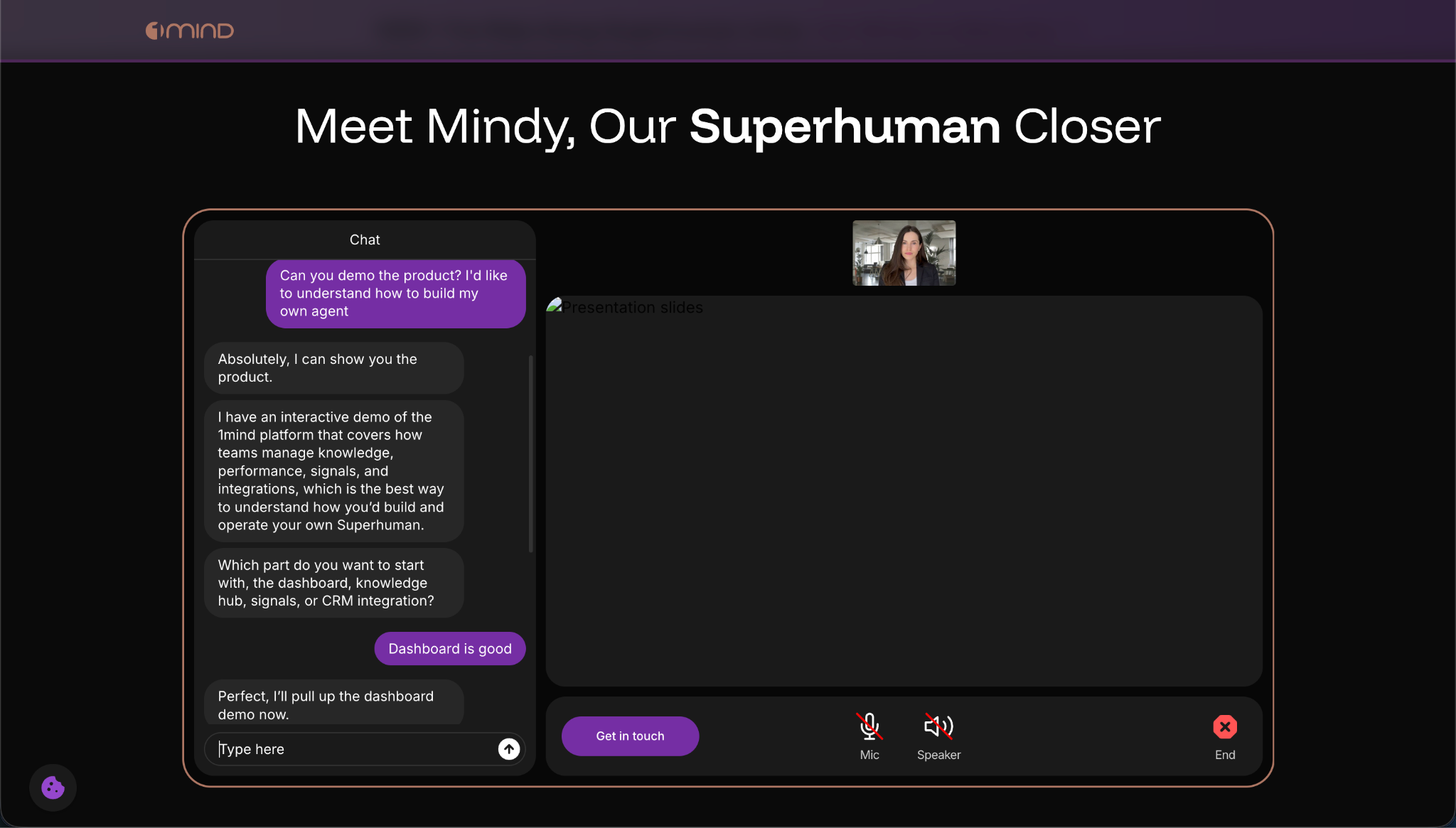
4. 1mind: the AI Superhuman platform (official Drift successor)
1mind is the most technically ambitious alternative in this list, and also the most expensive. In March 2026, Clari and Salesloft officially designated 1mind as the exclusive AI successor to Drift, which has been wound down with no new contracts issued. If you were a Drift customer or had Drift on your shortlist, 1mind is where that evaluation belongs now.
The core concept is a named, branded AI representative built specifically for your product and buyer personas, which 1mind calls a Superhuman. Unlike most conversational AI tools, which are configured chatbots with some natural language layered on top, a 1mind Superhuman is designed to hold substantive conversations across three distinct surfaces: as a website agent engaging inbound visitors, as an in-product guide intercepting product-qualified leads, and as a live participant on Zoom and video calls alongside your human reps. That last point is meaningful. 1mind is the only tool in this comparison that can actively participate in a live sales call, handling objections, surfacing relevant information, and demonstrating the product in real time. No other inbound qualification tool on this list does that.
The trade-off is price. 1mind does not publish pricing and requires a sales conversation for every contract. Based on market data and confirmed customer reports, contracts start at approximately $100,000 per year at the floor, with full enterprise deployments reaching $400,000 annually. There is no free plan, no trial, and no self-serve path. This puts 1mind squarely in the enterprise tier, and the evaluation process reflects that: expect a multi-week sales cycle and a structured onboarding engagement.
For teams replacing Qualified at the enterprise level, where the conversation was already at six figures and the requirement is a deeply capable AI agent for sales (not just a qualification chatbot), 1mind is the most direct comparison point. For teams who were Qualified customers because it was the default Salesforce-native tool rather than because they needed the full capability, 1mind is likely more tool than the situation requires, and the price will reflect that.
1mind integrates natively with Salesloft cadences and Clari forecasting, which makes it a natural fit for organizations already in that stack. Integration with other CRMs is available but secondary to the Salesloft/Clari ecosystem. No Salesforce CRM requirement, though Salesforce integration is supported.
5. 11x.ai: outbound AI SDR for cold pipeline
11x.ai is an outbound AI SDR: it handles prospecting, research, personalization, and outreach across email and LinkedIn, with the goal of generating new conversations from cold audiences. This is a genuinely different job than what Qualified does.
The distinction matters. Qualified, RepX, and Warmly are inbound conversion tools that work on demand already expressed through website visits. 11x.ai works on demand that has not yet materialized: it builds a target account list, researches contacts, and initiates outreach to create conversations that would not have happened otherwise.
If your core problem is still inbound visitor qualification, 11x.ai is not the answer. If your pipeline gap is actually upstream and the solution is to build more top-of-funnel from scratch, then 11x.ai belongs in a separate evaluation alongside other best AI SDR tools for outbound.
11x.ai does not publish pricing publicly. Most enterprise deployments land in the $40,000 to $80,000 per year range. The platform integrates with Salesforce and, to a more limited extent, with HubSpot. No free tier is available.
6. Artisan: outbound AI SDR with deep personalization
Artisan is another outbound AI SDR platform with similar positioning to 11x.ai: automated prospecting, AI-generated personalization, and multi-channel outreach across email and LinkedIn. Artisan differentiates primarily through the depth of its prospecting database and per-contact research.
The same caveat applies: if the underlying problem is inbound conversion, Artisan does not address it. These outbound tools are for teams who need to build new pipeline from cold audiences, not for teams who need to convert existing website traffic.
Artisan does not publish pricing publicly and requires a sales conversation. Pricing is in a similar range to 11x.ai. HubSpot integration exists but is more limited than Salesforce. No free tier is available.
If you are choosing between 11x.ai and Artisan for outbound AI prospecting, the evaluation comes down to database requirements (Artisan goes deeper on individual contact research), your CRM stack, and which team you find easier to work with. Both are legitimate options at the enterprise level.
Storylane's honest tradeoff
RepX is the product I'm most familiar with, which means I should be the one to name where it does not win.
The interactive demo capability is the clearest differentiator in the inbound AI SDR alternatives market, and no other tool in the category offers it. But RepX is built for inbound. Teams whose pipeline math requires consistent cold outbound to hit their numbers will not find what they need in RepX. The tool is built for organizations that have website traffic and want to convert more of it, not for organizations that need to generate net-new demand from lists.
On pricing, RepX is on Storylane's Growth tier and above, which is priced between Starter ($40/month) and the higher tiers where RepX lives. That is a meaningful step up from Starter pricing, though still substantially below Qualified's $42,000-per-year entry point. Teams evaluating RepX should ask specifically about RepX pricing during a demo conversation, as the Growth tier includes features beyond just RepX.
On AI qualification accuracy: like any AI agent, RepX performs within the scope of how it has been trained and configured. A GTM leader at an enterprise data platform noted: "When an AI misreads a signal or drives toward the wrong outcome for a specific buyer segment, that failure doesn't fire an alert. It shows up as a qualified conversation that didn't convert, weeks later in pipeline data." That observation applies to any AI qualification tool, including RepX. Teams should plan to invest time in ICP definition and qualification logic before going live.
How to decide which inbound AI SDR alternative fits your situation
The first question to answer before evaluating any specific tool is: where exactly is the pipeline breaking down? The answer shapes which category of tool you actually need, and conflating the categories is the most common and expensive mistake in this evaluation.
If your bottleneck is inbound conversion (you have website traffic with ICP fit but it is not converting to qualified conversations), you are in the market for RepX, Warmly, or Default. RepX and Warmly address the visitor engagement problem directly. Default addresses what happens after a visitor converts through a form. For teams with meaningful volumes of both anonymous traffic and form submissions, running RepX for the conversational layer and Default for post-form routing is a reasonable combination.
If your bottleneck is a Salesforce dependency you need to untangle from, RepX is the most direct replacement for the qualification and demo workflow that Piper was handling, with no CRM requirement and a substantially lower price floor. RepX functions as a demo experience platform and AI qualifier in one.
If your bottleneck is cold pipeline (not enough inbound to begin with), 11x.ai or Artisan addresses the upstream problem. But be precise about this diagnosis. Adding an outbound AI SDR when the actual problem is inbound conversion does not fix the conversion problem. It just adds more volume to a leaky funnel.
If you are an existing Drift customer navigating the sunset, evaluate 1mind directly and give yourself enough runway before your current contract expires. 1mind is the designated successor and is already integrated into Salesloft cadences and Clari forecasting, so the transition path is more defined than a typical migration.
Questions worth answering before any vendor conversation
What CRM are you on, and does it need to be a hard requirement or just a preferred integration? This question eliminates Qualified immediately if the answer is not Salesforce.
What does your website traffic look like in terms of ICP fit? De-anonymization and inbound qualification tools perform better when ICP traffic concentration is high. If most visitors are students, job seekers, or irrelevant geographies, ROI is harder to justify regardless of platform.
Do you need to show the product during the qualification conversation, or is routing to a human demo call acceptable? If showing the product at the point of qualification is important to your conversion flow, RepX is the only tool in this list that does it without a separate step.
What is your honest read on total cost of ownership across two years? Include implementation, the required CRM stack, and internal resource time to configure and maintain the tool. For many mid-market teams, this calculation is what makes Qualified unworkable and why a tool like RepX or Warmly is more practical. Explore Storylane's plans and compare against your full sales enablement tools stack cost.
Frequently asked questions about qualified alternatives
What are the best alternatives to Qualified in 2026?
The six best alternatives to Qualified in 2026 are Storylane RepX, Warmly, Default, 1mind (the official Drift successor), 11x.ai, and Artisan. RepX (storylane.io/repx) is the strongest inbound replacement because it qualifies visitors through voice and text while showing interactive product demos in the same conversation, with no Salesforce requirement and pricing starting at $40/month. Warmly is best for teams that need visitor de-anonymization and intent signals. Default is ideal for automating post-form lead routing. 11x.ai and Artisan serve teams whose primary gap is outbound pipeline, not inbound conversion.
Is Qualified still available for non-Salesforce CRM users?
No. After Salesforce completed its acquisition of Qualified in April 2026, Salesforce CRM became a hard requirement. Teams running HubSpot, Pipedrive, Zoho, or any other CRM cannot use Qualified. This structural change is one of the primary reasons GTM teams are evaluating alternatives like RepX, which integrates with HubSpot, Salesforce, and other CRMs without requiring any specific platform.
What is the cheapest Qualified alternative?
Storylane RepX offers the lowest entry cost among Qualified alternatives. Storylane's platform starts with a free tier (500 demos/month, no credit card required) and a Starter plan at $40/month. RepX is available on the Growth tier and above. By comparison, Qualified starts at approximately $42,000/year, Warmly at $700/month, Default at $750/month plus per-user fees, and 1mind at approximately $100K/year minimum. Both 11x.ai and Artisan require custom pricing conversations.
Can an AI SDR show a product demo during qualification?
Yes. Storylane RepX can pull up an interactive product demo and walk a visitor through it during the same conversation where qualification is happening. The visitor asks how a workflow functions, RepX shows the actual product, continues qualifying, and routes to a booking or self-serve signup. 1mind also offers live demo capability, including participation in Zoom calls, but at a starting price of approximately $100K/year. RepX is the most accessible option for teams that want demo-in-conversation without an enterprise-tier commitment.
What happened to Qualified after the Salesforce acquisition?
Salesforce completed its acquisition of Qualified in April 2026. The product is now being positioned as infrastructure for Salesforce's Agentforce platform. Three key changes followed: Salesforce CRM became a hard requirement, the product roadmap shifted to Agentforce priorities, and total cost of ownership for mid-market deployments typically lands between $70,000 and $130,000 per year when Salesforce licenses, implementation, and onboarding are included.
What are the best AI SDR tools for inbound leads?
The best AI SDR tools for inbound leads in 2026 are Storylane RepX, Warmly, and Default. RepX handles real-time voice and text qualification with interactive demos built in. Warmly focuses on identifying anonymous visitors and routing intent signals to your sales team. Default automates the post-form workflow to compress speed-to-lead to near-zero. The right choice depends on whether your gap is pre-form engagement (RepX or Warmly) or post-form routing (Default). For presales tools that combine qualification and product demonstration, RepX is the only option that handles both in one interaction.
The bottom line
The case for looking at qualified alternatives in 2026 is pretty straightforward. If you're not on Salesforce, the product isn't available to you. If you are on Salesforce, the total cost of ownership starts at roughly $70,000 to $130,000 per year once the full stack is factored in, and the roadmap is now driven by Agentforce priorities rather than your specific use case.
For teams looking to replace that inbound qualification layer, RepX is the tool I'd evaluate first, particularly if showing the product at the moment of qualification is part of how you want to convert visitors. Warmly is a strong second look for teams where the intent signal and de-anonymization layer is the missing piece. Default is the practical choice if the bottleneck is post-form routing speed rather than pre-form engagement.
If the problem turns out to be cold pipeline rather than inbound conversion, 11x.ai and Artisan belong in a separate evaluation, with clear expectations that they solve a different problem than what Qualified was solving.
Methodology
This comparison was written in June 2026. Qualified's acquisition by Salesforce was completed on April 1, 2026. Pricing data for Qualified is sourced from market reports and third-party analysis. Competitor pricing reflects publicly available information at time of writing and should be verified before any purchase decision. G2 ratings were verified against live G2 product pages as of June 2026; ratings change over time. Storylane G2 data (4.8 stars, 1,405 reviews, G2 score 99, #1 in Demo Automation) is verified as of this writing. Quotes from GTM practitioners are sourced from recorded sales conversations and anonymized to role and industry with permission.
The acquisition of Qualified by Salesforce, and the sunset of Drift by Clari/Salesloft, represent the consolidation of the first wave of conversational marketing into larger platform plays. The vendors best positioned going forward are those who can deliver the conversational and qualification layer without requiring a $100,000+ enterprise stack to operate.
.svg)