Imagine you’re visiting a clothing store. The first thing you’ll notice is the entrance. If the gate isn’t enticing enough, you would not enter the store, right?
Similarly, a website welcome page serves as a virtual front door, offering the first impression of your brand. It plays a pivotal role in grabbing the attention and interest of users. Hence, it needs to be world-class.
In this blog, we’ll explore the need for a welcome page and what are the essential elements that need to be included in it.
What is a Website Welcome Page?
A website welcome page is the first page a user lands on when they search for your solution online. It's essentially your home page.
The main objective of this page is to get visitors to take a desired action - like signing up or booking a demo or call. To push them toward that goal, your home page should explain what your company does, what problems they solve, and who can benefit from using your solution. Coupled with interactive visual elements, a compelling home page can help increase sign-ups or demos.
11 Best Website Welcome Page Examples
A well-polished landing page can significantly boost your conversion rates - although it all comes down to giving your website visitors (who are your potential customers) a seamless customer experience.
Here are 11 website landing page examples to inspire you.
Cool website homepages
1. Lavender
Lavender is making waves in the sales world as an email AI coach. It's like having a sales genius look over your shoulder as you type.
Three reasons why we love their welcome page:
- The hero section now directly addresses sales professionals' needs. They've replaced the previous, vague "Email like magic" headline with the more targeted "more replies = more sales pipeline," speaking directly to the priorities of SDRs and AEs.
- They've positioned themselves as the Sales email AI coach you never knew you needed. It's not just about pretty emails anymore - it's about optimizing your outbound game.
- As a bonus, an interactive game in the second fold adds an engaging touch. It's like they're saying, "Hey, we know sales can be tough, so let's have some fun while we're at it!".
The best part? This homepage facelift isn't just about looking good - it's about speaking directly to their ideal customers.
By focusing on the problems they solve and the benefits they offer, Lavender's homepage now serves as a more effective gateway to their product.
This approach underscores the importance of thoughtful hero copy. It's not just introductory text but a crucial first impression that can significantly impact user engagement and conversion rates.
2. Rows
Ever visited a homepage to only be directed to the product itself? That’s what Rows is doing to stand out from the crowd in the spreadsheet industry.
Three reasons why it stands out:
- They've abandoned the conventional landing page approach. Instead of describing Rows' capabilities, they offer an immediate, hands-on product experience. This strategy allows visitors to explore the spreadsheet as a website and understand the platform's functionality directly.
- The "dive right in" approach is a stroke of genius. No more barriers between you and the product - it's just you and a world of spreadsheet possibilities. It's as if they're saying, "Why read about it when you can experience it?"
- They demonstrate their collaborative features in real time. Visitors can witness how spreadsheets transform into interactive websites, showcasing the platform's unique capabilities in a tangible way.
The platform works to highlight Rows' distinctive features without overwhelming new visitors with excessive information or technical jargo.
Rows has clearly prioritized a "show, don't tell" philosophy in its user acquisition strategy. By transforming its homepage into an interactive showcase of its product's capabilities, Rows has turned it into a playground for potential users, and we're here for it!
Interactive website home pages
3. Cognism
Cognism is making waves in sales intelligence, quickly becoming the go-to platform for B2B prospecting.
Three reasons why we're impressed:
- The homepage cuts right to the chase. Within seconds, you know exactly where you are, what Cognism does, and why you should care. Just clear, compelling messaging that gets to the point.
- Just below the hero section, there's an interactive demo waiting to be explored. It's like they're saying, "Don't just take our word for it, try it yourself!" This hands-on approach is a game-changer for curious visitors.
- The layout is designed to keep you scrolling. They've mastered the art of the "5-second rule" - answering the crucial questions of "Where am I?", "What can I do here?", and "Why should I care?"
The demo makes the website welcome page interactive, which is a clever way to showcase the product's capabilities without overwhelming new visitors.
Cognism has clearly put some serious thought into making their site work harder for them, and it shows.
4. Pulley
Pulley is shaking up the equity management game - it's like having a financial wizard in your pocket for all things startup equity.
Three reasons why we're excited about their approach:
- They've ditched the boring product lists and gone straight for the "show, don't tell" method. Right on their fundraising modeling landing page, there's an interactive demo letting visitors spin the product. It's like trying on a pair of shoes before you buy them - but for complex equity calculations!
- The demo is designed with founders in mind. It walks you through modeling fundraising impact on equity dilution - a task that usually requires an MBA and three cups of coffee. But with Pulley, it's as easy as ever.
- Instead of bombarding you with a laundry list of features, Pulley focuses on the good stuff - the benefits and impact. It's not about what the product does; it's about what you can achieve with it.
The effectiveness of this approach is evident in the numbers: the interactive demo has garnered over 10,000 impressions and successfully converted thousands of visitors into free users.
The takeaway? By providing a hands-on experience directly on the landing page, brands can significantly enhance user engagement and drive conversions.
Creative Website Home Pages
5. Butter
Butter is stirring up the virtual collaboration space - it's quickly becoming an alternative to the usual video conferencing fare.
Three reasons why their homepage works well:
- The hero section now cuts straight to the chase. They've swapped the earlier, wordy "The best way to plan & run highly engaging sessions" for the punchier "Run more engaging sessions. Get better outcomes." It's like they're saying, "Hey, we know what you really want - let's make it happen."
- They've spiced up their sign-up options. Gone are the bland "sign up it's free" or "book a demo" buttons. Now, you can "sign up with Google" or "sign up for free" - making it easier than ever for them to take a free trial. It's a small change that could lead to big improvements in sign-up rates.
- They've replaced the static image with an auto-playing video showcasing Butter's features in action. This dynamic element provides visitors with an immediate visual understanding of the platform's capabilities.
The revamped homepage doesn't stop there. They've carved out sections throughout to highlight their features, emphasizing how Butter eliminates the need to juggle multiple apps. Plus, they're serving up a buffet of templates for polls, flashcards, and more.
Butter's updated homepage represents more than just a visual refresh; it's a strategic overhaul that clearly communicates its value proposition and effectively demonstrates its platform's capabilities. It's not just competing with Zoom; it's whipping up a whole new recipe for virtual collaboration.
6. Capsule video
Capsule positions itself as an innovative platform for enterprise teams that need branded demos.
Three key aspects of their homepage design stand out:
- The hero section now captivates visitors immediately with an auto-playing video. They've replaced the static thumbnail and "watch the video" CTA with dynamic content that showcases their platform's capabilities right from the start.
- They've clearly repositioned themselves as a comprehensive video creator for various types of branded demos. This shift emphasizes the platform's versatility and speaks directly to the needs of marketers and content creators.
- Introducing AI features, including an AI co-producer, highlights Capsule's commitment to technological advancement. This addition enhances the platform's capabilities and appeals to users looking for cutting-edge tools.
The redesigned homepage also takes a fresh approach to social proof. By switching from video testimonials to tweet-format endorsements, Capsule can now showcase a broader range of positive feedback in a more digestible format.
This homepage goes beyond visual improvements; it's a strategic move to better communicate Capsule's value proposition. Thus, Capsule's homepage now serves as a more effective gateway to its platform.
Simple Website Home Pages
7. Notion

Notion is an all-in-one, AI-powered collaboration platform where teams can create documents, projects, and wikis.
Three reasons why we like it:
- It’s minimal. With its famous black-and-white illustrations, Notion captivates users at first glance.
- Kushal Khandelwal, a product marketing expert, praises Notion's home page: “I like Notion because they explain exactly what the product is and why the ICP needs it right in the above-the-line messaging. It also shows me the product and what jobs I can do using actual product illustrations.”
- Since Notion is cross-functional, its home page contains a section on how different teams can use the product. This caters to all the relevant audiences and helps them make a more informed purchase decision.
8. Miro

Miro is a visual collaboration platform that delivers an intuitive and engaging collaboration tailored for multiple teams.
Three reasons why we like it:
- With a simple design and copy, Miro’s home page provides a neat and calm customer experience.
- Gowthami, Performance Marketer at Klenty, shares her thoughts on Miro’s home page, “The Miro website is well organized and follows a structure. Motivates users to take action wherever required and allows users to visualize and understand the product better in both design and copy. It delivers value, is interactive, and clearly shows what users would benefit from the product.
- Images are comprehensive and give a taste of the product. In the second fold, they’ve added an interactive GIF that allows users to see how the product works. The banner below the first fold showcases all the big customers using Miro, which adds social credibility.
9. Grammarly

Grammarly is an AI-powered writing assistant that edits, scores and improves your writing.
Three reasons why we like it:
- Grammarly’s website has a clean, modern design that’s easy to navigate. The main options are clearly labeled, making it easier for visitors to navigate the website.
- Their copy clearly emphasizes the “what, why, and who” - what is Grammarly, what’s the need for them, and who it is for. They also mention the various places their plugin can be used.
- The website ends with customer testimonials stating how Grammarly helped them and in what aspects - reassuring visitors that this is a good product that has benefitted multiple teams.
10. Wix

Wix assists users in website creation.
Three reasons why we like it:
- Being a website creation software, they emphasize that their website was also created using their product - giving visitors a first-hand feel of what their product can achieve.
- Design and copy come together to create a fantastic user experience. With minimal white space, Wix has done a great job of making the website appealing and letting users know their value simply but effectively.
- They have also provided free website templates that visitors can use right now to create their website - making it an effective landing page that drives higher conversion rates.
11. Mailchimp

Mailchimp is an email automation software that helps users plan and execute email campaigns.
Three reasons why we like it:
- The headline is simple and straightforward. They let users know exactly what they do, leaving no room for confusion.
- With interactive images and elements, the home page draws visitors’ attention, while the copy is short enough to convey the value without boring them. Shorter copy drives higher conversions as visitors lack the attention span to read long content.
- An interactive support chatbot pops up upon entering the website, which makes it easier for visitors to reach out to them in case of any confusion.
What to Include in a Website Welcome Page Without Fail
A welcoming home page combines multiple factors playing harmoniously with each other. As Gowthami puts it, "A homepage is a collection of elements. Together, they must create the best first impression. It could be the copy, design, and the flow of the page. Making a good first impression is the key. Users must get an idea of what you sell and how they would benefit from it when they first visit a website."
We've seen some exciting website welcome page examples. Let's see what key elements tie them all together. Below are some of the crucial things a website home page should contain:
1. Have Your Brand Shine Through
The home page is often the first visitor interaction with your website. Having consistent branding helps create a memorable first impression. Branding includes company logos and brand colors, visuals, landing page design style, tagline, typography, and voice. Maintaining consistency across all your website pages is vital to increasing brand recall.
2. Explain What You Do In The Shortest Way Possible
Lalith Venkatesh says, "If you are a SaaS, you must tell the user what you do in the first headline in simple, straightforward language. Marketers constantly assume that their prospects know what they know. But that’s not the right approach. Keeping the headline, for that matter even the rest of the copy, short and to the point helps visitors grasp the true value of your solution without boring them.”
3. Place Call-To-Actions (CTAs) In The Right Places
Ashok Dhaksan, Senior Growth Marketer, emphasizes the importance of CTAs, “Without a call to action button, visitors are lost. They won’t know what to do. You can have the best design and even better copy, but without a button or text indicating what users should do next, you’ll never be able to get them to convert. CTAs are directives to users that help them navigate the website. Also, they give insights into user behavior and preferences, allowing us to measure and optimize the website to turn the home page into a high-converting landing page.”
4. Support Your Writing With Visuals
Images on your website are crucial to back up your claims. Make sure your website has a modern design that demands trust. Plus, buyers expect a glimpse into the solution to make an informed decision.
5. Add Interactive Demos To Deliver Value
Buyers nowadays want to “try before they buy.” They want to know how your product will benefit them even before they log in. This is why including interactive demos on your website will help instantly deliver your product's value.
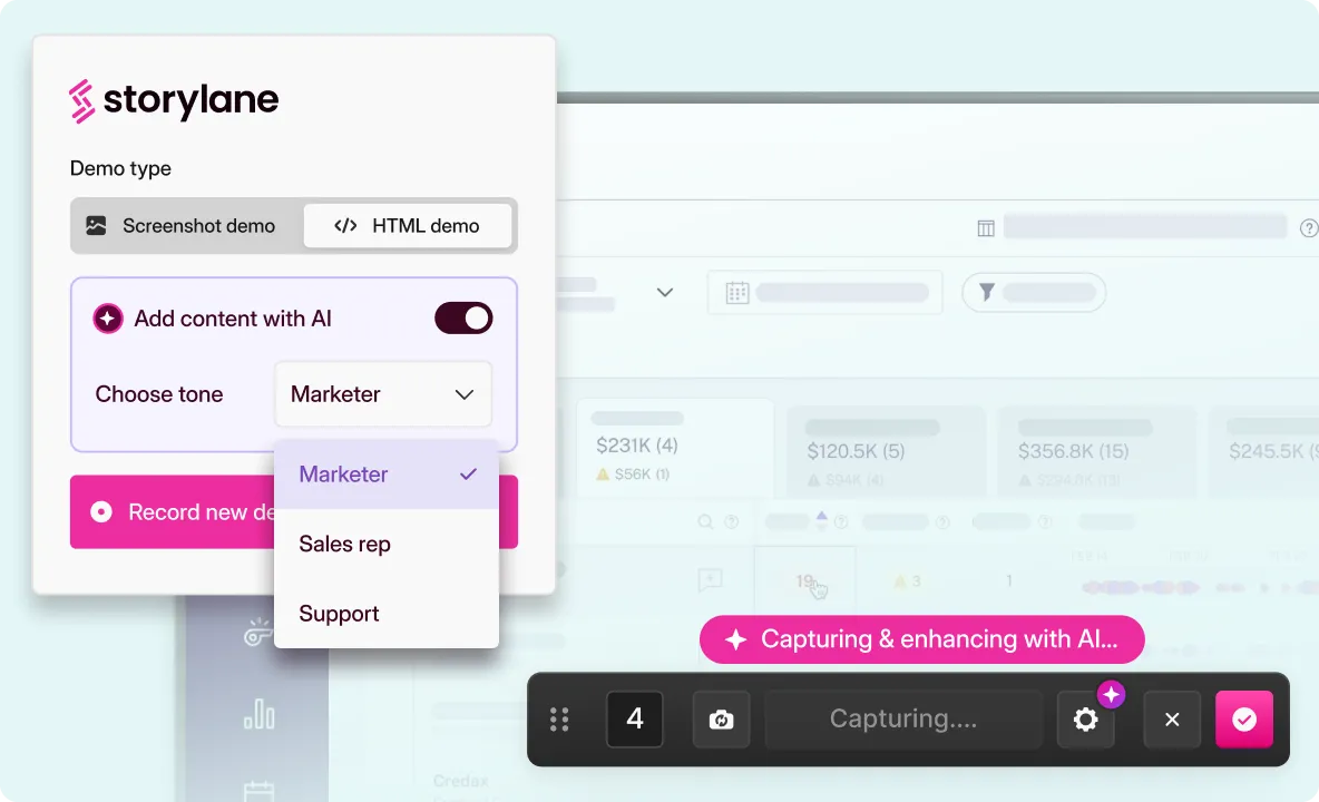
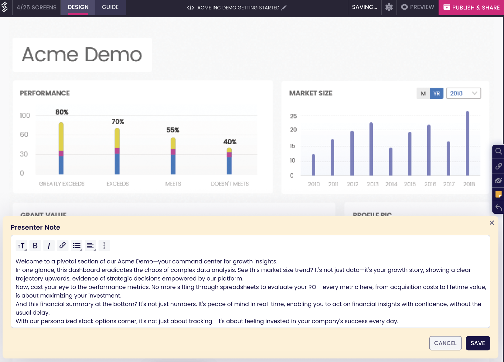
Interactive demos are replicas of your product that can be embedded on websites. They provide users with a hands-on experience of your product, allowing them to interact, investigate, and connect with the product virtually.
No-code tools like Storylane help you build interactive demos in no time. Ignition added an interactive demo to its website, saw a 10% increase in paid conversions, and generated 5000 leads annually. Read the full story here.
6. Back Your Claims With Social Proof
Social proof, like testimonials or percentage increases indicating how your solution changed lives, is a testament to trust. Even with a world-class product, only some people will purchase your product with some kind of review. Think about it: if you go to Amazon looking for a product, will you buy it blindly or go through the reviews first? It’s the same logic.
7. Make It Easy For Users To Navigate
When visitors land on your website, it can be too overwhelming to visit a cluttered website, which was a norm some years ago. It’s important to add elements like arrows and buttons that help guide users on where to go and what to do next. It’s crucial for decreasing bounce rates (calculated by measuring how many people leave your website without taking any action).
Users read the page from top to bottom and text from left to right. Put the most critical links in the navigation bar at the top of the page. Add CTA buttons in the top-right corner, as users are familiar with signing up from there.
Maintain a good balance of design and text, and make your home page scannable, as most users just skim through.
Always indicate that users need to scroll to read the whole page. Add scroll bars to the right of your page.
For example, Veeva cleverly prompts users to scroll by displaying only the headline of their second fold.

8. State Features But Emphasize On Benefits
Your homepage is a snapshot of what your product does for the prospect. So, mention all the different features or capabilities and the value they deliver clearly and concisely. Kushal tells us about his writing process: “I like to keep the copy as clear and concise as possible. Avoid complex and long sentences. Also, I've seen many marketers directly frame the copy to talk about the product and company, but I prefer to talk from the customers' perspective and what they can do with the product and its features.”
9. Add Success Indicators To Build Trust
Along with customer testimonials, it also helps to add awards and achievements on your website home page to build trust and credibility.
In Conclusion
Crafting a compelling website welcome page is a delicate interplay of design, content, and user experience.
As businesses strive to make a lasting impact on their audience, understanding and implementing these elements can transform a homepage into a high-converting landing page. A well-crafted welcome page is the gateway to a seamless customer journey, inviting users to explore, engage, and convert.
1. What Does URL Stand For?
URL stands for Uniform Resource Locator. It is a unique identifier that allows users to locate a file on the internet.
2. How Do You Write a Catchy Landing Page?
A catchy and effective landing page combines brilliant design and conversion-focused copy. Having clear and catchy headlines, concise sub-heads, and interactive elements will help users remember your brand and the value you deliver.
3. How Do I Create a Landing Page Without a Website?
Landing pages can be created without a website using landing page builders like ConvertKit or HubSpot. They provide a shareable link that can be sent to prospects and clients quickly.
Related Reading
Genius Landing Page Optimization Examples to Boost Conversions
“Coming Soon” Landing Pages That Convert: Examples to Inspire You

.svg)
.svg)









.svg)

.webp)