.svg)

Does a potential customer on a free trial experience your product in its full-blown glory? Of course, not.
Yet, 63% of the potential customers will decide whether to subscribe to your product or not depending on how they were onboarded. Meanwhile, 74% of them will move to other solutions if the onboarding process is particularly complicated.
These numbers leave much to be desired.
A poor user onboarding experience will also inevitably lead to poor product adoption, retention rates, and revenue.
What goes wrong? One of two things:
- In-app guidance focuses too much on getting a high completion rate over making sure users experience the “wins” early in the process.
- Instead of focusing on the user’s needs and challenges, the tutorial focuses on the product: advanced features, striking UI, etc.
Either way, the solution lies in striking a balance between user needs, UI/UX elements, and showcasing the “wins” to create a highly effective in-app tutorial.
But before we tell you how to create one, let’s quickly touch base.
What are In-App Tutorials?
In-app tutorials are interactive user guides that are built into an app's user interface. They provide in-app guidance to newly onboarded users by introducing core features, highlighting key workflows, and providing app training directly within the app to prompt user action.
In-app tutorials often use a combination of tooltips, modal windows, and other UI elements to walk users through the product’s valuable features and functionalities in a step-by-step manner.
Once users finish the tutorial, they can get started without having to refer to support articles or spend hours on a call.
These tutorials may include video demonstrations, product tours, or step-by-step, interactive walkthroughs.
(See in-app tutorial examples now!)
Here’s what in-app tutorials are not: guides and communication shared outside of the app. This includes SMS messages, emails, help docs, blog posts, and more.
Benefits of In-App Tutorials
The primary goal of in-app tutorials is to drive product adoption through feature discovery and user action. They are vital in simplifying the user journey and ensuring quick user activation—ultimately encouraging a more satisfied and self-sufficient customer base.
Let's look into various other reasons why in-app tutorials are beneficial.
1. Ease of Use
In-app guidance makes it easier for users, especially the new ones, to understand how to effectively use the app or software, reducing frustration and the learning curve.
2. Feature Discovery
They play an active role in ensuring all users are aware of and utilize the full range of features available - maximizing the value they get from the product.
3. Self-Paced Learning
No customer wants to spend hours with a sales rep or customer success manager to understand how to navigate your product.
In-app tutorials allow users to explore the product independently and give them an easy reference point for when they want to go over the valuable features again.
4. Efficient Onboarding
In-app tutorials are major time-savers for new users, as they help them learn to use your app quickly. They improve the onboarding process by offering step-by-step guidance within the app that shows users how to use key features and complete important tasks.
These tutorials bring those "aha!" moments where users grasp the value of your product, making their journey more effective and enjoyable.
5. Enhance Product Adoption
Most features are in the shadows because users don't know how to find or use them.
Through interactive walkthroughs, your user base will know exactly where to look for the target feature and how to use it. This virtually enables users to realize its core value. And when users adopt the product, they are more likely to continue using it over time, boosting customer retention.
6. Drive User Engagement
You want new users to engage with your product if you want them to stay. You must prompt them to click, scroll, or navigate to a different tab within your product—or any other user action. The goal is to keep them engaged.
And once user engagement increases, they'll discover newer ways to utilize your product and derive value from it.
7. User Acquisition
Offering users a taste of your product before they commit makes it easier to attract new users. In-app tutorials are valuable in introducing free trials for your software, which can help shorten the sales cycle.
Types of In-App Tutorials
There are multiple ways to provide in-app guidance. Here are four commonly used tutorials you can use.
1. Pop-Ups Within the App
When a user signs up for your product, you can show pop-ups illustrating the benefits of your product or a core functionality you'd like them to try first.
An in-app pop-up will typically contain textual instructions, but it works best when you have a video attached to it.
Here’s how Jeevithan from Mad Street Den created in-app guidance using pop-ups:
"When we launched a new product last year, our goal was to increase adoption at scale. The best way to do that was within the product. So, the team quickly got to work on short 2-minute videos for all valuable features, with captions and detailed instructions on how to use them.
The idea was that as soon as a user entered the platform, they should be able to navigate it easily with the help of in-app guidance."
2. Interactive Product Guides
Interactive product guides are multi-step tutorials that provide in-app guidance on the product’s core functionality.
It uses action-driven tooltips and other clickable elements instead of passive instructions to encourage users to take the suggested action as they move from one valuable feature to another. This aids and speeds up the learning process.
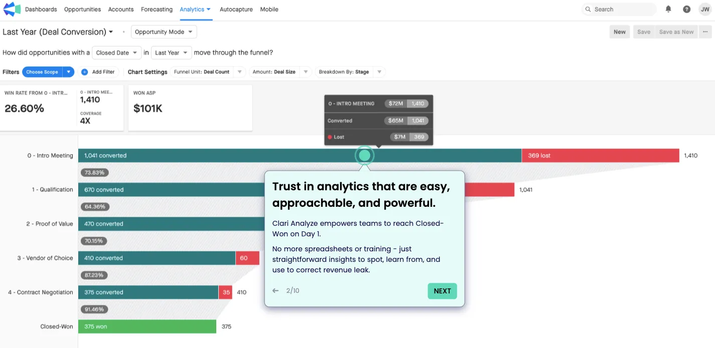
For example, Clari provides a combination of pulsating hotspots and tooltips explaining the key features in short, crisp messages to help first-time users identify and get familiar with the product.
But how do you create one? In-app tutorial software like Storylane helps you build interactive product guides to improve your average completion rate. Its HTML editor enables you to add a variety of widgets to instruct users.
You can provide support with textual instructions and videos along with a suite of personalization options. It only takes 10 minutes to demonstrate a specific use case or workflow relevant to the user. How? Get started for free and see for yourself.
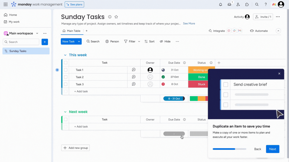
3. Pulsing Hotspots
Another efficient way to bring attention to advanced features is by using Hotspots. They are an interactive UX element designed to bring attention to a certain product area without being intrusive or annoying.
For example, monday.com uses a combination of HotSpots and pop-ups to capture the user's eye and showcase their premium features tactfully.
4. User Onboarding Checklists
User Onboarding checklists are helpful to-do lists that make it easier for new users to get started with a product.
For example, Klenty offers a step-by-step, simple checklist of preliminary onboarding steps that a user needs to complete to begin the adoption process.
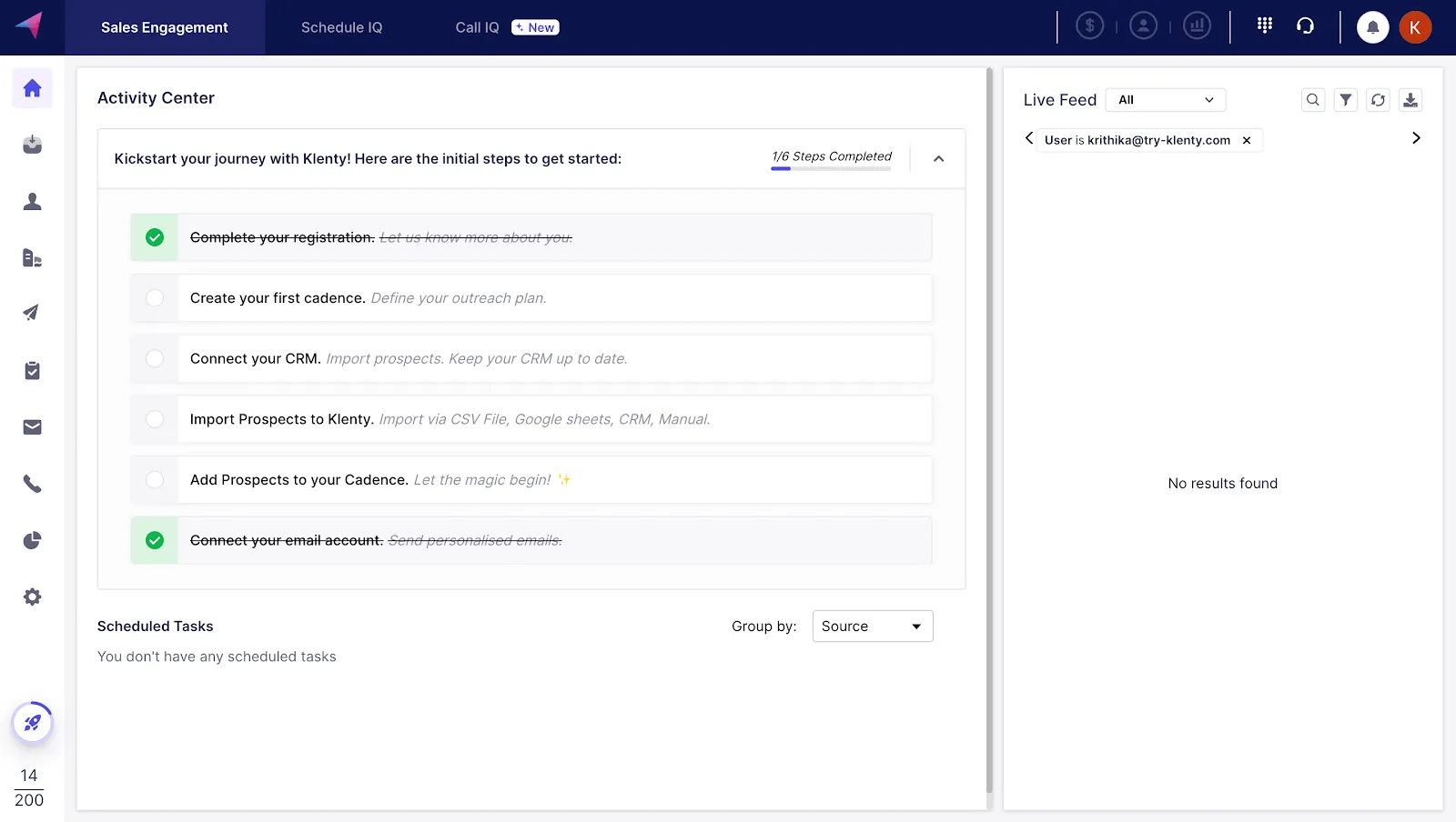
Tanya George, Product Marketer at Klenty, shared the thought process behind this:
"At Klenty, we wanted our users to start with the basics, like connecting their email IDs or CRMs. But often, they'd struggle to navigate within the product. So, we devised a quick solution to include user onboarding checklists within the app. And it has impacted product adoption significantly.
Our customers have a premium walkthrough experience, and we can also track where users are getting stuck to assist them whenever necessary,"
How to Create Amazing In-App Tutorials
It only takes five steps to create a highly engaging in-app tutorial. They are:
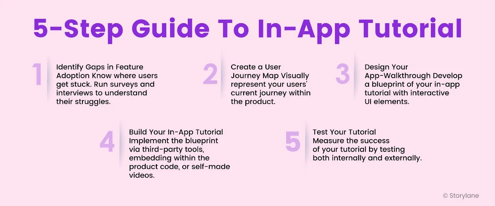
Step 1: Identify Gaps in Your Feature Adoption
A good place to start would be to analyze customers' behavior on your product and identify areas that need to be adopted. It could be for various reasons - maybe the feature is hard to find or customers need help understanding what it's there for.
Either way, bringing attention to a feature is a surefire way to increase adoption.
Usability tests, focus groups, surveys, and user interviews can help you discover where they struggle.
Step 2: Create a User Journey Map
User journey maps visually represent the steps a user takes to activate your product. Below is an example of a user journey map:

Formulating a user journey map requires a deep understanding of your users, their steps when using it, and the challenges they might face.
While it typically covers the user's entire product journey (from first touch to ongoing usage)—for a product walkthrough, focus only on the adoption side of things.
Step 3: Design Your In-App Tutorial
With a clear understanding of the usage of the product, it's time to create a blueprint for your app walkthrough.
As discussed earlier, there are various ways to take your users through the product. Pick one that best suits your needs.
Use pop-ups with texts and videos if your feature is quite complex. If it's straightforward, use pulsating hotspots to bring attention.
Here’s how to go about building your blueprint:
- Choose your workflow: Deriving from your user journey map, choose the best workflow that would help your users adopt your feature/product.
- Create a storyboard: Visually represent how your in-app tutorial will unfold, screen-by-screen.
- Create a narrative: Each screen should have instructional content that leads up to the next.
- Personalize: Add elements like personalization placeholders and CTA buttons to make the user experience memorable.
It's all about user engagement. Some UI patterns to remember:
- Modal Windows is a pop-up that appears in front of the main window. They are usually text-based with a simple CTA button. They can be especially useful if you've released a new feature and want your users to try it.
- Slideouts are a less intrusive way to capture attention. They pop up on the side, allowing users to decide if they want to engage or not.
- Tooltips are little dialog boxes highlighting a specific part of the product. They're great for guiding your users through a step-by-step product walkthrough.
- Hotspots are little dots that appear on the product to bring attention to a certain area.
Step 4: Build Your Walkthrough
Implementing the blueprint comes next.
There are various ways to do it:
- Use no-code, third-party tools built specifically for in-app guides.
- If your team is tech-savvy, explore building the patterns by yourself through code.
- Use platforms like Storylane to create simple step-by-step tutorials to be added to the pop-ups.
📌 Remember: You need to strategically place UI elements at the right place and trigger them at the right time for the best customer onboarding experience.
Dave Rigotti, Co-founder of Inflection.io, also highlights in his article,
“Have contextual help resources at each stage. Think of searchable knowledge bases, FAQs, and in-app tooltips. Make it easy for users and customers to access relevant information or a support resource when they need help.”
Step 5: Test Your Walkthrough
After that, it's time to evaluate.
Start by trying the walkthrough yourself. Then, have other teams in your company try it, as they might notice things you missed. Finally, let a small group of users test it to see how most people will react and improve it if needed.
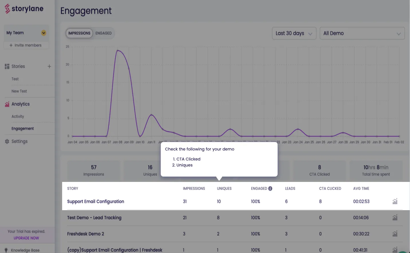
Gather consistent feedback and measure your success by assessing how many users adopted your target feature after the walkthrough release.
If you use Storylane to build the interactive walkthrough, you can capture a variety of data—from engagement rate and walkthrough impressions to the number of CTA clicks and average time spent viewing it.
Analyze this data to identify where users most users drop off– that’s where they need more guidance.
Click on the image to see Storylane's Analytics Dashboard in action: 👇
In-App Tutorial Examples
An in-app tutorial isn’t just a simple checklist for users to cross. It must offer a contextual onboarding experience by showcasing how to use the product in a pre-defined workflow.
Here are 8 in-app tutorial examples to learn from.
1. HubSpot
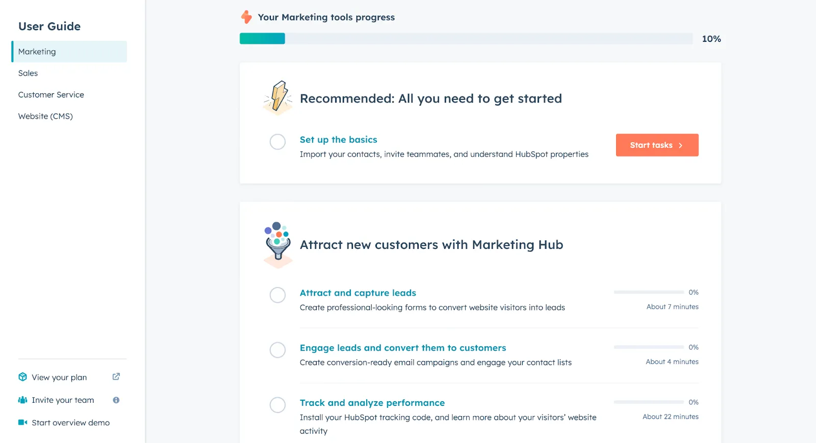
What works?
- HubSpot provides a clearly defined onboarding process to facilitate self-serve onboarding, as it serves a broader user base who care about different use cases.
- The tutorial walks the users through every step required to set up the CRM. This way, users always know where to find specific features and don’t get stuck often.
- It also does a good job of drawing attention to both essential and advanced features while also highlighting smaller details. This ensures you become familiar with the key features and nothing is overlooked.
2. Productboard
What works?
- As a product management platform, Productboard is designed to simplify team projects. In a similar vein, its in-app tutorial is short and straightforward with just ten steps.
- As a user, you can see your progress as the product tour goes on. This provides visual cues about the pending steps and encourages users to complete the tutorial.
- You can see Swimlane’s example in the background as tooltips explain each feature one by one. This use of real-world data instead of sample one gives a better understanding of how the product will work in the user’s day-to-day operations.
Click on the 'Begin Tour' button to check it out ☝️
3. Grammarly
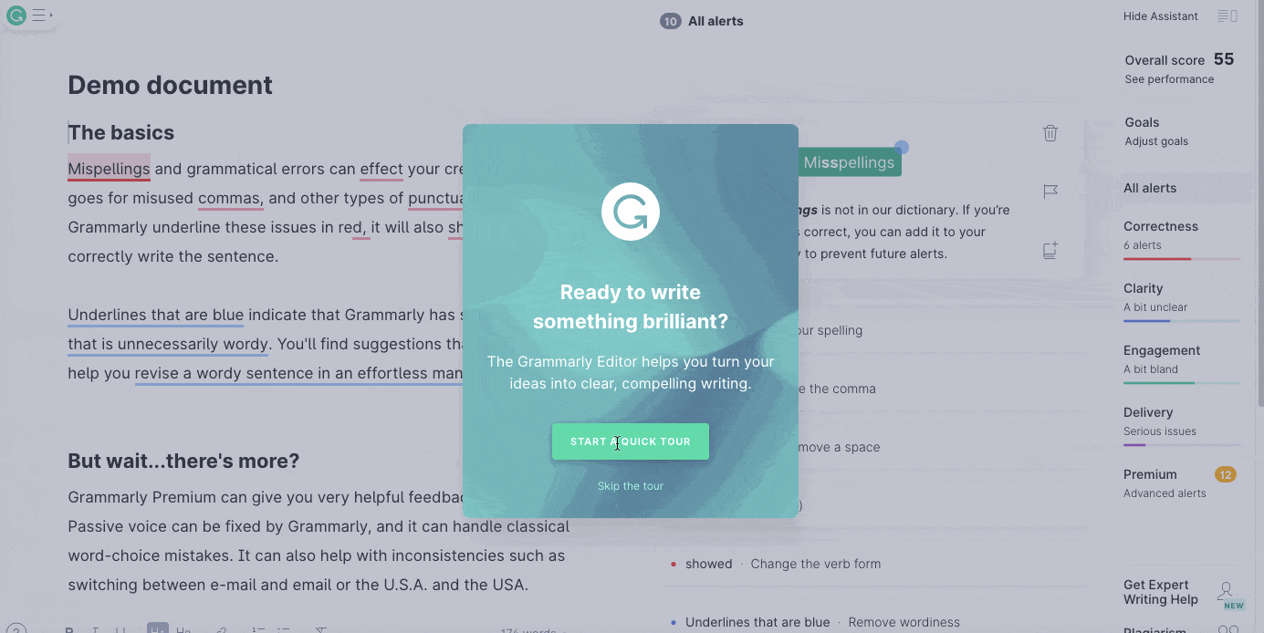
What works?
- The skip button on the first screen of the walkthrough gives users an option to opt out, should they want to. It shows respect for the user’s time and helps you avoid frustrating the users with a no-skip tutorial to get started.
- Users are quickly guided to a video tour where Grammarly engages users through clickable GIFs, adding to the engagement factor.
- Upon completing the video tour, users are redirected to a demo view to see Grammarly in action where pulsating blue hotspots are used to tell users what to click on next. This whole transition is super smooth and comprehensive.
- The last step of the walkthrough is a demo document, where users get to check for grammatical errors and get familiar with Grammarly's glossary. While a simple demonstration, it speaks to the user-friendliness of the product’s UX and motivates user action.
4. Slack
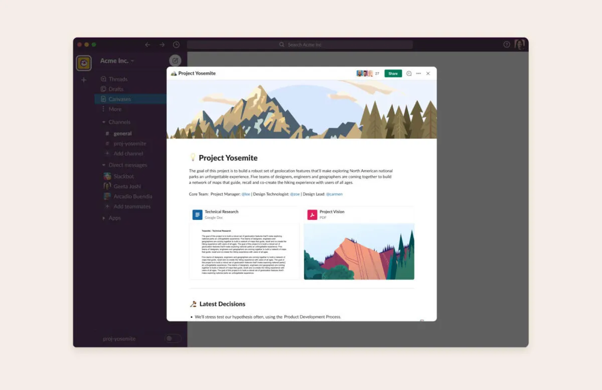
What works?
This particular in-app tutorial is for Slack’s new feature, Canvas. It's essentially docs for your chat, where teams can collaborate and brainstorm ideas in one shared space. For its launch, Slack created an interactive walkthrough.
- The tutorial started with a clever pop-up within the app, illustrating the various benefits of Canvas by making users interact with it directly. This served as motivation for users to give the feature a try.
- With simple, pop-up texts, the tutorial showed users how to navigate and adopt Canvas into their daily workflows, encouraging feature adoption.
5. SentinelOne
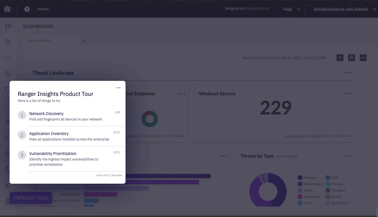
What works?
- SentinelOne’s interactive walkthrough starts with a simple checklist. It provides three different options to explore the product, which ensures the user isn’t overwhelmed with the choices or features at a go.
- The persona-driven onboarding also makes the tutorial contextually richer. So you’re not just checking out the product, you’re a security analyst learning about SentinelOne’s Ranger Insights platform.
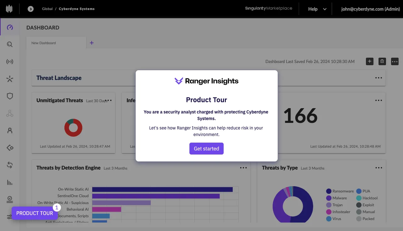
- The use of pulsing hotspots and action-driven tooltips offers smooth navigation and crisp messaging to ensure the users understand how the advanced product features work.
6. Fathom
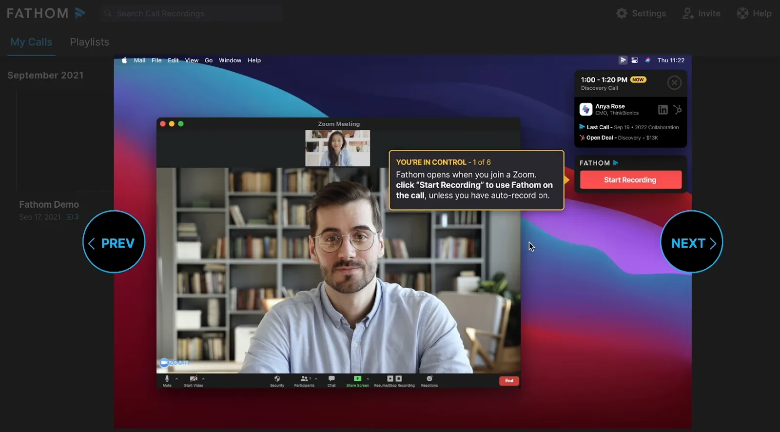
What works?
- Fathom takes users through a short, 7-step interactive walkthrough. Since the number of steps is clearly indicated, users know how they’re progressing and stay motivated to watch till the end.
- A sample Zoom call shows up automatically, which showcases how the product works within a specific context and eliminates the need for users to create a fresh meeting to check the tool in action.
- Users go through each functionality via a self-paced guided tutorial. They can interact and click through the tutorial to better understand the product’s UX and core features.
7. AlphaSense
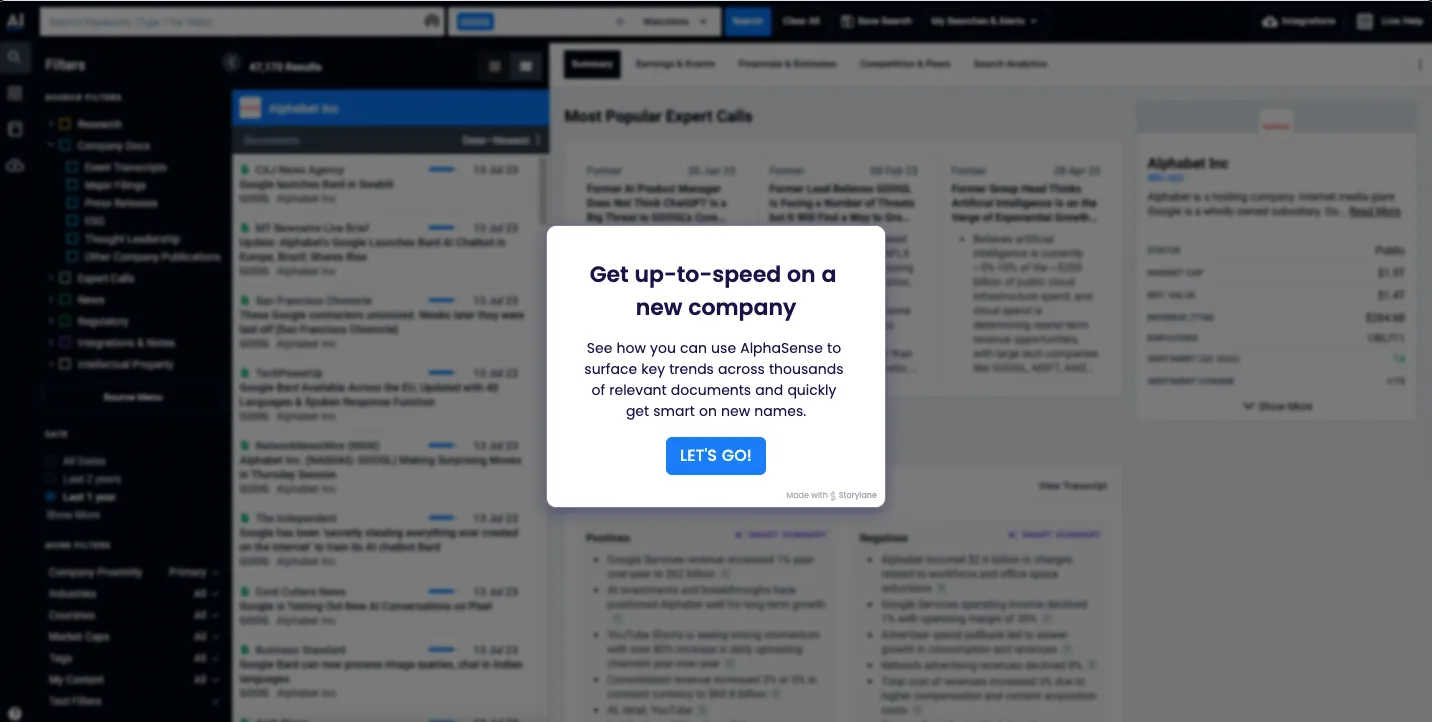
What works?
AlphaSense is a market intelligence and search platform for scouring thousands of business sources to look up and find insights about companies, industries, and specific topics.
- In its in-app tutorial, users are welcomed with a clear and crisp message about a specific use case: how to look up a new company’s details. So users know what they’ll learn before jumping in with misunderstood expectations.
- The combination of bright blue hotspots and action-driven tooltips make the interactive walkthrough easy to navigate while driving user action.
- The accompanying text also clearly explains the core features and what they do, encouraging a quick learning process.
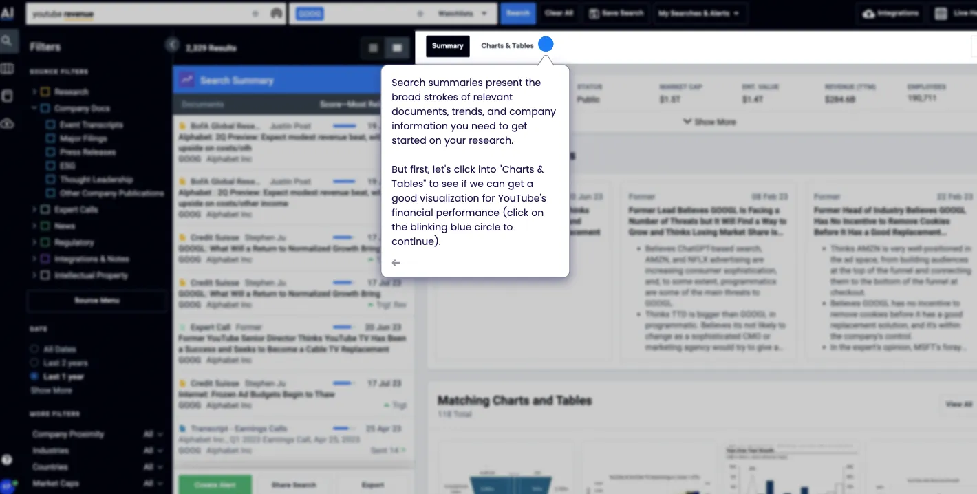
- Since the in-app tutorial shows YouTube’s financial data, you also get a better sense of the advanced product features and capabilities as a user.
8. Evernote

What works?
Evernote is an all-in-one organization tool that helps you take stock of and streamline your day. From taking notes to scheduling appointments, you can do it all.
- Since Evernote is a multifaceted app they allow users to choose their use case during onboarding. This ensures you get a more personalized tour of the product than a generic one.
- The app walkthrough is cleverly customized to each user's needs, so they engage and interact better with the product offering a positive first experience.
- As the first step, it doesn’t ask you to create a note from scratch but pick a pre-made template. It cleverly introduces the type of note-taking users can do, encouraging adoption.

Create Impactful Interactive Guides with Storylane
You may think onboarding is only about the period after a new user signs up. However, adapting to a product is a continuous learning process.
Initial onboarding might get the user to try the product. But do they become experts and turn into advocates immediately? No. To help users master advanced product features, make sense of new updates, and get the most out of the product—you need to build effective in-app walkthroughs.
Storylane is a no-code in-app tutorial software that helps you build and share highly interactive product walkthroughs in 10 minutes or less.
You can create a comprehensive onboarding flow with Storylane’s tooltips and hotspots. Explain underutilized features or promote a new functionality added to your roster to increase product usage and boost conversions.
Check out Storylane in action for free!
In-app tutorials - Frequently asked questions
Q. How do you make a tutorial for an app?
Here are five steps to create an in-app tutorial:
- Start by identifying gaps in your feature adoption.
- Then, create a user journey map to understand user activation.
- Based on the data collected, create a narrative and storyboard a contextual onboarding flow.
- Next, use an in-app tutorial software to build the tutorial.
- Finally, test out the tutorial with focused groups and get feedback to make changes before finalizing it.
Q. Do I need developers to create in-app tutorials, or can I use no-code tools?
No-code platforms like Storylane, Userpilot, and Appcues let you launch tutorials in days without developers. Custom builds take 2-6 months and require frontend engineers. Choose no-code for speed and testing; build custom only for complex product logic or strict security requirements.
Q. What's a good completion rate for in-app tutorials?
The industry average is 19.2% across B2B SaaS companies. FinTech products see 24.5%, while MarTech averages 12.5%. Below 10% signals friction. Rates between 15-25% are healthy. Above 25% is excellent.
Q. How long does it take to create and launch an in-app tutorial?
No-code tools take 1-2 weeks from planning to launch. Custom builds require 6-12 weeks for design, development, and QA.
Q. Should I use tooltips, walkthroughs, or checklists for my in-app tutorial?
Use tooltips for single-feature explanations. Choose interactive walkthroughs for multi-step workflows. Deploy checklists for complex onboarding with 3-7 activation tasks. Use hotspots for passive feature discovery without interrupting users.
Q. What ROI can I expect from implementing in-app tutorials?
Effective tutorials can double activation rates—Impala increased theirs from 23% to 46%. Since 63% of users decide to subscribe based on onboarding, improved tutorials directly impact conversion. Calculate ROI by multiplying activation lift by monthly trial users and ARPU.
Q. How do I measure if my in-app tutorial is working?
Track completion rate as your primary metric—target 15-25%. Monitor time-to-value, activation rate, and feature adoption. Analyze drop-off points to identify friction. A/B test different formats and measure which drives better activation.
Q. What are common mistakes when creating in-app tutorials?
- Avoid tutorials longer than 5 steps—users abandon them. Always include a skip option for power users.
- Use the user's actual data when possible. Get insight from first running Storylane demos with realistic sample to see reception and use the wining demo as your base for the in app tutorial.
- Never launch a tutorial without testing on 5-10 real users first.
Turn every free trial into a fast ‘aha’ moment—build in-app tutorials that convert onboarded users into paying customers with Storylane
.jpg)
.png)