Writing a SaaS landing page is like writing a dating app profile. Pretty visuals alone don’t cut it; you must use the right words to compel people to take action. Since all your digital marketing efforts are focused on getting people to your website, your landing pages can either make or break all your hard work.
In this blog, we’ll delve into what makes the perfect landing page and the best practices you must follow to turn site visitors into customers.
What is a SaaS landing page?
SaaS landing pages are web pages that showcase important product details, such as features and pricing plans, with the goal of converting website visitors into free trial users or paying customers. It is a web page found by your prospects through PPC or social media channels that offers concise information about the software's features and benefits and compelling calls to action.
Most SaaS landing pages have multiple folds, with the first fold showcasing a highly impactful copy that’s a maximum of 5-6 words, a call to action that pushes them to take the next step, and an accompanying graphic. Of course, it doesn’t necessarily need to follow this format.
The important point is this: If you only had 3 seconds to pitch your product, what would you say? Write that down here. The pitch should include the “Why should I get this product or service” in a crux.
Elements of a Good SaaS Landing Page
A good landing page has the following key elements:
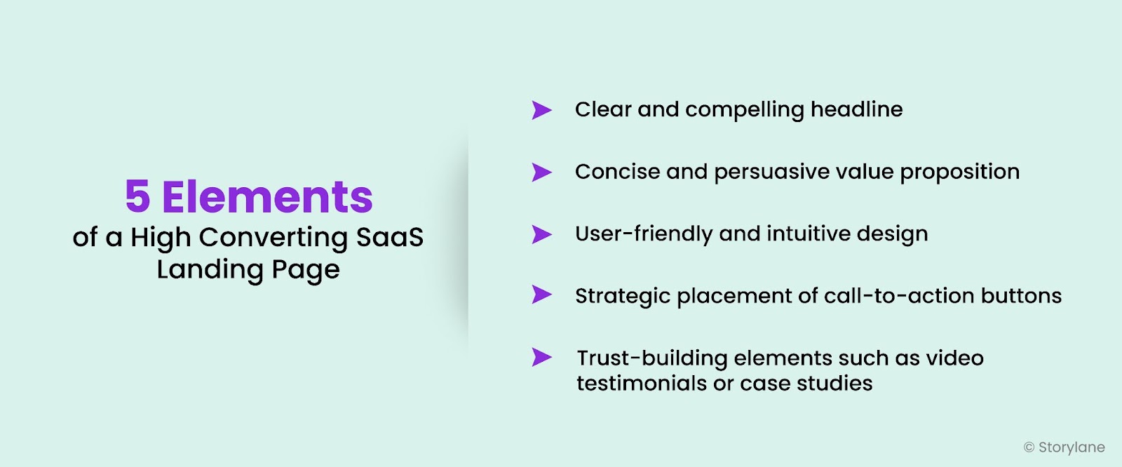
Let’s take Airtable as an example and how they’ve improved their home page to speak to their target audience. Here’s the old version:

Here are 3 major problems here:
- Vague messaging with hero text
- Unnecessary jargon used
- Generic CTA
If you are a potential customer, that statement tells nothing about what Airtable is. What does it connect to? What will you achieve? There is no clarity.
Now, here’s their new and improved landing page, where they hone in on one specific use case:

The messaging and positioning have been refined in the hero text, and they explain the product USP clearly to their audience.
Your website is a 24x7 sales rep, so make sure you attract the right audience and offer a seamless user experience.
“Don’t forget to take into consideration what role your website plays in your buyer’s journey! Are they coming in cold? Are they already aware of their problems and are looking for a potential solution? Are they coming to your website at the product-aware stage? The answer to this determines how much education vs conversion weighting you put on your copy.” – Michelle Picoto, Co-founder and B2B Tech Growth Strategist at DeepStar Strategic
How is a Landing Page Different from a Homepage?
While many folks use landing pages and home pages interchangeably, they’re quite different. A landing page is a single page designed and used for a specific campaign, whereas the home page is the main page for your website, almost like the hall the front door opens to.
For instance, when you type “best sales intelligence tool” and click on the first ad on Google, it leads you to Paperflite’s landing page,

However, when you go to their main website by clicking on the company’s logo on the top left corner, this is the web page that pops up:
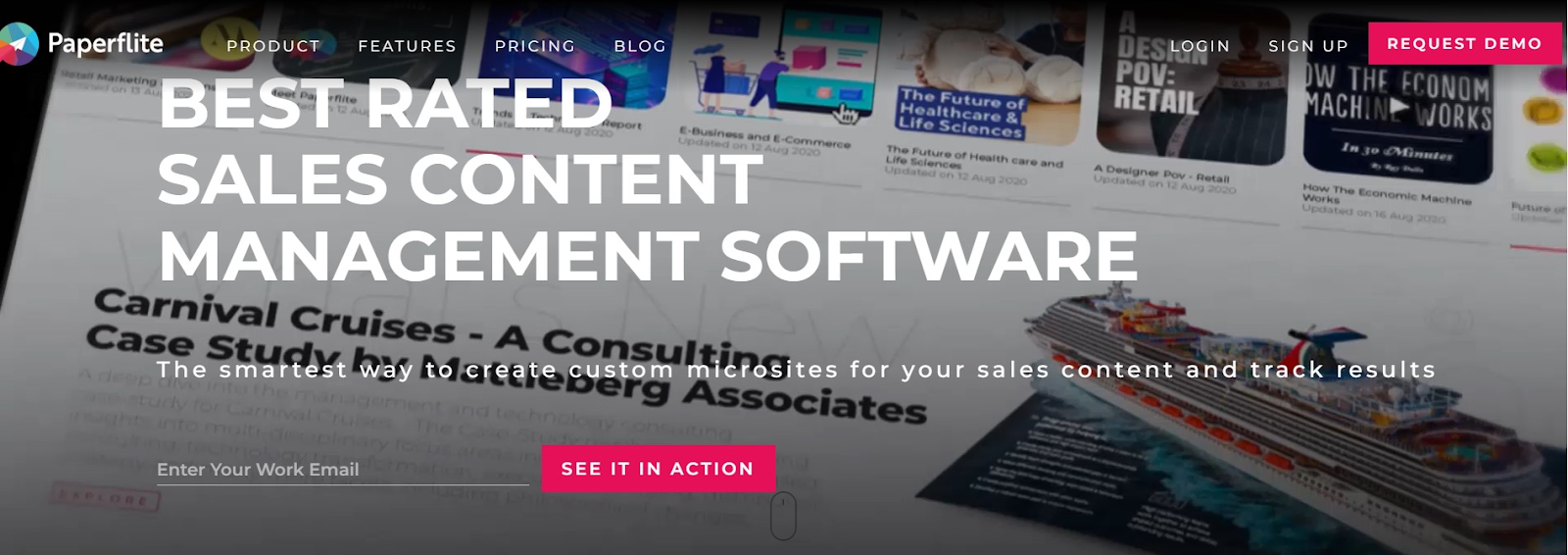
Here is a table outlining the 5 main differences between a landing page and a home page:
How to Structure a Good SaaS Landing Page
The anatomy of a landing page is typically similar across all SaaS websites, but you must be mindful of structuring it in a way that answers users’ search intent.
“Remember, the role of your website is to answer the following questions and garner a series of micro-yeses from your buyers:"
- Do you have my attention?
- Can I relate to what you’re talking about?
- Do you have proof of what you say?
- Can you give value to me? Why you and no one else?
- What do you want from me?
- How do I go about the next step?
"If you’ve done your messaging exercise well, you’ll have your messaging pillars built out and prioritized based on what your ideal buyers are looking to do or solve.” Michelle Picoto, Co-founder and B2B Tech Growth Strategist at DeepStar Strategic
We’re going to break down the structure of a good landing page by using Clari as an example.
Here are the 6 points you should be mindful of when it comes to structuring SaaS landing pages:
1. Hero Section
“First impression is the last impression” is the principle you must follow when crafting the hero section of your landing page. If visitors don’t understand how your product can help them within 10 seconds, they’ll click away.
Clari positions their product in a way that gives its visitors a sense of ownership over the revenue process. The description succinctly explains how the product can help them, and invites them to explore the product themselves.

2. Address Pain Points
When discussing pain points, avoid using vague and generic terms like “we help you boost revenue” or “we streamline your workflow.” Your competitors will likely use the same language, so how does your product stand out?
“Your messaging will land better by explaining how it solves a specific pain point — not general aspirational longings.” – Anthony Pierri, Founder at Fletch PMM in his interview with Unlayer
Your message must evoke emotions and have your visitor think “How can I fix this ASAP?” Clari takes a conversational approach with their copy and explains how their features will save you from revenue leakage.

3. Product Visuals
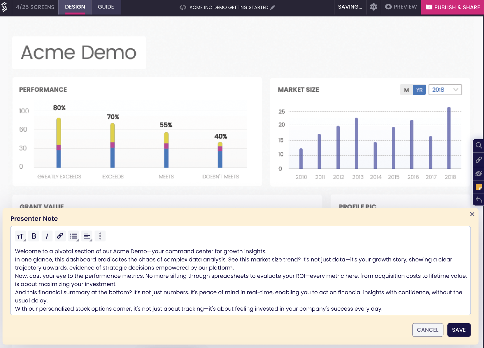
It’s always better to show than tell, and adding dashboard images and feature explainer videos is the way to go. However, Clari takes one step ahead and allows users to take an interactive product tour of their platform. Interactive demo videos are a great way to drive consideration and shorten the sales cycle.
Clari’s team opted for an interactive demo platform when they acquired Wingman last year and were in the process of integrating the marketing teams. Given that Wingman already had a product demo with a self-guided tour through Storylane, they chose our platform for continuity and familiarity.

Plus, they were also in the midst of a new web launch and needed to create a demo quickly using high-fidelity screenshots with callouts. Luckily, Storylane offers a suite of exciting features that allows you to create product walkthroughs in just 10 minutes!

💡 Clari uses interactive demos to give website visitors a first-hand experience of their product, and managed to engage 33% of their website visitors in just one week!
4. Social Proof
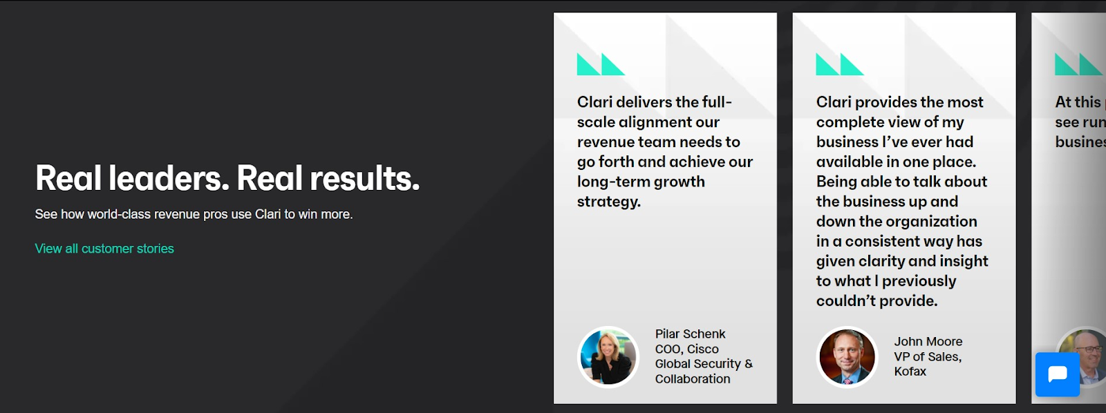
These days, who doesn’t buy something without asking their colleagues, peers or checking out online reviews? Especially in B2B SaaS, it’s imperative to ask around and find out first-hand reviews. Therefore, showcasing social proof, or name dropping on your landing page can increase trust in your brand.
Display success stories to establish authority in your industry. Clari has included customer testimonials from industry experts to show how their product is a boon for revenue leaders around the world.
5. Address Objections
“Why should we choose you” is the most common buyer objection that comes up when visitors are exploring your site. Answer their queries by adding an FAQ section, quantifying your results, and establishing credibility.
Clari shows that they’re the best RevOps tool out there by showing badges from trusted sources like G2, Gartner, Forrester, and TrustRadius. They’ve also included specific stats to show exactly how their platform helps users meet their goals.

6. Compelling CTA
Every landing page is created with the primary goal of inciting action from the visitor. When writing a call-to-action, make sure you answer the following questions:
- Why are users visiting your site?
- What specific problem do they have?
- What solution are you providing to solve it?
When people visit your website, they aren’t necessarily looking to invest in your product right away. They just want an easy fix to their current problem. If you want visitors to stay on your site and convert, your CTA must highlight the magnitude of the problem and how your solution is the best way to fix it.
Moreover, it is crucial to note that every CTA doesn’t need to be “book a demo” because potential customers may not be ready to engage yet. You can also have them sign up for a free trial or take a product tour.
Clari uses a consistent CTA across their website by driving urgency with their copy. The CTA is crisp and catchy and doesn’t compel users to book a demo directly.

7 SaaS Landing Page Best Practices You Must Follow According to Experts
Now that you know the ABCs of building a SaaS landing page, here is some expert insight from seasoned marketing professionals on the best practices you must follow to optimize your landing page for a higher conversion rate:
Use Interactive Product Demos
Do you know why car dealerships allow people to test drive their cars? It’s because they aim to sell the experience of being a car owner and the feeling of power you get when you drive down the road in a fancy new vehicle. With a staggering 15.9 million in overall motor vehicle sales, the significance of this hands-on experience is evident.
Using an interactive product demo on your landing pages evokes a similar feeling in potential clients. They want to get a feel of your product to see how it can solve their problems.
“The next generation of buyers want to see the impact and try the product before engaging too much with sales” – Nalin Senthamil, CEO at Storylane.
Embedding an interactive demo on your landing page is the best way to educate your buyers about your product and increase the chance of closing the deal.

Cognism has incorporated its product demo on its homepage, so users can test the product immediately instead of navigating through the entire site to learn about the different features and use cases.

▶️Find out how sevDesk generated 527 leads with a 28% conversion rate using Storylane.
Customer-Centric Positioning
You are building a product for your customers, so make sure your messaging and copy are not “me-focused.” Always take a customer-first approach with your landing pages.
“Explain the 4 main things that help people decide if they should be interested:
What is this? Is it for me? What can I do with it? How is it different from alternatives?
"Good positioning and messaging should not only convince your ideal customer that your tool is THE solution for them but also signal to bad-fit customers that they're better off elsewhere.” – Pavlo Cherniakov, Founder at Concise Copy Co.
Here’s how Wynter shows it’s the best message-testing platform for B2B marketers by clearly outlining how it can help them achieve their goals.

Sprinkle Social Proof
Showing reviews on your product landing page is one way to gain trust, but if you want to take things up a notch, you can add them throughout your website. Make sure you have it above the fold to increase visibility.
“Social proof can be one heck of a good salesperson, So don't just dismiss it by adding a few well-known logos to your site and calling it a day” – Talia Wolf, Founder and CEO at GetUplift
HoneyCart strategically puts a testimonial on their pricing page with a review that justifies how the product is worth the price.

Explain the Transformation
People don’t buy the product; they buy the solution to their problems. They don’t buy an exercise machine, they buy the motivation to lose weight. When you’re creating your landing page, show how your product transforms the lives of your end users and organizations in the long run.
"The secret to crafting impactful copy for SaaS landing pages lies in the nuanced art of Feature-Benefit Transformation. For instance, instead of saying 'Our platform has advanced encryption,' it's more compelling to say, "Experience unparalleled security and peace of mind with our advanced encryption technology." This transforms the feature into a direct benefit, creating a more engaging and personalized message" – Bhavik Sarkhedi, Founder of Content Whale
GrooveHQ has a great landing page that explains why a shared inbox is needed for businesses by using a simple and visually pleasing design to display how customer service teams can benefit from using shared inboxes.

“Keep your copy solution-oriented that can relate to your customers. Oftentimes the copy is so focused on talking about features that it becomes hard to understand. Always think from an outside-in POV rather than an inside-out POV.” – Zaid Hashmi, Growth Marketer at Netcore
Ditch the “Everything for Everyone” Approach
When a landing page tries to appeal to everyone, it dilutes the message and alienates the target audience. While tailoring your copy, write for one person and target one specific use case.
“The content for B2B SaaS shouldn't be much different from B2C. Companies are still made up of individual consumers, so even if it's for B2B, you still need to consider the individual instead of the company when you're writing.”
– Aerin Paulo, Ex-Head of Marketing at ComplYant
BaseCamp is one of the numerous project management tools in the market today, but instead of casting a wide net, they choose to position themselves as the best project management tool for small businesses.

Their entire messaging focuses on supporting “the underdogs” and how their tool can give you the power to improve productivity and scale as an enterprise would.
Use Storytelling
Marketing and storytelling go together like chocolate and caramel. When crafting a landing page, use storytelling to build relatability with your users. DocSend does this best on its “How it Works” page by creating a fictional character named Jessica and explaining how she can improve her workflow with their tool.

They explain how the product works in 6 simple steps, and each of them subtly highlights DocSend’s wide range of features.

Use Zero Party Intent Data
Data is the new oil, and when you gather data through multiple sources like surveys, lead gen forms, etc., you get a deeper perspective into your potential client’s true preferences. You understand the language they use, the features they prioritize and the outcomes they expect after using your product.
“One of the best ways to optimize your landing pages is to collect the data that helps you personalize them. Things like quizzes and questionnaires help you know what to sell, how to sell it, and why to sell it”
– Alex Garcia, Founder at MarketingExamined
Paychex is an HR Payroll software that has an interactive form on its homepage where users can input their company details. Once the details are added, it suggests the right solution for their needs. Now the sales representative can use a more personalized approach to reach out to their prospects rather than sending generic outreach messages to book a demo.

You can also use interactive demos to capture leads on your website and send them to your CRM within minutes.

Wrapping Up
Building a SaaS landing page can be tricky, but it’s not rocket science. Following the above best practices can significantly improve your chances of closing the deal.
But if you want to stand out from your competitors and really connect with your buyer – then Storylane is the perfect addition to your marketing tech stack.
With Storylane, you can create personalized product demos in just 10 minutes, thereby meeting your conversion goals and boosting your inbound pipeline. Book a demo today to learn how best to showcase your product on your landing page.
Q1. What is the difference between a landing page and a homepage?
The homepage is the main or front page of a website and is typically the first page visitors encounter. A landing page is a standalone web page created for a specific marketing or advertising campaign.
Q2. What is the best aspect ratio for a landing page?
It is recommended to maintain a 16:9 (widescreen, horizontal, landscape) aspect ratio.
Q3. What are the three components of the landing page conversion path?
The three components of a landing page conversion path typically include:
- Call-to-Action (CTA)
- Landing Page Form
- Thank You Page
Related Reading
1.Coming Soon Landing Pages That Convert: Examples to Inspire You

.svg)
.svg)









.svg)

.webp)